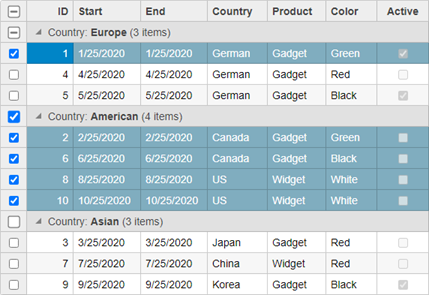
FlexGrid selector adds check boxes to every grid row for multiple row selection. This selection scheme can be very useful on mobile devices, which have no keyboards with shift and control keys for extended selections. The selector is represented by the Selector class which defines an extender used to set the FlexGrid selector. The Selector class can be used on header columns as well as regular scrollable/data columns. It works with both, flat and hierarchical views, where you can toggle the selected state for a row in flat view and toggle the selected state for entire groups at once in hierarchical views.

Controller
| CellMarkerController.cs |
コードのコピー
|
|---|---|
public ActionResult Index() { return View(Sale.GetData(15)); } |
|
View for the Controller
| Index.cshtml |
コードのコピー
|
|---|---|
@model IEnumerable<Sale> @*Instantiate FlexGrid and set its properties*@ @(Html.C1().FlexGrid<Sale>() .Id("ovFlexGrid").ShowGroupPanel(s => s .MaxGroups(Convert.ToInt32(4)) .Placeholder("Please add columns for grouping here") .HideGroupedColumns(Convert.ToBoolean(false))) .AutoGenerateColumns(false) .Bind(Model) .PageSize(10) .CssClass("grid") .IsReadOnly(true) .Columns(bl => { bl.Add(cb => cb.Binding("ID")); bl.Add(cb => cb.Binding("Start")); bl.Add(cb => cb.Binding("End")); bl.Add(cb => cb.Binding("Country")); bl.Add(cb => cb.Binding("Product")); bl.Add(cb => cb.Binding("Color")); bl.Add(cb => cb.Binding("Active")); }) .Selector(sb => sb.ShowCheckAll(true)) ) |
|