Grouping refers to combining rows based on column values. When grouping is applied to a grid, it automatically sorts the data, splits it into groups, and adds collapsible group rows above or below each group.
FlexGrid supports column-wise grouping of grid data through the CollectionView class as a datasource. You can configure group description by using the GroupBy method in view. You can also add grouping using JavaScript by adding GroupDescription objects to the collectionView.groupDescriptions property. Here, the column for grouping the grid data is specified in the code.
You can customize the text displayed in group header rows using the GroupHeaderFormat property. By default, it displays the name of the group, followed by the current group and the number of items in the group. To format the aggregated data in the group header for a particular column, you can set the format property on each Column object.
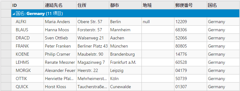
The following image shows how the FlexGrid appears on using the GroupBy method. The example uses table, Customer from the NWind.mdb database.

The following code examples demonstrate how to enable Grouping in the FlexGrid:
In Code
GroupingController.cs
| C# |
コードのコピー
|
|---|---|
public ActionResult Grouping() { var nwind = new C1NWindEntities(); return View(nwind.Customers); } |
|
Grouping.cshtml
| Razor |
コードのコピー
|
|---|---|
@using MVCFlexGrid.Models @model IEnumerable<Customer> @(Html.C1().FlexGrid<Customer>() .Id("pagingGrid") .AutoGenerateColumns(false) .Height(300) .Width(840) .IsReadOnly(true) .Bind(Model) .GroupBy("Country") .Columns(columns => { columns.Add(column => column.Binding("CustomerID")); columns.Add(column => column.Binding("ContactName")); columns.Add(column => column.Binding("Address")); columns.Add(column => column.Binding("City")); columns.Add(column => column.Binding("Region")); columns.Add(column => column.Binding("PostalCode").Format("p0")); columns.Add(column => column.Binding("Country")); }) ) @Html.Partial("_Pager", "pagingGrid") |
|