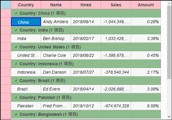
The appearance of the FlexGrid control is defined using CSS classes which represent different grid elements such as row, column, cell etc. You can customize these classes to change the appearance of the FlexGrid control.
In this example, we customize the default CSS rules to make the following customization to the grid's appearance:
- FlexGrid border.
- Background color for topLeft, columnHeader, rowHeader cells and GroupRow.
- ColumnHeader text is centered aligned.
- Font style italic for alternative rows.
- Solid border for selected cells.
- Sort icon color.
- Collapsed/Expand Group Icon color.
- Font color for FlexGrid editor.
These custom CSS rules can be applied to the FlexGrid by applying a CSS class to the FlexGrid control using the CssClass property. This property applies the CSS rules to the non-header cells in a row or column. Similarly, you can apply CSS rules to all the cells, including headers, in a column or row using CssClassAll property.
The following image shows how the FlexGrid control appears after applying styles using custom CSS.

Add Custom Stylesheet
Create a new ASP.NET MVC application. Once you have created the application, a Content folder is created in the Solution Explorer after adding the view to the application. To add a custom style sheet in your application, follow these steps:
- In the Solution Explorer, right-click the Content folder.
- From the context menu, select Add | Style Sheet. The Specify Name for Item dialog appears.
- Set name of the style sheet (for example:
app.css)and click OK. - Replace the default code of app.css file with the code given below.
app.css コードのコピー.custom.wj-flexgrid{ border: black 2px solid; border-radius: 0; margin-top:15px; } .custom .wj-topleft .wj-cell { background: lightblue; } .custom .wj-colheaders .wj-cell { background: pink; text-align:center !important; } .custom .wj-rowheaders .wj-cell { background: pink; } .custom .wj-alt{ font-style:italic; } .custom .wj-group:not(.wj-state-selected):not(.wj-state-multi-selected) { font-weight: bold; background-color: darkseagreen; } .custom .wj-glyph-down-right{ color:green; } .custom .wj-glyph-right{ color:green; } .custom .wj-state-selected{ border: blue 2px solid; } .custom .wj-state-multi-selected { border: blue 2px solid; } .custom .wj-grid-editor{ color:blue; } .custom .wj-glyph-up { color: blueviolet; } .custom .wj-glyph-down{ color:blueviolet; }
Styling.cshtml
| Razor |
コードのコピー
|
|---|---|
@model IEnumerable<Person>
<div>
    <div style="width:90%;margin:0 auto;">
<c1-flex-grid id="flexGrid" auto-generate-columns="false" class="custom" width="575px" height="900px"
    key-action-tab="Cycle">
    <c1-items-source source-collection="@Model" group-by="Country"></c1-items-source>
    <c1-flex-grid-column binding="Country" header="Country" width="100"></c1-flex-grid-column>
    <c1-flex-grid-column binding="Name" header="Name" width="100"></c1-flex-grid-column>
    <c1-flex-grid-column binding="Hired" header="Hired" width="100" required="true"></c1-flex-grid-column>
    <c1-flex-grid-column binding="Sales" format="n" width="100"></c1-flex-grid-column>
    <c1-flex-grid-column binding="Amount" format="p2" width="100"></c1-flex-grid-column>
</c1-flex-grid>
    </div>
</div>
|
|