ItemTemplates を使用してコントロール内のカスタムコンテンツを指定することで、ListBox コントロールをカスタマイズすることができます。ListBox のテンプレート内で ComponentOne MVC コントロールを使用することもできます。
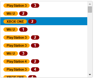
次の図は、ItemTemplates を適用した ListBox を示しています。
次のコード例は、ItemTemplates を使用して ListBox コントロールをカスタマイズする方法を示します。
コードの場合
ListBoxController.cs
| C# |
コードのコピー
|
|---|---|
public ActionResult ItemTemplate() { var list = MVCFlexGrid.Models.CustomerOrder.GetOrderData(100).ToList(); return View(list); } |
|
ListBox.cshtml
| HTML |
コードのコピー
|
|---|---|
@model List<CustomerOrder>

<style>
    .badge {
        color: white;
        background-color: darkred;
        border-radius: 10px;
        padding: 1px 10px;
    }

    .label {
        color: black;
        background-color: orange;
        border-radius: 10px;
        padding: 1px 10px;
    }
</style>

<div>
    <label>Custom HTML</label>
    <c1-list-box width="300px" height="250px">
        <c1-input-item-template>
            <span>
        <span class="label">{{Product}}</span>
        <span class="badge">{{Count}}</span>
            </span>
        </c1-input-item-template>
        <c1-items-source source-collection=@Model></c1-items-source>
    </c1-list-box>
</div>

<div>
    <label>C1 MVC controls</label>
    <c1-list-box width="300px" height="250px">
        <c1-input-item-template>
            <span>
                <c1-input-number template-bindings="@(new { Value = "Count"})"
min=0 max=10 step=1 is-template=true></c1-input-number>
            </span>
        </c1-input-item-template>
        <c1-items-source source-collection=@Model></c1-items-source>
    </c1-list-box>
</div>
|
|