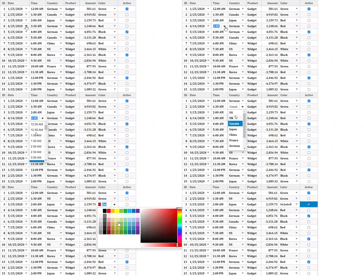
FlexGrid provides in-built support for Excel like fast editing, however, in certain cases you may need advance editing experience. To enable such editing, you can customize your editing experience by using custom editors and specify custom editor controls using the Editor property on the Column. The Editor property simply sets a reference to an MVC input control to be used as a custom cell editor. For this, you can use any input control that you want, including Date Picker, Numeric Textbox, AutoComplete, Color Picker, and more.
The following example demonstrates how you can use MVC InputDate, InputTime, ComboBox, InputNumber, and InputColor controls as custom editors. To use an input control as a custom editor, all you have to do is associate an instance of the control with a grid column or a style using its Editor property. This example also showcases how CellTemplate can be used for customizing the editors further in some of the columns.

To accomplish this, follow these steps:
Create an MVC Application
Create a new MVC application using the ComponentOne or VisualStudio templates. For more information about creating an MVC application, see Configuring your MVC Application topic.
Create a Datasource for FlexGrid
- Add a new class to the folder Models (for example:
Sale.cs). See Adding controls to know how to add a new model. - Replace the following code in the new model to define the classes that serve as a datasource for the FlexGrid control.
Sale.cs コードのコピーpublic class Sale { public int ID { get; set; } public DateTime Start { get; set; } public DateTime End { get; set; } public string Country { get; set; } public string Product { get; set; } public string Color { get; set; } public double Amount { get; set; } public double Amount2 { get; set; } public double Discount { get; set; } public bool Active { get; set; } public MonthData[] Trends { get; set; } public int Rank { get; set; } private static List<string> COUNTRIES = new List<string> { "US", "UK", "Canada", "Japan", "China", "France", "German", "Italy", "Korea", "Australia" }; private static List<string> PRODUCTS = new List<string> { "Widget", "Gadget", "Doohickey" }; private static List<string> COLORS = new List<string> { "Black", "White", "Red", "Green", "Blue" }; public static IEnumerable<Sale> GetData(int total) { var rand = new Random(0); var dt = DateTime.Now; var list = Enumerable.Range(0, total).Select(i => { var country = COUNTRIES[rand.Next(0, COUNTRIES.Count - 1)]; var product = PRODUCTS[rand.Next(0, PRODUCTS.Count - 1)]; var color = COLORS[rand.Next(0, COLORS.Count - 1)]; var startDate = new DateTime(dt.Year, i % 12 + 1, 25); var endDate = new DateTime(dt.Year, i % 12 + 1, 25, i % 24, (i % 2) * 30, 0); return new Sale { ID = i + 1, Start = startDate, End = endDate, Country = country, Product = product, Color = color, Amount = Math.Round(rand.NextDouble() * 10000 - 5000, 2), Amount2 = Math.Round(rand.NextDouble() * 5000, 2), Discount = Math.Round(rand.NextDouble() / 4, 2), Active = (i % 4 == 0), Trends = Enumerable.Range(0, 12).Select(x => new MonthData { Month = x + 1, Data = rand.Next(0, 100) }).ToArray(), Rank = rand.Next(1, 6) }; }); return list; } public static List<string> GetCountries() { var countries = new List<string>(); countries.AddRange(COUNTRIES); return countries; } public static List<string> GetProducts() { List<string> products = new List<string>(); products.AddRange(PRODUCTS); return products; } } public class MonthData { public int Month { get; set; } public double Data { get; set; } }
Add Custom Editors to the FlexGrid control
Complete the following steps to initialize a FlexGrid control.
Add a new Controller
- In the Solution Explorer, right click the folder Controllers.
- From the context menu, select Add | Controller. The Add Scaffold dialog appears.
- Complete the following steps in the Add Scaffold dialog:
- Select MVC 5 Controller - Empty template.
- Set name of the controller (for example:
CustomEditorController). - Click Add.
- Replace the method Index() with the following method.
IndexController.cs
C# コードのコピーusing FlexGrid_Core.Models; namespace FlexGrid_Core.Controllers { public class CustomEditorController : Controller { public IActionResult Index() { return View(Sale.GetData(15)); } } }
Note: Replace FlexGrid_MVC.Models; with <YourMVCApplicationName>.Models; in the references.
Add a View for the controller:
- From the Solution Explorer, expand the folder Controllers and double click the controller (for example:
Default1Controller) to open it. - Place the cursor inside the method
Index(). - Right click and select Add View. The Add View dialog appears.
- In the Add View dialog, verify that the View name is Index and View engine is Razor (CSHTML).
- Click Add. A view has been added for the controller.
- In the Solution Explorer, double click
Index.cshtmlto open it. - Replace the default code of the Views\Index.cshtml file with the one given below to initialize a FlexGrid control.
Razor コードのコピー@using FlexGrid_Core.Models @model IEnumerable<Sale> @{ List<string> countries = Sale.GetCountries(); List<string> products = Sale.GetProducts(); } <style type="text/css"> .grid { height: 500px; border: 2px solid #e0e0e0; font-family: Cambria; font-weight: bold; } </style> <c1-input-date id="dateEditor" style="width:100%" is-required="false" format="d"></c1-input-date> <c1-combo-box id="countryEditor" style="width:100%" is-editable="false"> <c1-items-source source-collection="@countries"></c1-items-source> </c1-combo-box> <c1-input-color id="colorEditor" style="width:100%" is-required="false"></c1-input-color> <!-- FlexGrid hosting the custom editors --> <c1-flex-grid auto-generate-columns="false" width="700px" class="grid" allow-add-new="true" selection-mode="Cell"> <c1-items-source source-collection="@Model"></c1-items-source> <c1-flex-grid-column binding="ID" width="0.4*"></c1-flex-grid-column> <c1-flex-grid-column binding="Start" header="Date" format="d" editor="dateEditor"></c1-flex-grid-column> <c1-flex-grid-column binding="End" header="Time" format="t"> <c1-flex-grid-cell-template is-editing="true"> <c1-input-time id="timeEditor" style="width:100%" is-required="false" step="30" format="t" template-bindings="@(new {Value="End"})"></c1-input-time> </c1-flex-grid-cell-template> </c1-flex-grid-column> <c1-flex-grid-column binding="Country" editor="countryEditor"></c1-flex-grid-column> <c1-flex-grid-column binding="Product"> <c1-flex-grid-cell-template is-editing="true"> <input type="text" id="{{uid}}" style="width:100%;height:100%" value="{{Product}}" /> </c1-flex-grid-cell-template> </c1-flex-grid-column> <c1-flex-grid-column binding="Amount" width="1.0*" format="n2"> <c1-flex-grid-cell-template is-editing="true"> <c1-input-number id="amountEditor" style="width:100%" is-required="false" format="c2" step="10" template-bindings="@(new {Value="Amount"})"></c1-input-number> </c1-flex-grid-cell-template> </c1-flex-grid-column> <c1-flex-grid-column binding="Color" format="n2" editor="colorEditor"></c1-flex-grid-column> <c1-flex-grid-column binding="Active"></c1-flex-grid-column> </c1-flex-grid>
Build and Run the Project
- Click Build | Build Solution to build the project.
- Press F5 to run the project.