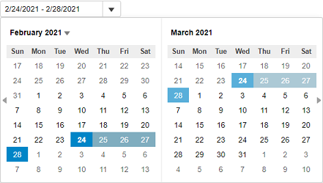
In addition to setting the day range, InputDateRange allows you to customize the dropdown calendar to show the specified number of weeks before and after the currently visible calendar month. Furthermore, it lets you display multiple calendar months at a time in the dropdown calendar. Let us dive into the details of how to achieve these in the following sections.
Specify Weeks to Display Before and After the Current Month
InputDateRange allows you to specify the number of weeks you want to display on the calendar before and after the current calendar month. However, these weeks are displayed in disabled state on the calendar. InputDateRange provides the WeeksBefore property to set the number of weeks to be displayed before the current month and the WeeksAfter property to set the number of weeks to be displayed after the current month.

The following code uses the WeeksBefore and WeeksAfter properties to display two weeks before and one week after the currently displayed months in the calendar:
| C# |
コードのコピー
|
|---|---|
<c1-input-date-range id="demoControl" weeks-before="1" weeks-after="2" value="@today" close-on-selection="false" range-end="@rangeEnd"> </c1-input-date-range> |
|
Display Multiple Calendar Months
The InputDateRange control supports multi-month view. It allows you to show multiple months in the calendar, at a time, using the MonthCount property. The value for the MonthCount property is set to 2, by default, for the InputDateRange control. However, you can always change it based on your requirements.

The following code showcases the use of MonthCount property to display three months at a time in the calendar of the InputDateRange control.
| C# |
コードのコピー
|
|---|---|
@{
    var today = DateTime.Now.Date;
    var rangeEnd = today.AddDays(4);
}

<c1-input-date-range id="demoControl" value="@today" month-count="3" close-on-selection="false" range-end="@rangeEnd">
</c1-input-date-range>
|
|