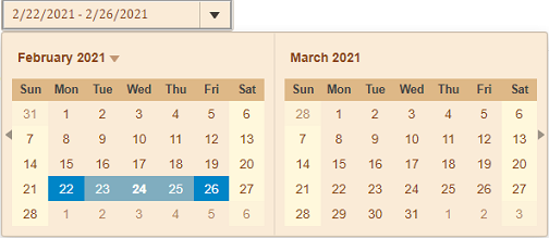
The InputDateRange control has a simple layout which makes it easy to style using CSS. InputDateRange provides various options to customize the appearance of the InputDateRange control and all its elements using CSS, so that you can style and display the InputDateRange control as per your requirement.

The following code demonstrates the use of CSS to style the InputDateRange control:
| C# |
コードのコピー
|
|---|---|
@{
    var today = DateTime.Now.Date;
    var rangeEnd = today.AddDays(3);
}
<style>
  .wj-control{
      color:saddlebrown;
      background-color:antiquewhite;
  }
  .wj-input-group{
      font-family:'Cambria Math';
      border:groove;
  }
    .wj-header{
        background-color:burlywood;
    }
    .wj-day-weekend {
        background-color: cornsilk;
    }
    .wj-inputdate-dropdown {
        max-height: initial;
    }
</style>

    <c1-input-date-range id="demoControl"  close-on-selection="false" month-count="2" value="@today" range-end="@rangeEnd">
    </c1-input-date-range>
|
|