The split layout is helpful when we want to add the tiles in different orientations for different groups. It enables the users to have nested groups where in each group can have a different orientation. The group can either consist of another or a tile. Each tile can render any MVC or HTML control. The order in which the groups are rendered is determined by the Orientation property. When the orientation is set to Horizontal, the groups or tiles are rendered horizontally and when the orientation is set to Vertical, then the groups or tiles are rendered vertically.
DashboardLayout allows you to set the split layout using its AttachSplitLayout method of the DashboardLayoutBuilder class. The split layout divides the dashboard into multiple section where in you can add multiple tiles to the layout. The SplitGroup class represents the group for the split layout and on the other hand SplitTile class represents the tiles in the split layout.
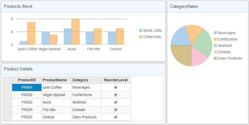
The following image shows how DashboardLayout control appears after adding a split layout.

The following code example demonstrates how to set split layout for the DashboardLayout control. This example uses the sample created in the QuickStart section.
| HTML |
コードのコピー
|
|---|---|
<c1-dashboard-layout>
    <c1-split-layout orientation="Horizontal">
        <c1-split-group orientation="Vertical" size="2*">
            <c1-split-group orientation="Horizontal" size="*">
                <c1-split-tile header-text="Products Stock" size="*">
                    <c1-flex-chart binding-x="ProductName" chart-type="Column" style="height:150px;">
                        <c1-items-source source-collection="@Model"></c1-items-source>
                        <c1-flex-chart-series name="Stock Units" binding="UnitsInStock"></c1-flex-chart-series>
                        <c1-flex-chart-series name="Order Units" binding="UnitsOnOrder"></c1-flex-chart-series>
                    </c1-flex-chart>
                </c1-split-tile>
            </c1-split-group>
            <c1-split-tile header-text="Product Details" size="*">
                <c1-flex-grid auto-generate-columns="false">
                    <c1-flex-grid-column binding="ProductID" width="150"></c1-flex-grid-column>
                    <c1-flex-grid-column binding="ProductName" width="150"></c1-flex-grid-column>
                    <c1-flex-grid-column binding="Category" width="150"></c1-flex-grid-column>
                    <c1-flex-grid-column binding="ReorderLevel" width="150"></c1-flex-grid-column>
                    <c1-items-source source-collection="@Model" width="150"></c1-items-source>
                </c1-flex-grid>
            </c1-split-tile>
        </c1-split-group>
        <c1-split-group size="*">
            <c1-split-tile header-text="CategorySales" size="*">
                <c1-flex-pie binding-name="Category" binding="Sales">
                    <c1-items-source source-collection="Model"></c1-items-source>
                </c1-flex-pie>
            </c1-split-tile>
        </c1-split-group>
    </c1-split-layout>
</c1-dashboard-layout>
|
|