Calendar allows you to customize its appearance in different ways based on your requirements. You can choose to change the first day of the week displayed in the calendar, show a limited set of days in the displayed calendar month, change the display format of the days and months, display multiple months in the calendar at a time, and hide the header, navigation buttons and adjacent days. Let us dive into the details of all these features in the following sections.
Set Date Range
Calendar allows you to display a date range and disable the rest of the dates from the calendar which implies that you can restrict the selection to the specified range of dates from the calendar. This can be done using the MinDate and MaxDate properties of the C1Calendar class which allow you to set the minimum number of days displayed before and maximum number of days displayed after the specified date for selection at runtime, respectively.

The following code uses the MinDate and MaxDate properties to display the ten days before and ten days after today's date in the calendar:
| Razor |
コードのコピー
|
|---|---|
<C1Calendar MinDate="@DateTime.Today.AddDays(-10)" MaxDate="@DateTime.Today.AddDays(10)"></C1Calendar> |
|
Set First Day of Week
By default, Calendar displays "Sunday" as the first day of the week. However, you can change it to display the first day of the week depending on your local culture using FirstDayOfWeek property of the C1Calendar class.
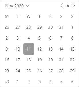
The following code uses the FirstDayOfWeek property to display "Monday" as the first week in the Calendar:
| Razor |
コードのコピー
|
|---|---|
<C1Calendar FirstDayOfWeek="@DayOfWeek.Monday"></C1Calendar>
|
|
Customize Days of Week and Month Formats
Calendar allows you to specify formats for displaying the names of the days in a week and the calendar months. You can set the format for representing the names of days in a week by using DayOfWeekFormat property of the C1Calendar class. Similarly, you can use HeaderMonthFormat property of the C1Calendar class to set the format for displaying month of the year in the Calendar control.
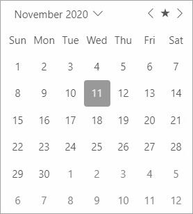
The following code showcases the use of DayOfWeekFormat and HeaderMonthFormat property to set the "ddd" day format and "MMMM" month format in the control, respectively.
| Razor |
コードのコピー
|
|---|---|
<C1Calendar DayOfWeekFormat="ddd" HeaderMonthFormat="MMMM"></C1Calendar> |
|
Display Multiple Calendar Months
Calendar supports multi-month view. It allows you to display multiple months at a time in the Calendar control using MonthCount property of the C1Calendar class.
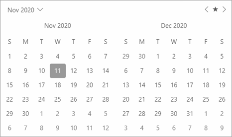
The following code showcases the use of MonthCount property to display two months at a time in the Calendar control.
| Razor |
コードのコピー
|
|---|---|
<C1Calendar MonthCount="2"></C1Calendar>
|
|
Customize Header, Navigation Buttons and Adjacent Days
By default, the header, navigation buttons and adjacent days are visible in the Calendar control. However, Calendar allows you to control the visibility of the header, navigation buttons and adjacent days based on your requirements. It lets you choose whether to show the navigation buttons, adjacent days, and header at runtime. You can hide the calendar header, navigation buttons and adjacent days by setting the ShowHeader, ShowNavigationButtons and ShowAdjacentDay properties to false.

The following code demonstrates how you can hide the calendar header, navigation buttons and adjacent days.
| Razor |
コードのコピー
|
|---|---|
<C1Calendar ShowNavigationButtons="false" ShowAdjacentDay="false" ShowHeader="false"></C1Calendar> |
|