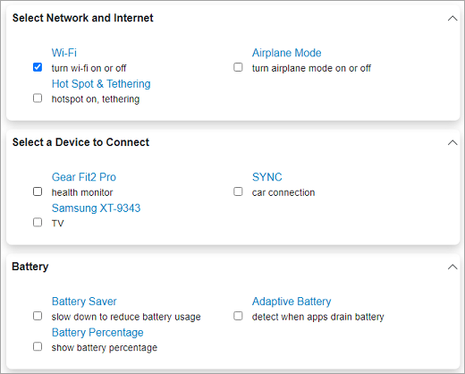
Accordion provides expand modes to make the control more useful in fitting into different application UIs. This is useful in cases where you want to conserve screen real estate so that the user is free of unnecessary distractions. Just like the musical instrument accordion, the Accordion control provides the flexibility to tightly compress for storage and then decompress when a player wants to use it.

By default, the Accordion control expands only one item at a time and collapses the other items. However, you can change this expanding behavior of the accordion items using ExpandMode property of the C1Accordion class. The ExpandMode property determines how many items in the Accordion control can be expanded or collapsed at a time using the ExpandMode enumeration which provides the following three options for this purpose:
| Expand Modes | Description |
|---|---|
| One | Only one item in the Accordion control can be expanded one at a time. This is the default option. |
| Collapsible | All items in the Accordion control can be collapsed. |
| Any | Any item in the Accordion control can be expanded or collapsed. |
The following code snippet illustrates how to set the ExpandMode property in Blazor Accordion.
| Index.razor |
コードのコピー
|
|---|---|
<C1Accordion ExpandMode="@C1.Blazor.Accordion.ExpandMode.Any"> <AccordionItem Header="Select Network and Internet"> <div class="accordion-item-content"> <div class="item-input"> <input id="wifi" type="checkbox" checked /> <label for="wifi"> Wi-Fi <span>turn wi-fi on or off</span> </label> </div> <div class="item-input"> <input id="apmode" type="checkbox" /> <label for="apmode"> Airplane Mode <span>turn airplane mode on or off</span> </label> </div> <div class="item-input"> <input id="hotspot" type="checkbox" /> <label for="hotspot"> Hot Spot & Tethering <span>hotspot on, tethering</span> </label> </div> </div> </AccordionItem> <AccordionItem Header="Select a Device to Connect"> <div class="accordion-item-content"> <div class="item-input"> <input id="dev1" type="checkbox" /> <label for="dev1"> Gear Fit2 Pro <span>health monitor</span> </label> </div> <div class="item-input"> <input id="dev2" type="checkbox" /> <label for="dev2"> SYNC <span>car connection</span> </label> </div> <div class="item-input"> <input id="dev3" type="checkbox" /> <label for="dev3"> Samsung XT-9343 <span>TV</span> </label> </div> </div> </AccordionItem> <AccordionItem Header="Battery"> <div class="accordion-item-content"> <div class="item-input"> <input id="bat-sav" type="checkbox" /> <label for="bat-sav"> Battery Saver <span>slow down to reduce battery usage</span> </label> </div> <div class="item-input"> <input id="bat-adapt" type="checkbox" /> <label for="bat-adapt"> Adaptive Battery <span>detect when apps drain battery</span> </label> </div> <div class="item-input"> <input id="bat-pct" type="checkbox" /> <label for="bat-pct"> Battery Percentage <span>show battery percentage</span> </label> </div> </div> </AccordionItem> </C1Accordion> <style> .accordion-item-content { margin: 20px; grid:auto-flow; } .item-input{ width:40%; box-sizing:border-box; position:relative; display:inline-block; max-width:100%; margin: 0 20px; } .item-input input[type=checkbox]+label{ padding-left:10px; color:#0085c7; } .item-input > label > span{ display:block; font-weight: normal; font-size:90%; opacity:.90; color:black; } .app-item input[type=checkbox]{ margin-left: 20px; } </style> |
|