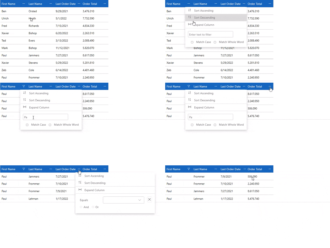
The FlexGrid control has built-in column header menu that allows you to perform column-based actions at runtime like sorting, grouping, filtering and resizing columns. The column header menu can be invoked by clicking on the ellipses button beside the column name. It helps you to apply sorting, grouping and filtering on each column data type separately. By default, the ellipses button for the column header menu appears when the mouse is over the column header. However, you can customize this behavior of the column header menu ellipses button by using ColumnOptionsMenuVisibility property of the FlexGrid class. The ColumnOptionsMenuVisibility property sets the visibility of the column header menu using the GridColumnOptionsMenuVisibility enumeration.
The following GIF displays the column header menu at runtime.
|
|
The following code demonstrates how you can customize the visibility of column header menu using the ColumnOptionsMenuVisibility property. This example uses the Customer.cs class available in the BlazorExplorer product sample.
| Index.razor |
コードのコピー
|
|---|---|
@using System.Collections.ObjectModel; @using C1.Blazor.Core @using C1.Blazor.Grid @using C1.Blazor.Input @using FlexGridColumnOptions.Data <FlexGrid AutoGenerateColumns="false" ItemsSource="customers" Style="@("max-height:50vh")" ColumnHeaderStyle="@("background-color:#1565C0;color:#fff;font-size: 16px;")" ColumnOptionsMenuVisibility="GridColumnOptionsMenuVisibility.Visible"> <FlexGridColumns> <GridColumn Binding="FirstName" /> <GridColumn Binding="LastName" /> <GridColumn Binding="LastOrderDate" Format="d" /> <GridColumn Binding="OrderTotal" Format="N" /> </FlexGridColumns> </FlexGrid> @code { ObservableCollection<Customer> customers; protected override void OnInitialized() { customers = Customer.GetCustomerList(100); } } |
|
