The LinearGauge control uses a linear pointer to show a value along a linear scale. You can set the value across the scale and display it on the gauge using Value property of the C1Gauge class. This helps to analyze the current value of the Gauge control and measure how this value falls between the minimum and maximum values on the scale.
For example, let's say, you want to create a Linear Gauge for measuring the percentage of completion of a task. The amount of work done can be measured and displayed using the Value property.
The following image displays the value on the gauge.

To learn about using the Value property in code, see Linear Gauge Quick Start topic.
Minimum and Maximum values
The Min and Max properties of the C1Gauges class helps to set the minimum and maximum values to be displayed on the gauge. The default values of the Min and Max properties are 0 and 100, respectively. However, you can change these values based on your requirements.
The following image showcases the minimum value set to 1 and the maximum value set to 100 for the gauge.

The following code shows how to set the Min and Max properties in the Linear Gauge control:
| Index.razor |
コードのコピー
|
|---|---|
<C1LinearGauge Value="25" Min="1" Max="100" TextVisibility="GaugeTextVisibility.All"></C1LinearGauge> |
|
Step
The step determines how the intervals of the Value can be set when the user interacts with the control. For instance, if the Step is 20, and the minimum and maximum values are 0 and 100, respectively, the possible values will be 0, 20, 40, 60, 80, and 100 as showcased in the following GIF.

The step can be set using the Step property of the C1Gauge class as showcased in the following code.
| Index.razor |
コードのコピー
|
|---|---|
<C1LinearGauge Value="25" Step="20" TextVisibility="GaugeTextVisibility.All"></C1LinearGauge> |
|
Label
The values can be be displayed as text or labels in the gauge using the TextVisibility property. This property specifies one of the following values to be displayed using the GuageTextVisibility enumeration:
| Values | Description | Snapshot |
|---|---|---|
| All | Show the gauge's value, min, and max as text labels. |  |
| MinMax | Show the gauge's min and max values as text labels. |  |
| Value | Show the gauge's value as text label. |  |
| None | Do not show any text label in the gauge. |  |
Face and Pointer
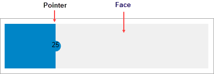
The face of the Gauge control determine the geometrical appearance of the control, while the pointer is an indicator that can be used to represent the gauge's current value. The following image showcases face and pointer of the linear gauge.
