RangeSlider provides various styling properties in the C1RangeSlider class which can be used to change the appearance of all its elements. It allows you to style the slider track, range track, thumbs and the overall control. Let us discuss how you can change the appearance and style of the RangeSlider control and its elements in the following sections.

Style RangeSlider
RangeSlider lets you change the appearance of the control by setting the width, border, border color, and much more by setting the Style property. The following image showcases the RangeSlider control with a colored border set using the Style property.

The following code shows how you can change the style and appearance of the RangeSlider control using the Style property. This example uses the sample created in the Range topic.
| Index.razor |
コードのコピー
|
|---|---|
<C1RangeSlider Style=@("width: 150px; border: 2px solid #32a1ce; border-radius: 10px;") Minimum=-10 Maximum=100></C1RangeSlider> |
|
Style Slider Track
You can change the look and feel of the slider track using TrackStyle property of the C1RangeSlider class. For example, the following image shows a different colored slider track whose color is changed using the TrackStyle property.

The following code shows how to change the background color of the slider track in RangeSlider control. This example uses the sample created in the Range topic.
| Index.razor |
コードのコピー
|
|---|---|
<C1RangeSlider TrackStyle=@("background-color: #fba0e3;") Minimum=-10 Maximum=100> </C1RangeSlider> |
|
Style Range Track
RangeSlider lets you style the range track by using RangeTrackStyle property of the C1RangeSlider class. For example, the following image shows a different colored range track whose color is changed using the RangeTrackStyle property.

The following code shows how to change the background of range track in RangeSlider control. This example uses the sample created in the Range topic.
| Index.razor |
コードのコピー
|
|---|---|
<C1RangeSlider RangeTrackStyle=@("background-color: #f53dc4;") Minimum=-10 Maximum=100></C1RangeSlider> |
|
Style and Customize Thumbs
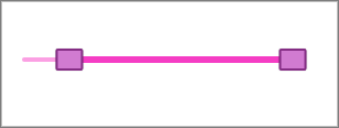
With RangeSlider, you can change the shape and style of the thumbs. For this, you can use LowerThumbStyle and UpperThumbStyle properties of the C1RangeSlider class to style lower value and upper value thumbs respectively. These properties can also be used to set the background color, border, width, border-radius, and much more to style the thumbs in RangeSlider as shown in the following image.

To change the thumb shape and style, use the following code. This example uses the sample created in the Range topic.
| Index.razor |
コードのコピー
|
|---|---|
<C1RangeSlider Minimum=-10 Maximum=100 LowerThumbStyle=@("width: 25px; height: 20px; border-radius: 2px; background-color: #d17bd1; border: 2px solid #852e85;") UpperThumbStyle=@("width: 25px; height: 20px; border-radius: 2px; background-color: #d17bd1; border: 2px solid #852e85;")> </C1RangeSlider> |
|