FlexGrid offers different ways of styling the grid data, rows and columns which makes it easier to design your application. You can customize the columns headers, text color, gridlines, cell background, and other elements of the FlexGrid.
FlexGrid contains many properties that allow you to easily style all visual aspects of the grid. In this section, we will see the different ways to customize the appearance of the grid.
Using CSS classes
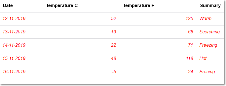
You can customize the grid using CSS classes. FlexGrid has two main CSS classes; .flexgrid-cell span used to style the column header cells and .flexgrid-cell used to style the data cells. In the following example, the column headers and cell data of the FlexGrid has been styled as shown in the image below.

Following code example demonstrates how to customize cells in FlexGrid using CSS classes.
Using API members
The different elements of FlexGrid such as rows, columns, headers, cells, selection etc. can by styled using the available API members. The styling API members of type C1Style are designated to different elements of the grid which helps in styling the elements with large data set of styling attributes such as change font color, cell background etc.
The API members available in C1Style are listed below.
| API member | Description |
|---|---|
| ColumnHeaderStyle | Styles the column header cells |
| ColumnHeaderSelectedStyle | Styles the selected column header cells |
| EditorStyle | Styles the cell editor |
| SelectionAdornerStyle | Styles the selection adorners |
| SelectionStyle | Styles the selected cells |
| RowStyle | Styles the row cells |
| RowHeaderStyle | Styles the row header cells. |
| RowHeaderSelectedStyle | Styles the selected row header cells |
| TopLeftCellStyle | Styles the top left cell |
| CursorStyle | Styles the cursor cell |
| AlternatingRowStyle | Styles the alternating rows |
| GroupRowStyle | Styles the Group row |
| NewRowStyle | Styles the new row |
| CellStyle | Styles the FlexGrid cells |
| GridLinesBrush | Paint the lines between cells |
| ColumnHeaderGridLinesBrush | Sets the color of the lines between the column header cells |
Using CellTemplate
CellTemplate allows you to define a template for styling data cells in the FlexGrid. In this example, a span element is wrapped to cell content in CellTemplate HTML markup and any style applied to the span element customizes the cell appearance.
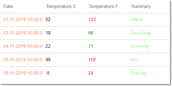
Here, a few styles are directly applied through the span while other styles have been conditionally applied by evaluating the cell values as shown in the image below.

Following code example demonstrate how to customize cells in FlexGrid using CellTemplate.