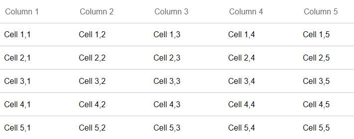
In addition to displaying bound data, FlexGrid can be used completely unbound. You can add any number of rows and columns and populate the cells programmatically or let the end-user fill them in like a spreadsheet.
FlexGrid supports selective column binding, which means the control can be customized to contain unbound columns apart from data bound columns. While the bound columns display data from a datasource, unbound columns contain custom data.
In the below example, the values displayed in the cells of an unbound column of FlexGrid are calculated using values from the cells of other columns that are bound to a data source. The following image shows a FlexGrid having unbound columns.

The following code example demonstrates how to implement unbound FlexGridColumns.
| Razor |
コードのコピー
|
|---|---|
@page "/UnboundColumn" @using C1.Blazor.Grid <h1>FlexGrid Unbound Mode</h1> <FlexGrid @ref="grid"> <FlexGridColumns> @for (int i = 0; i < 5; i++) { <GridColumn Header="@string.Format("Column {0}",i+1)" ></GridColumn> } </FlexGridColumns> <FlexGridRows> @for (int i = 0; i < 5; i++) { <GridRow></GridRow> } </FlexGridRows> </FlexGrid> @code { FlexGrid grid; protected override void OnAfterRender(bool firstRender) { if (firstRender) { for (int i = 0; i < grid.Rows.Count; i++) { for (int j = 0; j < grid.Columns.Count; j++) { grid[i, j] = string.Format("Cell {0},{1}", i + 1, j + 1); } } } } } |
|