InputPanel では、柔軟にカスタムテンプレートを作成して、ユーザーの要件に応じてコントロールのレイアウトを変更できます。カスタムテンプレートを作成することで、アプリケーションに合うコンパクトで見栄えのよいフォームを開発することができます。カスタムレイアウトを定義し、コントロールを表示する方法を変更するには、InputPanel の DataTemplate を使用します。
次の図に、InputPanel コントロールにカスタムテンプレートを適用したところを示します。
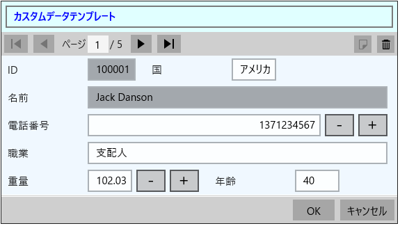
データテンプレートを使用してカスタムテンプレートを作成し、コントロールのレイアウトを変更するには、以下の手順に従います。この例では、「クイックスタート」で作成したサンプルを使用します。この例で作成するデータテンプレートでは、1 つのスタックパネルに 2 つの横方向のスタックパネルを含めます。内側の 2 つのスタックパネルには横方向に配置するエディタを入れ、外側のスタックパネルには縦方向に配置するエディタを入れます。InputPanel は、ItemsSource プロパティを通してこのデータテンプレートにアクセスします。
この例では、C1InputPanel クラスの HeaderTemplate プロパティを使用して InputPanel のヘッダーテンプレートをカスタマイズする方法も紹介しています。
デフォルトでは、InputPanel のすべてのエディタが縦に並べられます。エディタの配置を変更するには、AutoGenerate プロパティを false に設定します。
- 次のコードを <Page> タグ内に追加します。
XAML コードのコピーxmlns:c1="using:C1.Xaml" xmlns:c1input="using:C1.Xaml.InputPanel"
- 次のコードを <Page> タグの後に追加して、縦と横に積み重ねられたいくつかのエディタでDataTemplateを適用します。
XAML コードのコピー<Page.Resources> <DataTemplate x:Key="InputPanelCustomDataTemplate"> <StackPanel Background="AliceBlue"> <StackPanel Orientation="Horizontal"> <c1input:C1InputTextBox Header="ID" DataBinding="{Binding ID, Mode=OneWay}" IsReadOnly="True" LabelForeground="{Binding LabelForeground, ElementName=InPanel}"></c1input:C1InputTextBox> <c1input:C1InputTextBox Header="国" DataBinding="{Binding 国, Mode=TwoWay, UpdateSourceTrigger=PropertyChanged}" IsReadOnly="{Binding IsReadOnly, ElementName=InPanel}" LabelForeground="{Binding LabelForeground, ElementName=InPanel}"></c1input:C1InputTextBox> </StackPanel> <c1input:C1InputTextBox Header="名前" DataBinding="{Binding 名前, Mode=OneWay}" IsReadOnly="True" LabelForeground="{Binding LabelForeground, ElementName=InPanel}"></c1input:C1InputTextBox> <c1input:C1InputNumericBox Header="電話番号" DataBinding="{Binding 電話番号, Mode=TwoWay, UpdateSourceTrigger=PropertyChanged}" IsReadOnly="{Binding IsReadOnly, ElementName=InPanel}" LabelForeground="{Binding LabelForeground, ElementName=InPanel}"></c1input:C1InputNumericBox> <c1input:C1InputTextBox Header="職業" DataBinding="{Binding 職業, Mode=TwoWay, UpdateSourceTrigger=PropertyChanged}" IsReadOnly="{Binding IsReadOnly, ElementName=InPanel}" LabelForeground="{Binding LabelForeground, ElementName=InPanel}"></c1input:C1InputTextBox> <StackPanel Orientation="Horizontal"> <c1input:C1InputNumericBox Header="重量" DataBinding="{Binding 重量, Mode=TwoWay, UpdateSourceTrigger=PropertyChanged}" IsReadOnly="{Binding IsReadOnly, ElementName=InPanel}" LabelForeground="{Binding LabelForeground, ElementName=InPanel}"></c1input:C1InputNumericBox> <c1input:C1InputTextBox Header="年齢" DataBinding="{Binding 年齢, Mode=TwoWay, UpdateSourceTrigger=PropertyChanged}" IsReadOnly="{Binding IsReadOnly, ElementName=InPanel}" LabelForeground="{Binding LabelForeground, ElementName=InPanel}"></c1input:C1InputTextBox> </StackPanel> </StackPanel> </DataTemplate> <ItemsPanelTemplate x:Key="ItemsPanel"> <StackPanel Orientation="Vertical" Margin="20"/> </ItemsPanelTemplate> </Page.Resources>
- 次のコードを <Grid></Grid> タグ内に追加して、InputPanel とそのヘッダーテンプレートをカスタマイズします。
XAML コードのコピー<c1input:C1InputPanel x:Name="InPanel" AutoGenerate="False" ItemsPanelTemplate="{StaticResource ItemsPanel}" ItemsTemplate="{StaticResource InputPanelCustomDataTemplate}" HeaderBackground="LightCyan" HeaderFontWeight="Bold" Margin="20,40,58,80"> <c1input:C1InputPanel.HeaderTemplate> <DataTemplate> <StackPanel> <TextBox Text="カスタムデータテンプレート" Margin="6" Background="LightCyan" Foreground="Blue" /> </StackPanel> </DataTemplate> </c1input:C1InputPanel.HeaderTemplate> </c1input:C1InputPanel>
関連トピック