DateEdit provides various options to style the appearance of the DateEdit control as per your requirement and change the look and feel of the application you are creating.
DateEdit offers the following appearance and styling features:
Appearance
DateEdit provides the following options to dramatically enhance the appearance of the control.
| Properties | Description |
| CalendarDimensions | This property specifies the number of months to display in the Calendar dropdown in DateEdit. |
| MaxColumns | This property specifies the maximum number of columns to display in the dropdown Calendar in which the number of months will be accommodated. |
| VerticalOrientationLayout | This property lets you set month view in vertical layout. |
| DayNameLength | This property specifies the maximum length of the day names. |
| DayTitlePosition | This property sets the position of the day title in the dropdown calendar. |
| MonthTitlePosition | This property sets the position of the month titles in the dropdown calendar. |
| ShowWeekNumbers | This property when set to true displays week numbers in the dropdown calendar. |
This is how the DateEdit control looks after setting these properties.
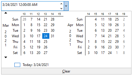
The following code snippet shows how to set the properties in DateEdit.
| C# |
コードのコピー
|
|---|---|
// DateEditドロップダウンカレンダーをカスタマイズします // 表示する月数を指定します dateEdit.Calendar.CalendarDimensions = 2; // 表示する列の最大数を指定します dateEdit.Calendar.MaxColumns = 2; // 垂直方向を設定します dateEdit.Calendar.VerticalOrientationLayout = true; // 日の名前の最大長を設定します dateEdit.Calendar.DayNameLength = 3; // ドロップダウンカレンダーで日のタイトルの位置を設定します dateEdit.Calendar.DayTitlePosition = C1.CalendarView.Position.Left; // ドロップダウンカレンダーで月のタイトルの位置を設定します dateEdit.Calendar.MonthTitlePosition = C1.CalendarView.Position.Left; // ドロップダウンカレンダーに週番号を表示するかどうかを設定します dateEdit.Calendar.ShowWeekNumbers = true; |
|
Font Settings and Alignment
DateEdit provides the following options to change the font settings and alignment of the control:
| Properties | Description |
| Font settings | Apply font settings to the text in the DateEdit control by setting the Font property from Font Control in Systems.Windows.Forms. |
| Text alignment | Set the alignment of the text in the DateEdit control by setting the TextAlign property from TextBox in Systems.Windows.Forms. |
This is how the DateEdit control looks after changing the font settings and alignment.

The following code snippet shows how to apply font settings and text alignment in DateEdit.
| C# |
コードのコピー
|
|---|---|
// フォント設定を適用します dateEdit.Font = new Font("Microsoft Sans Serif", 9F, FontStyle.Italic); // テキストの配置を設定します dateEdit.TextAlign = HorizontalAlignment.Left; |
|
Styling
DateEdit provides DateEditStyles class to style the UI of the control, both the ComboBox and dropdown calendar. The DateEdit control provides the Editor property to get the styles, which determines the appearance of the DateEdit ComboBox. Different styling properties can be applied to the ComboBox such as Default, Focused, Hot, Disabled and ReadOnly. Likewise, This helps to get the styling attributes to be set on the control. DateEdit also provides the Calendar property to get the styles, which determines the appearance of the drop-down Calendar.
The table below provides an idea about the different styling options:
| Styling attributes | Description |
| Default |
Get styling attributes when the general appearance of the element is in default state. |
| Hot | Get styling attributes when the when the cursor is over an element. |
| Focused | Get styling attributes for the general appearance of the focused element. |
| Disabled | Get styling attributes for the general appearance of the disabled element. |
| ReadOnly | Get styling attributes for the general appearance of the read-only element. |
| Common | Get styling attributes for the general appearance of the calendar. |
The snapshot below displays Default styling attribute applied to the DateEdit control.
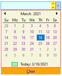
The following code snippet shows how to style the ComboBox, Calendar and Buttons in DateEdit:
| C# |
コードのコピー
|
|---|---|
// デフォルトのComboBox(エディター)スタイル dateEdit.Styles.Editor.Default.BackColor = Color.LightCyan; dateEdit.Styles.Editor.Default.ForeColor = Color.Brown; dateEdit.Styles.Editor.Default.BorderColor = Color.Blue; // ComboBoxのスタイルボタン(エディター) dateEdit.Styles.Editor.Button.Default.BackColor = Color.Yellow; dateEdit.Styles.Editor.Button.Default.ForeColor = Color.Red; // カレンダーのスタイル dateEdit.Styles.Calendar.Common.BackColor = Color.Beige; dateEdit.Styles.Calendar.Common.BorderColor = Color.Red; // 通常の日のスタイルを設定します dateEdit.Styles.Calendar.Day.Ordinary.ForeColor = Color.DarkViolet; // 今日 dateEdit.Styles.Calendar.Day.Today.BackColor = Color.PaleGreen; dateEdit.Styles.Calendar.Day.Today.ForeColor = Color.Orange; // ボタンのスタイルをクリアします dateEdit.Styles.Calendar.ClearButton.Default.BackColor = Color.Orange; dateEdit.Styles.Calendar.ClearButton.Default.ForeColor = Color.Blue; |
|