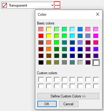
ColorPicker control lets a user choose from the varied list of colors presented in an interactive color selection interface. Users can select colors from different categories namely, System, Web and Custom or choose basic or custom colors fom the 'Color' dialog box. The C1ColorPicker class provides various properties to help in designing professional looking applications. You can set the location and size of the control by using Location and Size properties respectively.
Elements
ColorPicker comprises of four parts: textbox, dropdown button, ellipsis button and dropdown form.
TextBox: This is the area where the text of selected color along with the color gets displayed.
Dropdown button: This button on the right side opens up the dropdown form when clicked.
Dropdown form: This is the dropdown form, which contains the color options to choose from the three tabs namely, System, Web and Custom. The dropdown form appears when the user clicks on the dropdown button. You can set the alignment of the dropdown form by setting the DropDownAlign property.
Ellipsis button: This button on the extreme right opens up the 'Color' dialog from where user can select the basic colors available in the color picker as shown below:

You can further click on the 'Define Custom Colors' button which helps in creating custom colors by using the color palette, and then adding the defined colors to custom colors as shown below:
Add ColorPicker
ColorPicker control can be added to a Winforms application either by using code or via design-time by dragging and dropping C1ColorPicker through Toolbox. The following code shows how to add a ColorPicker control to a Winforms application.
| Create ColorPicker Control |
コードのコピー
|
|---|---|
// コードでColorPickerを追加します colorPicker = new C1.Win.Input.Pickers.C1ColorPicker(); colorPicker.Location = new System.Drawing.Point(35, 20); colorPicker.Size = new System.Drawing.Size(228, 33); colorPicker.TabIndex = 1; Controls.Add(colorPicker); |
|
Color Format Settings
User can select the type of color format which should be displayed in the text box and set it to Default, RGB, ARGB, Hex or Name by using the Format property. The following image shows the ColorPicker control when the color format is set to 'Hex'.
| Set Color Format |
コードのコピー
|
|---|---|
//色の16進形式の表現を使用します
c1ColorPicker5.Format = C1.Win.Input.Pickers.ColorPicker.ColorFormatType.Hex;
c1ColorPicker5.Color = System.Drawing.Color.FromArgb(180, 50, 200, 60);
|
|
Note: Please note that only named colors (colors from the 'System' and 'Web' tabs and some colors from the 'Custom' tab) have the 'Name' property. Hence, when the color format is set to 'Name', only the named colors display the name. The RGB(or ARGB) format is used for the rest of the colors.
Empty Color
ColorPicker control displays the transparent color and text in the textbox area, by default. However, user can change it to empty color (which is rgb(0,0,0)) and any desired text by using AllowEmpty and EmptyColorCaption properties respectively.
When AllowEmpty is set to 'true', Color is set to 'Empty' and AllowTransparent is set to 'False', the empty color is displayed in the textbox and can also be selected from the "Custom" tab as 'Auto' option. The EmptyColorCaption property can be used to set any text along with the empty color, for example, 'No Color' in the below case.
| Set Empty Color and Caption |
コードのコピー
|
|---|---|
//空の色を許可し、透明な色を拒否します c1ColorPicker2.EmptyColorCaption = "No color"; c1ColorPicker2.AllowEmpty = true; c1ColorPicker2.Color = System.Drawing.Color.Empty; c1ColorPicker3.AllowTransparent = false; |
|
Alignment
The alignment of dropdown form and the text inside the textbox can be set by using the DropDownAlign and TextAlign property respectively.
| Set Alignment of Text and DropDown |
コードのコピー
|
|---|---|
//テキストとドロップダウンカラーパレットの配置を変更します
c1ColorPicker4.TextAlign = System.Windows.Forms.HorizontalAlignment.Center;
c1ColorPicker4.DropDownAlign = C1.Win.Input.DropDownAlignment.Right;
|
|