Input provides various properties for customizing the appearance and styling the ColorPicker control, so that you can generate the Input ColorPicker as per your requirement and change the look and feel of the application you are creating.
Appearance
Let's explore how to use appearance-related properties to enrich the appearance of the ColorPicker control.
ColorPicker lets you add an icon and change the font in the editor.
The code snippet below uses the Font and Icon properties to enhance the look of the ColorPicker control.
| C# |
コードのコピー
|
|---|---|
// ColorPickerの外観に関連するプロパティを変更します c1ColorPicker1.Font = new System.Drawing.Font("Tahoma", 11F, System.Drawing.FontStyle.Regular, System.Drawing.GraphicsUnit.Point); c1ColorPicker1.Icon = new C1.Framework.C1BitmapIcon(null, new System.Drawing.Size(16, 16), System.Drawing.Color.Transparent, Image.FromFile(@"resources\OIP (7).jpg")); |
|
Styling
Just like changing the appearance of the control, Input also provides properties to style the UI of the ColorPicker control.
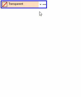
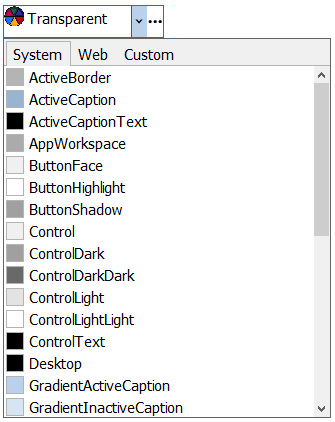
The C1ColorPicker class provides BackColor and ForeColor properties to set the background and foreground colors, respectively. Besides these, it also provides the Styles property to apply styling to different states of the control such as Default, Disabled, Hot, HotPressed, and Pressed.
To apply styling to ColorPicker, use the following code.
| C# |
コードのコピー
|
|---|---|
// ColorPickerコントロールをスタイル設定します //境界線を設定します c1ColorPicker1.Styles.Border = new C1.Framework.Thickness(3, 3, 3, 3); c1ColorPicker1.Styles.Default.BorderColor = System.Drawing.Color.Blue; //背景色と前色を設定します c1ColorPicker1.BackColor = System.Drawing.Color.PeachPuff; c1ColorPicker1.ForeColor = Color.Black; c1ColorPicker1.Styles.Hot.BackColor = System.Drawing.Color.DarkSalmon; //ドロップダウンをスタイル設定します c1ColorPicker1.Styles.DropDown.BackColor = Color.MistyRose; c1ColorPicker1.Styles.DropDown.Border = new C1.Framework.Thickness(3, 3, 3, 3); |
|