ComboBox is a combination of a textbox and a dropdown with a list of options to choose from. User can also enter a new value in the textbox by default. However, you can change this behavior to disable textbox editing and display the dropdown list only by setting the DropDownStyle property to DropDownList. You can get or set the selected item through its index or the item itself by using SelectedIndex or SelectedItem property.
| Create ComboBox Control |
コードのコピー
|
|---|---|
cmb = new C1ComboBox(); Controls.Add(this.cmb); item1 = new ComboBoxItem(); cmb.Items.Add(item1); cmb.Text = "Select a product"; item1.DisplayText = "Mobile Phone"; cmb.Location = new Point(10, 100); this.cmb.Size = new System.Drawing.Size(150, 29); |
|
Elements
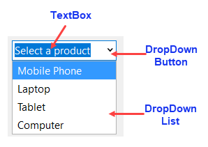
ComboBox comprises of three parts: textbox, dropdown button and dropdown list.

TextBox: This is the area where text of selected option gets displayed. You can display a default text in the control by setting the Text property.
Dropdown button: This button on right hand side of the combobox opens up the dropdown list when clicked.
Dropdown list: This is the list box which contains options to choose from. The dropdown list appears when user clicks on the dropdown button. You can set the width of this listbox by setting the DropDownWidth property. You can also choose maximum number of items that can be displayed in the list using MaxDropDownItems property.
Data Binding
Binding a control with a data source gives you ability to communicate and even update the underlying data through the control. ComboBox can be bound to an array, enumeration or a binding source as well using the ItemsDataSource property. In addition, ItemsDisplayMember and ItemsValueMember property lets you set the items to be displayed and actual value of the ComboBox items.
| Data Binding in ComboBox |
コードのコピー
|
|---|---|
c1ComboBox1.ItemsDataSource = bSource; c1ComboBox1.ItemsDisplayMember = "ProductName"; c1ComboBox1.ItemsValueMember = "ProductName"; c1ComboBox1.SelectedIndex = bSource.Position; c1ComboBox1.SelectedIndexChanged += C1ComboBox1_SelectedIndexChanged; |
|
Add or Remove Items
You can add or remove the objects in the list at run-time by using Items property of the C1ComboBox class. Add method lets you add a single object while AddRange method can be used to add an array of objects. To remove specific items from the list, you can use Remove method while Clear method lets you remove all items from the list.
| Add ComboBox Items |
コードのコピー
|
|---|---|
// ComboBoxに項目を追加します item1 = new ComboBoxItem(); cmb.Items.Add(item1); item2 = new ComboBoxItem(); cmb.Items.Add(item2); item3 = new ComboBoxItem(); cmb.Items.Add(item3); item4 = new ComboBoxItem(); cmb.Items.Add(item4); // ComboBoxとその項目の表示テキストを設定します cmb.Text = "Select a product"; item1.DisplayText = "Mobile Phone"; item2.DisplayText = "Laptop"; item3.DisplayText = "Tablet"; item4.DisplayText = "Computer"; |
|
| Remove ComboBox Items |
コードのコピー
|
|---|---|
cmb.Items.Remove(item2); |
|
Add Images to ComboBox Items
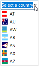
You can add images to the ComboBox items by using the ImageList control. Create an instance of the ImageList control, add images to it and assign that instance to ItemImageList property of the C1ComboBox class.

| Add Images to ComboBoxItems |
コードのコピー
|
|---|---|
ResourceManager resource = new ResourceManager("Input_QS_NET5.Properties.Resources", Assembly.GetExecutingAssembly()); var images = resource.GetResourceSet(CultureInfo.CurrentCulture, true, true) .Cast<System.Collections.DictionaryEntry>() .Where(x => x.Value.GetType() == typeof(Bitmap)) .Select(x => new { Name = x.Key.ToString(), Image = x.Value }).ToList(); imageList = new ImageList(); foreach (var imageItem in images) { item = new ComboBoxItem(); item.Value = item.ImageKey = item.DisplayText = imageItem.Name; imageList.Images.Add(imageItem.Name, (Image)imageItem.Image); cmb.Items.Add(item); } cmb.ItemsImageList = imageList; |
|
Item Modes
ComboBox allows you to build it's item presentation for which it provides the ItemMode property in the C1ComboBox class. The ItemMode property specifies the visual representation of ComboBox items using ComboBoxItemMode enumeration which provides the following three options:
|
Default In the default option, each C1ComboBoxItem is a string and can also be an image. |
HtmlPattern In the HtmlPattern, each item is built from a HTML pattern and bound item data. The HtmlPattern used in the following image is set to: <table><tr><td>Country:</td><td><b>{Text}</b></td></tr><tr><td align="right">Flag:</td><td><img src='{Text}'></td></tr></table> |
Html In the Html option, each item is a fragment of a HTML subset. |
 |
 |
 |
AutoSuggestion Mode
ComboBox supports auto suggestion feature that suggests text for a field in the ComboBox drop down list that matches user input. It provides these suggestions based on the filtering criteria through AutoSuggestMode enumeration which can be set using AutoSuggestMode property of C1ComboBox class. In order to work with the AutoSuggestMode property, you also need to set the AutoCompleteMode and AutoCompleteSource properties as it works only when the CustomSource or ListItems value is used in AutoCompleteSource.

The following code showcases how you can enable auto suggestion mode in the ComboBox control:
| ComboBox with AutoSuggestionMode |
コードのコピー
|
|---|---|
public Form1() { InitializeComponent(); C1ComboBox cb = new C1ComboBox(); this.Controls.Add(cb); cb.ItemsDataSource = _addresses; cb.AutoCompleteCustomSource.AddRange(_addresses.ToArray()); cb.AutoCompleteMode = AutoCompleteMode.Suggest; cb.AutoCompleteSource = AutoCompleteSource.CustomSource; cb.AutoSuggestMode = AutoSuggestMode.Contains; } private List<string> _addresses = new List<string>() { "boss@mycompany.com", "info@mycompany.com", "hr@mail.com", "sergey.brin@google.com", "devil@hell.org", "sun@shining.com", "boss2@mycompany.com", "info2@mycompany.com", "hr2@mail.com", "sergey.brin2@google.com", "devil2@hell.org", "sun2@shining.com", "boss3@mycompany.com", "info3@mycompany.com", "hr3@mail.com", "sergey.brin3@google.com", "devil3@hell.org", "sun3@shining.com", }; |
|
Tooltip
Tooltips are the labels that appear when you hovers over an element. ComboBox allows you to show a tooltip in the dropdown list to display additional information about the list item you hover in the dropdown. It provides ShowTooltip property in the C1comboBox class that displays the tooltip.

The following code demonstrates how you can use the ShowTooltip property to display tooltip for the ComboBox dropdown list items:
| Tooltip |
コードのコピー
|
|---|---|
C1ComboBox cb = new C1ComboBox(); this.Controls.Add(cb); cb.ShowTooltip = true; |
|