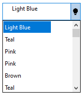
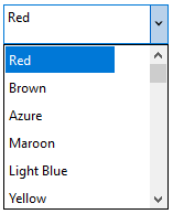
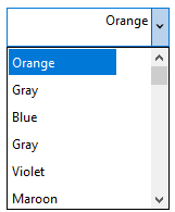
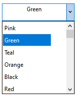
Input includes a powerful drop-down functionality, the DropDownControl. It provides a drop-down for any custom control. The DropDown control is a combination of a TextBox and a DropDownForm. The control's lets you look up data and select items from its list.
Elements
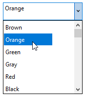
The DropDownControl consists of three parts: TextBox, DropDown Button and DropDownForm.
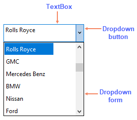
- TextBox: This is the area where text of selected option gets displayed.
- Dropdown button: This button on right hand side of the TextBox opens up the dropdown list when clicked.
- Dropdown form: This is the dropdown form, which contains options to choose from. The dropdown form appears when the user clicks on the dropdown button. You can set the width of the dropdown by setting the DropDownWidth property.
Add a Custom Control
You can set a custom control that can be hosted on the DropDown control using the Control property in C1DropDownControl class.
Let's say, you want to host a DataGridView control on the DropDown control. For this purpose, you can initialize the DropDown control, and use the Control property as shown in the code snippet below:
| C# |
コードのコピー
|
|---|---|
// DropDownControlを初期化します C1DropDownControl dropdownControl = new C1DropDownControl(); // DataGridViewを初期化します DataGridView dataGridView = new DataGridView (); // ドロップダウンフォームでDataGridViewコントロールをホストします。 dropdownControl.Control = dataGridView; |
|
After hosting the DataGridView control on the dropdown form, the data in the cells of the grid control can be reflected in the TextBox of the Input DropDownControl using the Text property. For this purpose, you have to subscribe to the SelectionChanged event in the form.
| C# |
コードのコピー
|
|---|---|
// DataGridViewコントロールのSelectionChangedイベントを登録します。
dataGridView.SelectionChanged += dataGridView_SelectionChanged;
|
|
The Text property of the DropDownControl is assigned to the Value property of the current cell in the DataGridView control using the event handler of the SelectionChanged event.
| C# |
コードのコピー
|
|---|---|
private void dataGridView_SelectionChanged(object sender, EventArgs e) { dropdownControl.Text = dataGridView.CurrentCell.Value.ToString(); } |
|
Here, the ToString method returns the string in the current cell and displays it in the text of the TextBox of the DropDown control.
Add a Placeholder Text
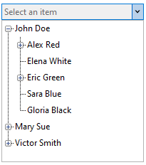
DropDown lets you display a text in the control when nothing is selected or displayed in it. For this purpose, you can add a placeholder text to the DropDown control using the Placeholder property in the Properties window, or via code.
| C# |
コードのコピー
|
|---|---|
dropdownControl.Placeholder = "Select an item";
|
|
This is how the DropDown control looks after adding the Placeholder property.
DropDown Style
The DropDown control provides the DropDownStyle property to specify whether the text portion can be edited. When the value of the property is set to Default, then the text portion of the dropdown is editable, and the dropdown list can be displayed by clicking the dropdown arrow. This also means, the user can enter a new value and is not limited to selecting an existing value.
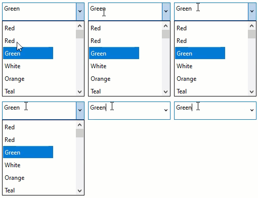
When the value of the property is set to DropDownList, then the text portion of the dropdown is not editable, and the dropdown list can be displayed by clicking any part of the control.

DropDown Alignment
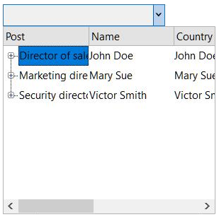
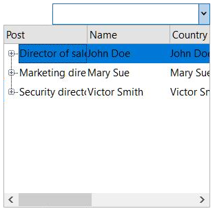
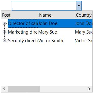
The DropDown control lets you set a value that determines the alignment of dropdown form with respect to the control using the DropDownAlignment property. By default, the dropdown form and the TextBox have equal alignment.
The Table below lists the three different types of dropdown alignment apart from the default alignment:
| DropDown Alignment | Snapshots |
| Left |
|
| Right |
|
| Center |
|
Text Alignment
You can set how the text is aligned in a dropdown control using the TextAlign property.
The Table below lists the three different types of text alignment:
| Text Alignment | Snapshots |
| Left |
|
| Right |
|
| Center |
|
Button Types
By default, the DropDown control has a dropdown button. But the control also provides other button settings, such as UpDown Button, Modal button and Custom Button.
UpDown Button
With an UpDown button, you can increment or decrement a value in the TextBox. You can set an UpDown button in the dropdown control by navigating to the ButtonSettings and UpDownButton in the Properties window, and setting the Enabled and Visible properties to true.
The DropDown control provides three types of UpDown button:
| UpDown button types | Snapshots |
| Default | 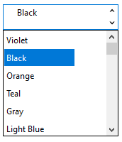 |
| UpLeftDownRight | 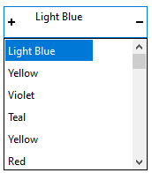 |
| UpRightDownLeft | 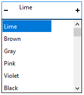 |
Modal Button
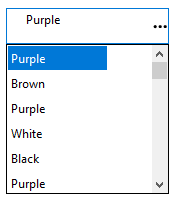
You can set an Modal button in the dropdown control by navigating to the ButtonSettings and ModalButton in the Properties window, and setting the Enabled and Visible properties to true.
Custom Button
You can set an Custom button in the dropdown control by navigating to the ButtonSettings and CustomButton in the Properties window. You can add an image for the custom dropdown icon using the Image property. To make the custom button visible, set the Enabled and Visible properties to true.
