C1ThemeController を使用して、C1Input コントロールに他のテーマを適用できます。テーマを使用して C1Input コントロールの外観をカスタマイズするには、コンポーネントトレイに C1ThemeControllerを追加し、Themes プロパティを設定します。
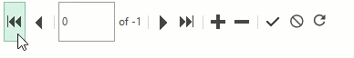
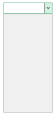
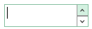
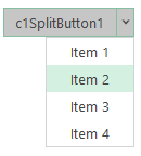
The following table lists all the Input controls when the themes set by the ThemeController is Office2016Green:
| Input controls | Snapshots with applied theme |
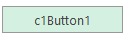
| Button |
|
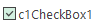
| CheckBox |
|
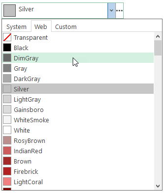
| ColorPicker |
|
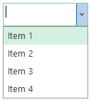
| ComboBox |
|
| DbNavigator |
|
| DropDown |
|
| MaskedTextBox |
|
| NumericEdit |
|
| RadioButton |
|
| RangeSlider |
|
| SplitButton |
|
| TextBox |
|


Refer the code snippet below to observe how a ComboBox control has been used to populate themes using C1ThemeController using the Form_Load and ComboBox_SelectedValueChanged events.
| C# |
コードのコピー
|
|---|---|
private void Form_Load(object sender, EventArgs e) { comboBox.Items.AddRange(C1ThemeController.GetThemes()); } private void comboBox_SelectedValueChanged(object sender, EventArgs e) { c1ThemeController.Theme = comboBox.SelectedItem.ToString(); } |
|