FlexPivot for WinForms
スタイル
FlexPivotSlicer の概要 > スタイル

FlexPivotSlicer provides various options that allows you to customize the appearance of the slicer and its elements. You can customize the appearance of the control by using Styles property of the C1FlexPivotSlicer class. The Style property is of SlicerStyles type which provides several properties to handle the styling of the control and the control elements.
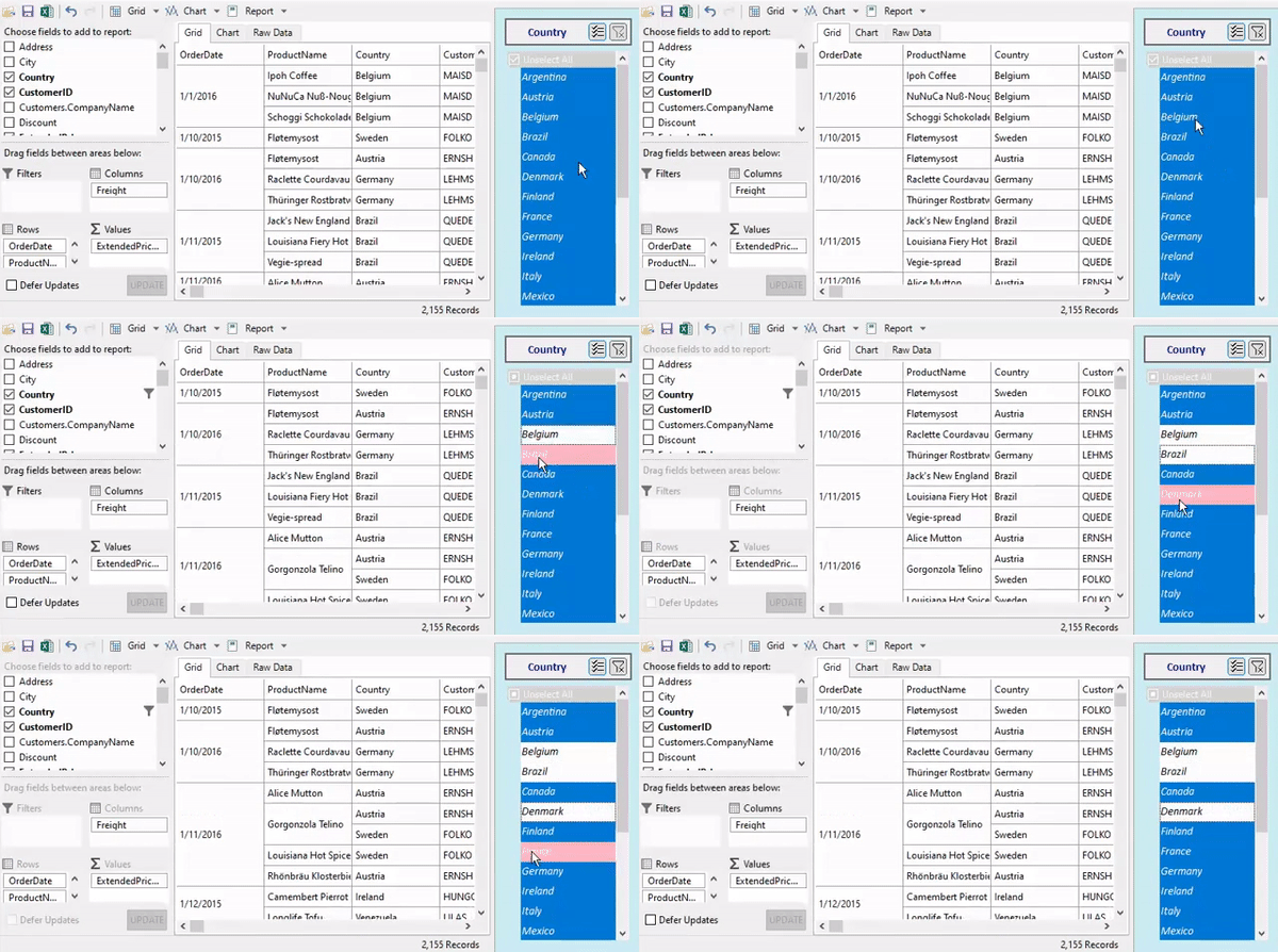
FlexPivotSlicer Styling

Style FlexPivotSlicer

The FlexPivotSlicer allows you to use the Common property which can be used to customize the overall appearance of the Slicer control. The Common property is of ICommonStyle type which is implemented by the CommonStyle class. Other than this, you can set the background and foreground color of the FlexPivotSlicer control by using the BackColor and ForeColor properties respectively.

Use the following code snippet to customize the appearance of the FlexPivotSlicer control.

'FlexPivotSlicerコントロールのスタイルを設定します
c1FlexPivotSlicer.Styles.Common.Padding = New C1.Framework.Thickness(10)
c1FlexPivotSlicer.Styles.Common.CheckListPadding = New C1.Framework.Thickness(5)
c1FlexPivotSlicer.Styles.Common.BackColor = Color.FromArgb(204, 236, 245)
//FlexPivotSlicerコントロールのスタイルを設定します
c1FlexPivotSlicer.Styles.Common.Padding = new C1.Framework.Thickness(10);
c1FlexPivotSlicer.Styles.Common.CheckListPadding = new C1.Framework.Thickness(5);
c1FlexPivotSlicer.Styles.Common.BackColor = Color.FromArgb(204, 236, 245);

Style Header

To customize the appearance of the FlexPivotSlicer header, you can use the Header property.

The following code snippet showcases the use of the Header property to customize the font, border, button, and alignment of the FlexPivotSlicer Header.

'コントロールのヘッダーのスタイルを設定します
c1FlexPivotSlicer.Styles.Header.Font = New Font("Calibri", 10, FontStyle.Bold)
c1FlexPivotSlicer.Styles.Header.ForeColor = Color.DarkBlue
c1FlexPivotSlicer.Styles.Header.Border = New C1.Framework.Thickness(2)
c1FlexPivotSlicer.Styles.Header.Button.Hot.BackColor = Color.LightBlue
c1FlexPivotSlicer.Styles.Header.Button.HotPressed.BackColor = Color.LightCyan
c1FlexPivotSlicer.Styles.Header.Button.Corners = New C1.Framework.Corners(2)
c1FlexPivotSlicer.Styles.Header.Images.SortAscending = Properties.Resources.sortAsc
c1FlexPivotSlicer.Styles.Header.HorizontalAlignment = C1.Framework.Alignment.Center
//コントロールのヘッダーのスタイルを設定します
c1FlexPivotSlicer.Styles.Header.Font = new Font("Calibri",10,FontStyle.Bold);
c1FlexPivotSlicer.Styles.Header.ForeColor = Color.DarkBlue;
c1FlexPivotSlicer.Styles.Header.Border = new C1.Framework.Thickness(2);
c1FlexPivotSlicer.Styles.Header.Button.Hot.BackColor = Color.LightBlue;
c1FlexPivotSlicer.Styles.Header.Button.HotPressed.BackColor = Color.LightCyan;
c1FlexPivotSlicer.Styles.Header.Button.Corners = new C1.Framework.Corners(2);
c1FlexPivotSlicer.Styles.Header.Images.SortAscending = Properties.Resources.sortAsc;
c1FlexPivotSlicer.Styles.Header.HorizontalAlignment = C1.Framework.Alignment.Center;

Style CheckList

To customize the appearance of the of list that appears in the FlexPivotSlicer control, you can use the Checklist property which is of the type CheckListStyles class.

'チェックリストのスタイルを設定します
c1FlexPivotSlicer.Styles.CheckList.Font = New Font("Calibri", 10, FontStyle.Italic)
c1FlexPivotSlicer.Styles.CheckList.UnfocusedSelected.ForeColor = Color.LightYellow
c1FlexPivotSlicer.Styles.CheckList.Header.ForeColor = Color.White
c1FlexPivotSlicer.Styles.CheckList.Header.BackColor = Color.LightGray
c1FlexPivotSlicer.Styles.CheckList.Hot.BackColor = Color.LightCyan
//チェックリストのスタイルを設定します
c1FlexPivotSlicer.Styles.CheckList.Font= new Font("Calibri", 10, FontStyle.Italic);
c1FlexPivotSlicer.Styles.CheckList.UnfocusedSelected.ForeColor = Color.LightYellow;
c1FlexPivotSlicer.Styles.CheckList.Header.ForeColor = Color.White;
c1FlexPivotSlicer.Styles.CheckList.Header.BackColor = Color.LightGray;
c1FlexPivotSlicer.Styles.CheckList.Hot.BackColor = Color.LightCyan; 
c1FlexPivotSlicer.Styles.CheckList.HotSelected.BackColor = Color.LightPink;