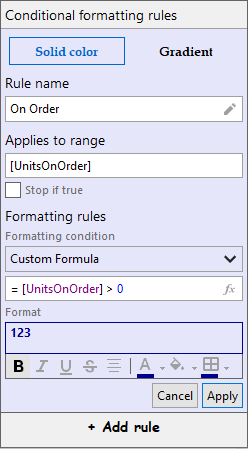
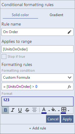
Rules Manager allows you to style its elements to change the look and feel of the control. It lets you play around with the display attributes of the control either by setting some styles or by applying theme to the control.
Apply Styles
To set styles for the RulesManager control, use the RulesManagerStyles class which represents styles for the control and can be accessed using Styles property of the C1RulesManager class. Moreover, it lets you change the background color of the control using BackColor property of the C1RulesManager class.
The following example showcases some of the styles applied on the RuleManager control, such as setting the back color, font family and border color of its elements. This example uses the sample created in the Quick Start section.

| C# |
コードのコピー
|
|---|---|
// RulesManagerのスタイルを設定します rulesManager.BackColor = Color.Lavender; rulesManager.Styles.Buttons.AddRuleButton.Font = new Font("Comic Sans MS", 10.25F, FontStyle.Bold); rulesManager.Styles.Buttons.TabButton.Border = new C1.Framework.Thickness(1, 1, 1, 1); rulesManager.Styles.Buttons.TabButton.Font = new Font("Book Antiqua", 9.75F, FontStyle.Bold); |
|
Apply Theme
To apply a theme to the RulesManager control, you can use the C1ThemeController component which loads and manages visual themes and applies them to the control. The following example showcases how you can use the C1ThemeController component to apply theme to the RulesManager control. This example uses the sample created in the Quick Start section.

| C# |
コードのコピー
|
|---|---|
// C1ThemeControllerを使用してRulesManagerでテーマを設定します c1ThemeController1.SetTheme(rulesManager, "MacBlue"); |
|