This QuickStart guide will walk you through creating a new theme for FlexGrid control based on a built-in theme template using the C1ThemeDesigner. The topic comprises of two steps:
Step 1: Create a New Theme using ThemeDesigner
In this step, you will create a new theme for FlexGrid control based on the Standard built-in theme template. For more information, see C1ThemeDesigner Application Overview.
    - Open the C1ThemeDesigner from the C:\Program Files (x86)\ComponentOne\Apps\v4.0 folder.
 
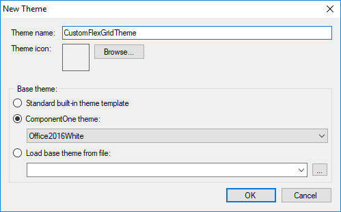
    - Click on Create New Theme from the Topic Bar. The New Theme dialog box appears.
 
    - Enter a suitable name for the theme and select Office2016White from the ComponentOne theme dropdown.


    - Click the right-pointing arrow beside C1FlexGrid in the Theme tree pane and, then select Styles.


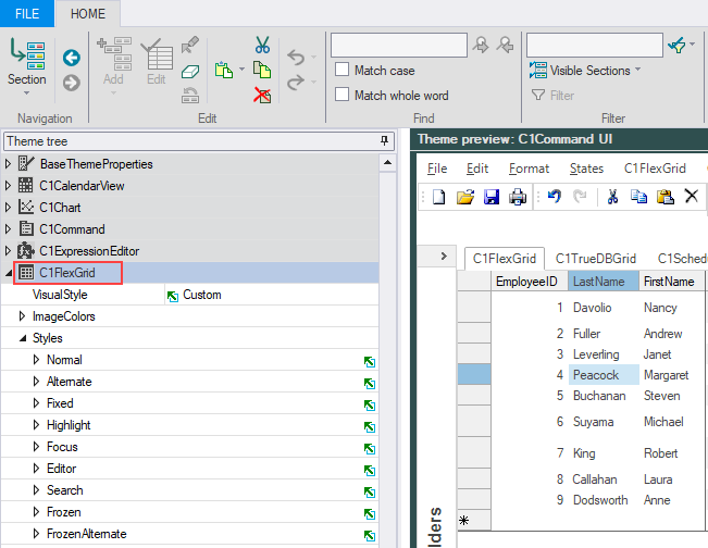
    - Expand the Normal section and set the following properties.


                    | Property | 
                    Value | 
                
                
                    | Background | 
                    White | 
                
                
                    | Border > Color | 
                    212; 212; 212; | 
                
                
                    | Border > Style | 
                    Flat | 
                
                
                    | Border > Width | 
                    1 | 
                
                
                    | Font | 
                    Calibri; 11.25 | 


    - Expand the Alternate section and set the following properties.


                    | Property | 
                    Value | 
                
                
                    | Background | 
                    White | 
                
                
                    | Font | 
                    Calibri; 11.25 | 


    - Expand the Fixed section and set the following properties.


                    | Property | 
                    Value | 
                
                
                    | Background | 
                    White | 
                
                
                    | Border > Color | 
                    171; 171; 171 | 
                
                
                    | Border > Direction | 
                    Both | 
                
                
                    | Border > Style | 
                    Flat | 
                
                
                    | Border > Width | 
                    1 | 
                
                
                    | Font | 
                    Calibri; 11.25 | 
                
                
                    | ForeColor | 
                    ControlText | 


    - Expand the Highlight section and set the following properties.


                    | Property | 
                    Value | 
                
                
                    | Background | 
                    198; 198; 198 | 
                
                
                    | Border > Color | 
                    165; 165; 165 | 
                
                
                    | Border > Direction | 
                    Both | 
                
                
                    | Border > Style | 
                    Flat | 
                
                
                    | Border > Width | 
                    1 | 
                
                
                    | Font | 
                    Calibri; 11.25 | 
                
                
                    | ForeColor | 
                    68; 68; 68 | 


    - Expand the Focus section and set the following properties.


                    | Property | 
                    Value | 
                
                
                    | Background | 
                    White | 
                
                
                    | Border > Color | 
                    33; 115; 70 | 
                
                
                    | Border > Direction | 
                    Both | 
                
                
                    | Border > Style | 
                    Double | 
                
                
                    | Border > Width | 
                    2 | 


    - Expand the SelectedColumnHeader and set the following properties.


                    | Property | 
                    Value | 
                
                
                    | Background | 
                    225; 225; 225 | 
                
                
                    | ForeColor | 
                    Black | 


        Notice that the changes made in the properties appear in the Theme preview pane.


    - Select File | Save As from the File menu to save the current theme in .c1themez file format.
 
Step 2: Using Theme in Visual Studio
To add and use the custom control theme in your application, perform the following steps.
    - 
        
            
                Open a form belonging to your FlexGrid application in the Visual Studio's forms designer.


    - Add the C1ThemeController from the toolbox onto your form. Make sure to provide reference to C1.C1Zip.4.dll in your project.
 
    - 
        
            Click on the C1ThemeController component's Add theme... action item. This will show a file open dialog.
        
     
    - 
        
            Browse and select the theme file ( .c1themez) in your system and then click OK. The selected theme will be added to your C# or VB project as an embedded resource in a Themes folder, and will be available for selection from the themes list provided by the C1ThemeController.
        
     
    - 
        
Run the application and observe the theme applied on your control.
        
        