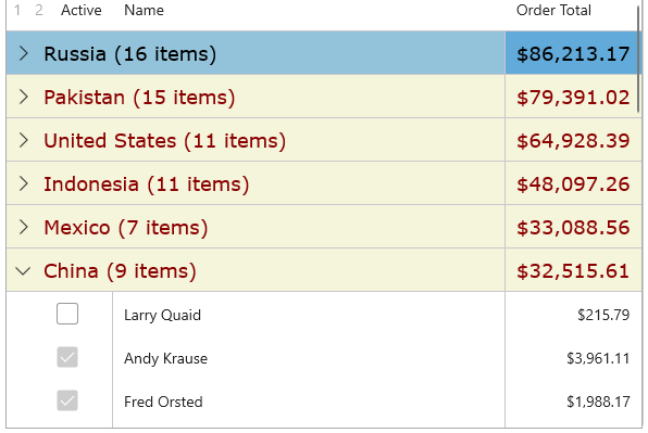
FlexGrid supports grouping through IDataCollection interface. It provides three overloads of GroupAsync method. Refer this topic for more information about overload methods. In the example depicted, we have used GroupAsync<T>(this C1.DataCollection.IDataCollection<T> dataCollection, params string[] fields) overload method that groups the data according to the specified group fields.
The image below shows grouping by the 'Country' field.

The following code example illustrates data grouping by country and active state through DataCollection.
The FlexGrid control allows you to split big chunks of data into groups and showcase rows summary for each group. FlexGrid also enables end-users to add an outline of rows, to collapse or expand groups. The FlexGrid class provides the ShowOutlineBar property to set a Boolean value, which decides whether the grid should display the outline button bar. If set to true, the grid will show an outline button bar, and if set to false, the grid does not show the outline bar.
Outline Grid Bar
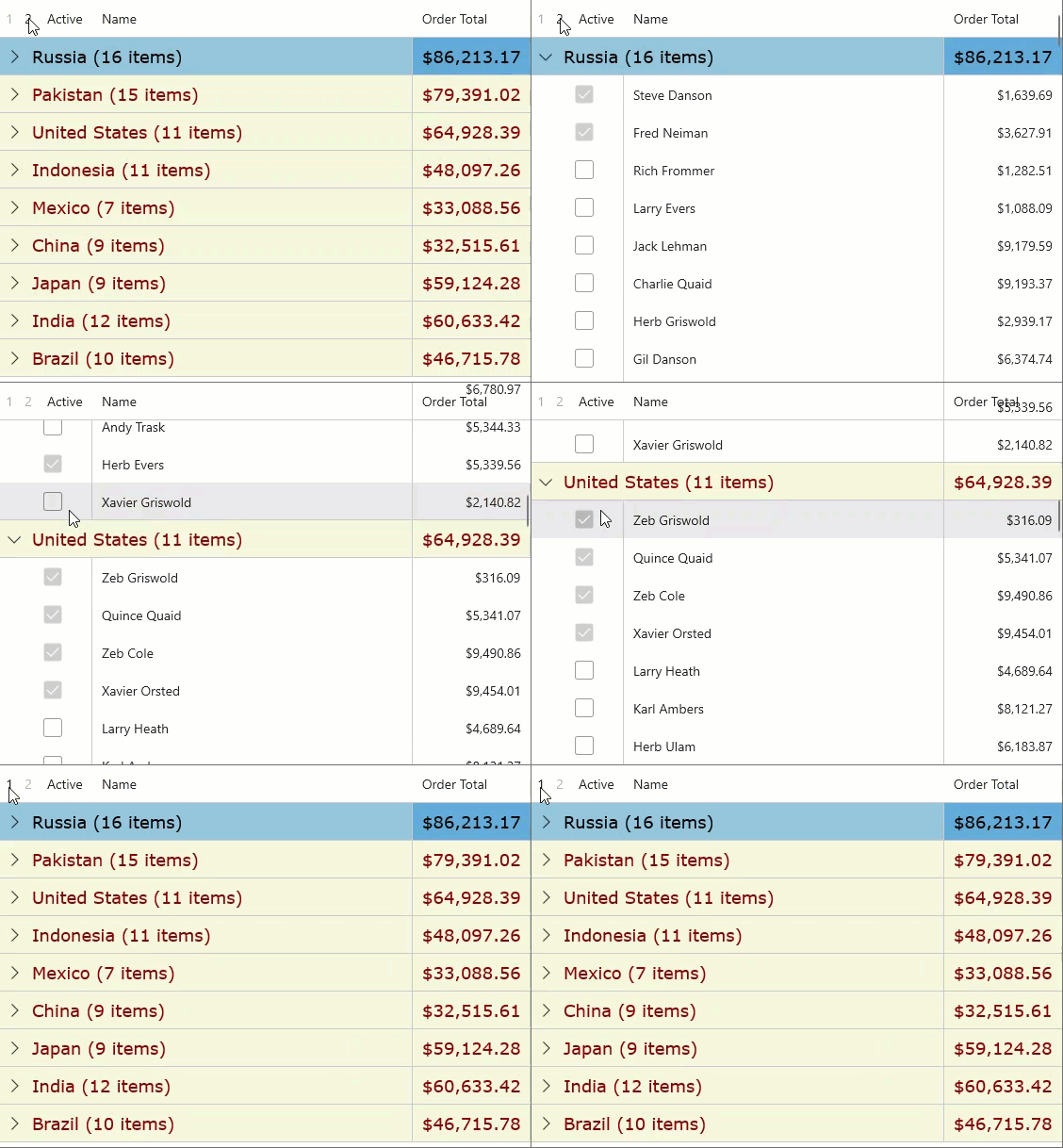
When the data is grouped into different levels, you can use the outline buttons 1 to collapse or 2 to expand multiple groups at once. Each outline button shows a number that indicates the group level.

Expand and Collapse Buttons
When you group data in a grid, the control draws buttons next to row groups. Each button has a expand or collapse symbol that indicates the group state. To collapse a group, click the  sign, and to expand the group, click the
  sign.
sign.
You can also use the ColumnHeaderGridLinesVisibility and GridLinesVisibility properties to indicate which grid lines separating column header cells are shown, and indicate which grid lines separating inner cells are shown, respectively. Another property that can be used is IsReadOnly, which sets a value to determine whether the grid is read-only.
Aggregates
You can display the aggregate value for each group in FlexGrid by setting the Aggregate property on each column to one of the supported aggregate values. Some of the supported aggregate values are Sum, Average, Count, Minimum, Maximum, Custom, None, Range, Std, StdPop, Sum, Var and VarPop.
| Aggregate Type | Definition |
| Average | Returns the average value of the non-null cells in the group. |
| Count | Returns the count of non-null values in the group. |
| Custom | Raises the CustomAggregate event to calculate custom aggregates. |
| Maximum | Returns the maximum value in the group. |
| Minimum | Returns the minimum value in the group. |
| None | No aggregate. |
| Range | Returns the difference between the maximum and minimum values in the group. |
| Std | Returns the sample standard deviation of the values in the group (uses the formula based on n-1). |
| StdPop | Returns the population standard deviation of the values in the group (uses the formula based on n). |
| Sum | Returns the sum of all values in the group. |
| Var | Returns the sample variance of the values in the group (uses the formula based on n-1). |
|
VarPop |
Returns the population variance of the values in the group (uses the formula based on n). |