Legend is a chart element which displays a list of colors, symbols and text corresponding to each data series drawn on that chart. It helps to identify, understand and analyze the plotted data in charts. In FlexChart, a legend is automatically displayed if the SeriesName property of the series is set. In other words, the Name property of series is required to generate a legend entry corresponding to the same.
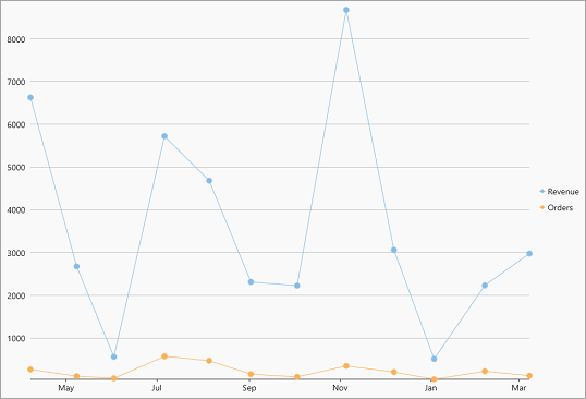
The following code demonstrates the code to set the SeriesName property for a series which in turn displays the legend.
| XAML |
コードのコピー
|
|---|---|
<c1:FlexChart x:Name="flexChart" BindingX="Date" ChartType="LineSymbols" Height="650"> <c1:FlexChart.Series> <c1:Series SeriesName="Revenue" Binding="Revenue"/> <c1:Series SeriesName="Orders" Binding="Orders"/> </c1:FlexChart.Series> </c1:FlexChart> |
|
Position and Orientation
FlexChart places the legend on the right side of the chart by default. However, you can change the position of the legend to display it at the top, bottom, left, or right with respect to the plot area by setting the LegendPosition property. This property specifies the position of the legend using the Position enumeration. Moreover, FlexChart displays the legend vertically by default, but you can change the orientation of the legend and display it horizontally using the LegendOrientation property. With the flexibility of changing the position and orientation of the legend, you can use the available space of the chart area in the most optimized manner.
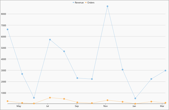
The following code showcases how to set the position and orientation of the legend:
| C# |
コードのコピー
|
|---|---|
//凡例の位置を設定します flexChart.LegendPosition = Position.Top; //凡例の方向を設定します flexChart.LegendOrientation = C1.Chart.Orientation.Horizontal; |
|
Toggle Series
With FlexChart, you can toggle the visibility of a data series by clicking on corresponding legend entry at runtime, if the LegendToggle property of FlexChart class is set to True.
The following GIF displays the toggling of data series on clicking the legend entry.
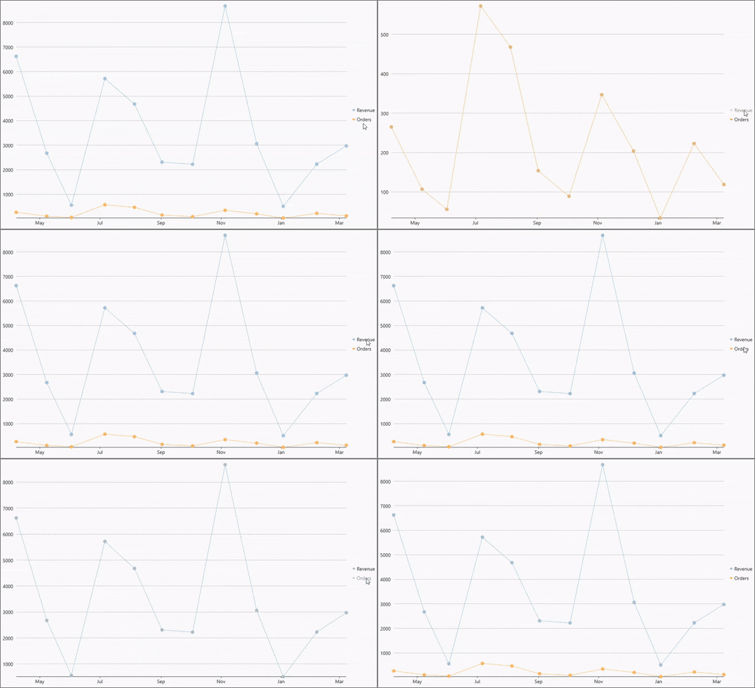
The following code can be used to set the LegendToggle property.
| C# |
コードのコピー
|
|---|---|
//凡例をクリックしてシリーズの表示を切り替えられるようにします flexChart.LegendToggle = true; |
|
Wrap Legend Text
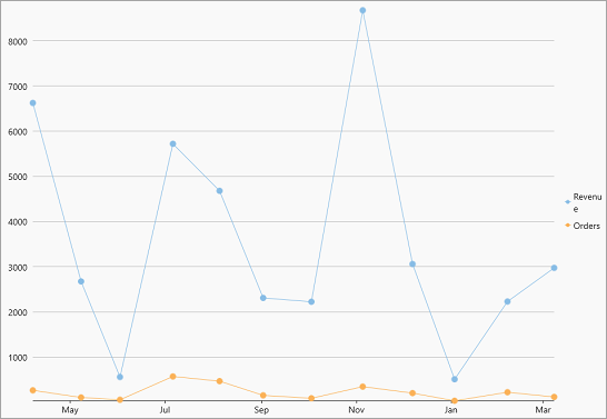
There are times when there is not enough space to display the complete text of legend entries in the chart area. For similar situations, FlexChart provides the LegendTextWrapping property that allows you to wrap or trim the legend text when width of text exceeds the value specified in the ItemMaxWidth property. The TextWrapping property sets one of the following wrapping modes for the legend text using the TextWrapping enumeration.
|
TextWrapping = TextWrapping.Wrap |
TextWrapping = TextWrapping.Truncate |
|---|---|
 |
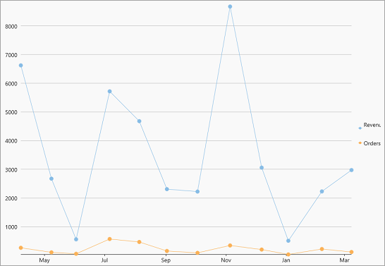 |
The following code illustrates the text wrapping performed on the legend text with width larger than the specified width.
| C# |
コードのコピー
|
|---|---|
flexChart.LegendMaxWidth = 50; flexChart.LegendTextWrapping = C1.Chart.TextWrapping.Wrap; |
|
Style Legend
FlexChart also allows you to style the legend and legend entries using the LegendStyle property. This property lets you specify the font, fill color, stroke width, stroke color etc. of the legend.
The following image showcases styles applied on the legend.
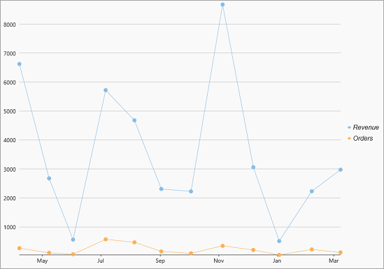
The following code demonstrates how to change the font size, font family and stroke thickness of the legend.
| C# |
コードのコピー
|
|---|---|
//凡例のスタイルを設定します flexChart.LegendStyle = new ChartStyle() { FontFamily = new FontFamily("Arial"), FontSize = 16, FontStyle= Windows.UI.Text.FontStyle.Italic, StrokeThickness = 0.75f }; |
|