The C1ListView control derives from ItemsControl and supports standard WinUI styling and templating features.
Basic Styling
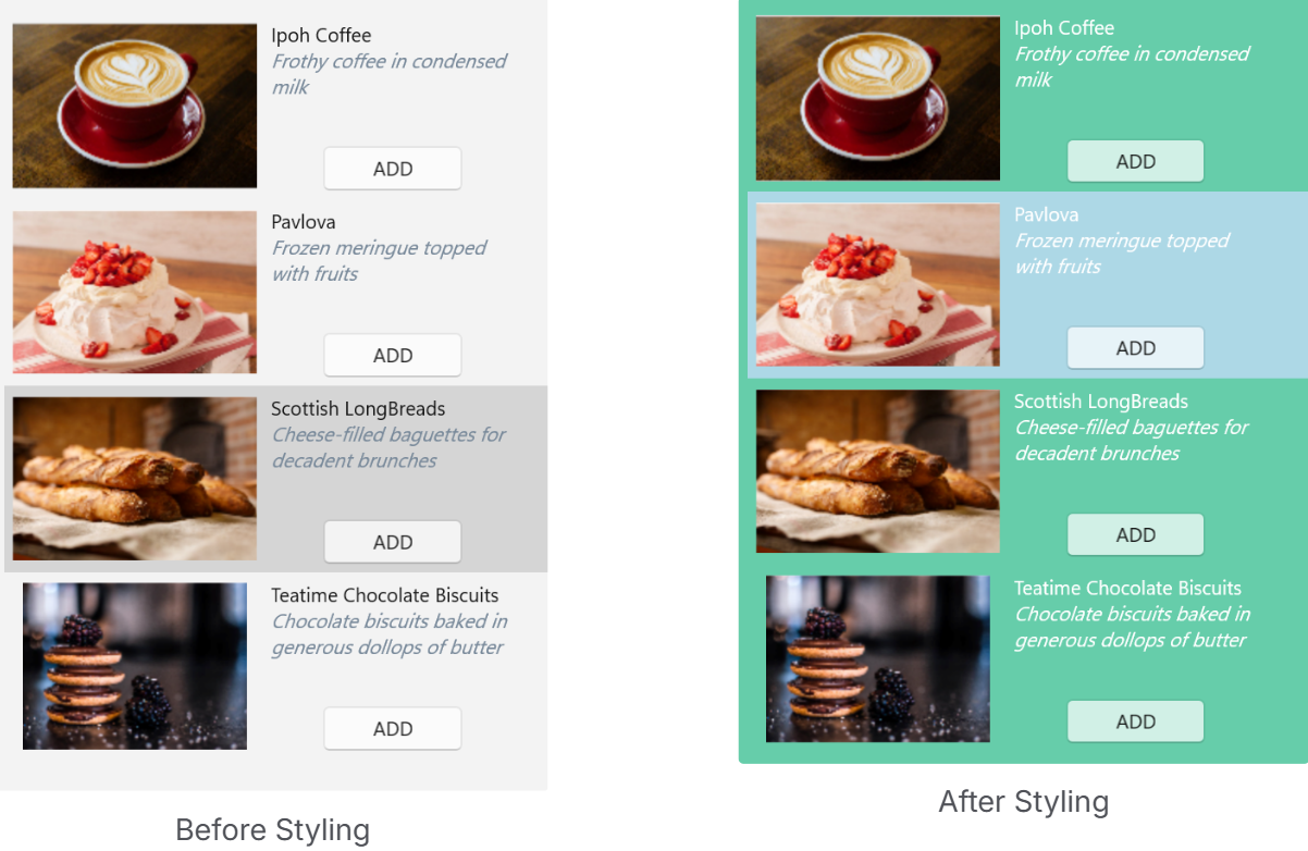
Visual properties such as Background, Foreground, and SelectedBackground define the appearance of the control.
| XAML |
コードのコピー
|
|---|---|
<c1:C1ListView x:Name="listView" Background="MediumAquamarine" Foreground="White" SelectedBackground="LightBlue" /> |
|
Item Styling
Item appearance and container behavior can be customized using the following properties:
-
ItemContainerStyle -
ItemContainerStyleSelector -
GroupStyle -
GroupStyleSelector
These properties enable consistent styling, conditional styling, and customization of grouped data presentation.
| XAML |
コードのコピー
|
|---|---|
<Window xmlns:local="clr-namespace:ListViewExplorer"> <Window.Resources> <local:MyStyleSelector x:Key="MyStyleSelector"> <local:MyStyleSelector.Resources> <ResourceDictionary> <Style x:Key="TeamA" TargetType="{x:Type c1:ListViewItemView}"> <Setter Property="FontWeight" Value="Bold"/> <Setter Property="VerticalAlignment" Value="Center"/> <Setter Property="ContentTemplate"> <Setter.Value> <DataTemplate> <TextBlock Text="{Binding Name}" Foreground="Red" TextWrapping="Wrap" FontFamily="Arial" FontSize="12" VerticalAlignment="Center" /> </DataTemplate> </Setter.Value> </Setter> </Style> </ResourceDictionary> </local:MyStyleSelector.Resources> </local:MyStyleSelector> </Window.Resources> <c1:C1ListView x:Name="C1ListView" Grid.Row="1" SelectionMode="Extended" ItemContainerStyleSelector="{StaticResource MyStyleSelector}" ZoomMode="Enabled" Orientation="Vertical" ShowCheckBoxes="True"/> </Window> |
|
Guidance
-
Use
ItemContainerStylefor uniform item styling -
Use
ItemContainerStyleSelectorfor condition-based styling -
Use
GroupStyleandGroupStyleSelectorwhen grouping is applied