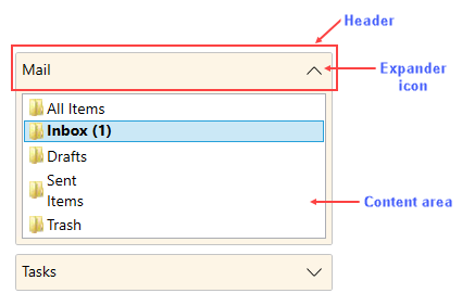
The Accordion control consists of elements like Header, Expand or Collapse icon and Content area.

- Header: The Accordion container has a Header element that appears at the top of the control.
- Expand/Collapse Icon: The expand icon appears by default on the right side of the header to enable expanding or collapsing the items within the Accordion pane.
- Content Area: An accordion pane's content area initially consists of an empty space. In the content area, you can add grids, text, images, and arbitrary controls. When working in Visual Studio's Design view, elements in the content area of the control can be added and moved on the control through a simple drag-and-drop operation.