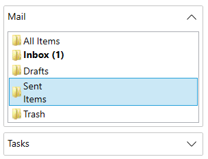
You can add multiple WPF controls within Accordion panes in the Accordion control. The Accordion control works like a container, to hold a collection of items. These items can be ListBox, StackPanels, Grid, Buttons, Images, TextBlocks, RangeSliders and more.

Let's say we want to create an Accordion control with each accordion pane expanding to show ListBox items with TexBlock and Images. For this purpose, we initially add an Accordion control, then to fill the accordion panes, we use Expanders and add ListBoxes to the Expander control. Within the ListBoxItems, we add a grid to hold both the TextBlock and image controls.
Use the code snippet below to add ListBoxItems to the Expander region of the Accordion for WPF control.
| XAML |
コードのコピー
|
|---|---|
<!-- Add Accordion control--> <c1:C1Accordion x:Name="accordion"> <!-- Add Expander control--> <c1:C1Expander Header="Mail" IsExpanded="True"> <!-- Add ListBox control--> <ListBox> <!-- Add ListBoxItem control--> <ListBoxItem> <!-- Add Grid control--> <Grid> <!-- Add Image control--> <Image Source="/AccordionExplorer;component/Resources/Folder.png" /> <!-- Add TextBlock control--> <TextBlock Text="All Items"/> </Grid> </ListBoxItem> <ListBoxItem> <Grid> <Image Source="/AccordionExplorer;component/Resources/Folder.png" /> <TextBlock Text="Inbox (1)"/> </Grid> </ListBoxItem> <ListBoxItem> <Grid> <Image Source="/AccordionExplorer;component/Resources/Folder.png" /> <TextBlock Text="Drafts" /> </Grid> </ListBoxItem> <ListBoxItem> <Grid> <Image Source="/AccordionExplorer;component/Resources/Folder.png" /> <TextBlock Text="Sent Items" /> </Grid> </ListBoxItem> <ListViewItem> <Grid> <Image Source="/AccordionExplorer;component/Resources/RecycleBin.png" /> <TextBlock Text="Trash" /> </Grid> </ListViewItem> </ListBox> </c1:C1Expander> </c1:C1Accordion> |
|