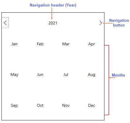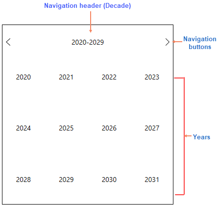
By default, when the Calendar control loads, it shows the 'month' view. The purpose and use of all the elements of the Calendar control is described below:
- Navigation header: The header helps to expand views, namely month, year and decade view. Upon loading the Calendar application, the 'month' (default) view shows the current month, the 'year' view shows the current year and the 'decade' view shows the current decade.
- Navigation buttons: The previous and next navigation buttons allow you to go to the previous or next month in the month view, the previous or next year in the year view and the previous or next decade in the decade view.
- Current date: Highlights the current date.
- Selected date: Highlights the selected date.
When you click the navigation header once in the default month view, the Calendar shows the 'year' view.

When you click the navigation header again in the year view, the Calendar shows the decade view.
