Calendar control lets you add Header and Navigation buttons. By default, Calendar does not contain header or navigation buttons. These UI functionalities have to be set manually using the Properties window or via the XAML code.
The following sub-sections discuss about the Header and Navigation buttons in detail:
Header
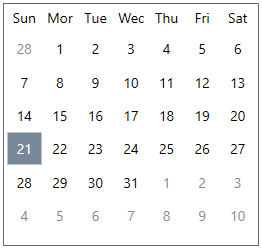
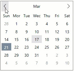
Calendar provides you the choice to show or hide the header area using the ShowHeader property. By default, the header is hidden as show in the image below:
The code snippet below shows how to display the header by setting the ShowHeader property to true:
| XAML |
コードのコピー
|
|---|---|
<c1:C1Calendar HorizontalAlignment="Left" VerticalAlignment="Top" ShowHeader="True"/> |
|
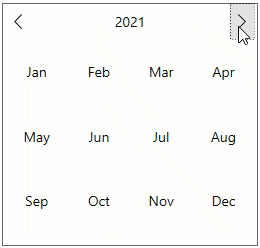
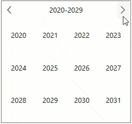
In the Calendar control, the Header region has a huge significance. This is because, the Header when clicked expands the views, namely month, year and decade view. To elaborate, when you click the header in the 'month' (default) view, it expands to show the current year in the year view mode. Likewise, when the header of the 'year' mode is clicked, it expands to show the current 'decade' in the decade view mode. Also, when the header of the decade view is clicked, it expands back to the month view.

Navigation Buttons
You can set the navigation buttons in the Calendar control using the ShowNavigationButtons property, by setting it to true, as shown in the code snippet below:
| XAML |
コードのコピー
|
|---|---|
<c1:C1Calendar HorizontalAlignment="Left" VerticalAlignment="Top" ShowHeader="True" ShowNavigationButtons="True"/> |
|
The Calendar control includes the navigation buttons for navigating between the calendar months in the default 'month' view. Clicking the previous single arrow button navigates you to the previous month and clicking the next single arrow navigates you to the next month.
In the 'year' view, the navigation buttons helps you navigate between the previous and next years, while in the 'decade' view, the navigation button helps you navigate between the previous and next decades.
The navigation is depicted as GIFs in the table below:
| Navigation | GIFs |
| In month view mode |
|
| In year view mode |
|
| In decade view mode |
|
Keyboard Navigation
Keyboard navigation support provides an effective way to navigate through the Calendar control, simply by using the defined keys when required.
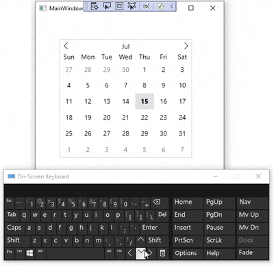
The following table lists the keyboard shortcut keys and their associated actions to use when navigating through the Calendar:
| Keyboard Keys | Action |
|---|---|
| Up ( ↑ ) | Moves focus to the date displayed above the selected date. |
| Down ( ↓ ) | Moves focus to the date displayed below the selected date. |
| Left ( ← ) | Moves focus to the date displayed on the left side of the selected date. |
| Right ( → ) | Moves focus to the date displayed on the right side of the selected date. |