This section explains how to select a date, dates or range of dates in the Calendar control.
Select a Specific Date
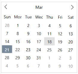
By default, one day can be selected at a time. You can select a particular date in the Calendar, when the control loads by setting the C1Calendar.SelectedDate property.

The following code snippet shows how to set the SelectedDate property:
| XAML |
コードのコピー
|
|---|---|
<c1:C1Calendar HorizontalAlignment="Left" VerticalAlignment="Top" SelectedDate="2021-03-18"> </c1:C1Calendar> |
|
Select Multiple Dates
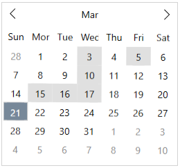
You can select more than one day by setting the C1Calendar.SelectedDates property as shown in the code snippet below:
| C# |
コードのコピー
|
|---|---|
// 選択する必要のある日付の配列を設定します DateTime[] dateTimes = new DateTime[] { new DateTime(2021, 03, 03), new DateTime(2021, 03, 05), new DateTime(2021, 03, 10), new DateTime(2021, 03, 15), new DateTime(2021, 03, 16), new DateTime(2021, 03, 17), // etc }; // 選択した日付のリストを設定します calendar.SelectedDates = dateTimes; |
|
This is how the resulting image looks like:

Select a Date Range
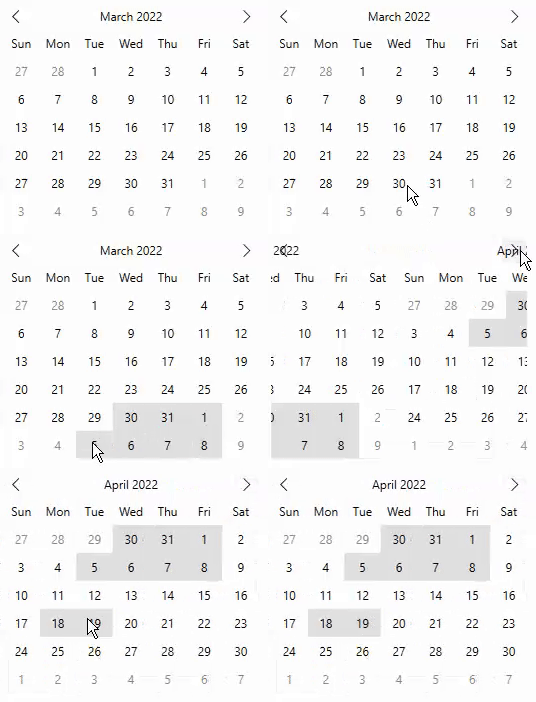
By default, Calendar allows you to select a day in the displayed calendar month. However, you can change this default behavior by using the SelectionMode property that allows multiple selection of dates across months by simply dragging the mouse horizontally at runtime. The SelectionMode property of C1Calendar class allows you to select a single date or multiple dates using the SelectionMode enumeration which specifies the selection behavior of the Calendar control. In addition, Calendar also allows you to limit the maximum number of days that can be selected by a user using the MaxSelectionCount property.
The following gif shows a date range selected in the calendar control across multiple months.

To allow the user to select a date range with limited number of days, use the following code. In this example, we are setting the SelectionMode property to SelectionMode.Multiple to allow user to select multiple dates and setting the MaxSelectionCount to 10 to set it as a limit for date range selection.
Display a Specific Date Range for Selection
You can customize the Calendar control to show a limited set of days in the visible calendar month and restrict the selection to the specified range of dates from the calendar.
You can specify minimum and maximum dates to prevent users from selecting a date and time in a particular range. Setting a minimum date helps you to restrict the date value that is set less than the specific value. Likewise, setting a maximum date helps you to restrict the date value that is set greater than the specific value.
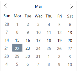
In the image below, the minimum and maximum date has been set to 13/03/2021 and 23/03/2021 respectively. As you can observe all other date values outside this range are disabled, and only a particular date range can be selected.

Users can set the minimum and maximum date values to the calendar dropdown of Calendar control, by using the MinDate and MaxDate properties.
The following code uses the MinDate and MaxDate properties to display the available date range for selection in the calendar:
| XAML |
コードのコピー
|
|---|---|
<c1:C1Calendar x:Name="calendar" HorizontalAlignment="Left" VerticalAlignment="Top" MaxDate="03/23/2021" MinDate="03/13/2021" /> |
|