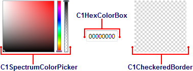
In addition to the full-featured C1ColorPicker control, ColorPicker for WPF includes parts of the C1ColorPicker control, that allow you to customize color picking in your application:
- C1SpectrumColorPicker
- C1HexColorBox
- C1CheckeredBorder
- C1BasicColorPickerPart
- C1AdvancedColorPickerPart

The following sections describe the above parts.
C1SpectrumColorPicker
The C1SpectrumColorPicker class represents the C1SpectrumColorPicker control which allows access to just the advanced color picking functionality of the C1ColorPicker control. The C1SpectrumColorPicker control appears similar to the following image:

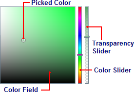
The C1SpectrumColorPicker control includes the following options/sections:
Color Field/Picked Color: The Color Field lets you choose a tone in a color's range. The Picked Color indicates the currently selected color. Move the Color Slider to pick a general color family and then fine tune the color selection in the Color Field.
Color Slider: This slider lets you choose from the color spectrum. Move the Color Slider to pick a general color and then fine tune the color selection in the Color Field.
Transparency Slider: This slider lets you lets you set the color's transparency. You can choose to make the color opaque or partially or completely transparent. Move the Transparency Slider to pick a transparency. This slider is only visible when the C1SpectrumColorPicker.ShowAlphaChannel property is set to True (default)
C1HexColorBox
The C1HexColorBox class represents the C1HexColorBox control which provides data validation for hexadecimal code entries. For example the basic C1HexColorBox control appears similar to the following image:

The C1HexColorBox control appears similar to a regular text box. By default, the C1HexColorBox control appears with eight digits. If eight digits are visible, the first two digits represent the color's transparency ranging from FF (opaque) to 00 (transparent) and the last six digits represent standard hexadecimal color selection. For more information about hexadecimal color selection, see w3schools.
Note that if the C1ColorPicker.ShowAlphaChannel property is set to False, only the last six digits will be visible (no transparency value will be included):

You can also, if you choose, choose to display a '#' symbol to the start of the C1HexColorBox control by setting the C1HexColorBox.ShowSharpPrefix property to True:

C1CheckeredBorder
The C1CheckeredBorder class represents the C1CheckeredBorder control which provides a simple way to display colors with set alpha values so you can display colors with varying transparencies. By default, the control appears similar to the following image:

The C1CheckeredBorder control supports both transparent and opaque color values:
|
Transparent |
Opaque |
|
|
|
C1BasicColorPickerPart
The C1BasicColorPickerPart control shows a range of predefined colors from a specified palette. It can be used as a standalone control to enable end-users to select a color from a wide variety of designed palettes and standard colors. For more information on the available palettes, see Available ColorPicker Palettes.
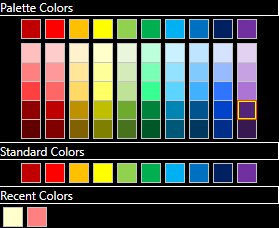
The C1BasicColorPickerPart control displays colors in three different sections i.e. Palette Colors, Standard Colors, and Recent Colors as demonstrated in the following image:

In ColorPicker, the BasicColorPickerPart control is represented by the C1BasicColorPickerPart class which provides access to various properties to set the selected color, palette, and much more. To add the BasicColorPickerPart control to your application, use the following code.
| XAML |
コードのコピー
|
|---|---|
<c1:C1BasicColorPickerPart Background="Black" Foreground="White" Margin="4" /> |
|
C1AdvancedColorPickerPart
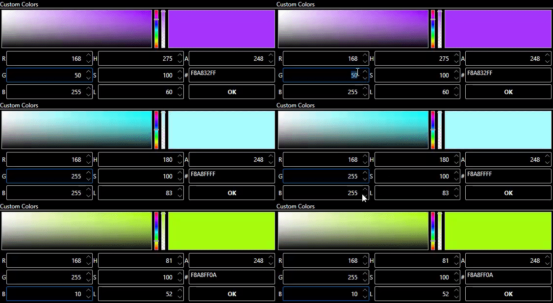
The C1AdvancedColorPickerPart control allows you to create a personalized color by changing the different components of the HSL or RGB representation of the color. It lets you set the RGB value, as well as the levels of hue, saturation, and lightness which can be used to create a variety of customized colors as per your requirements.
The following GIF demonstrates how you can adjust RGB and HSL values to create your custom colors.

In ColorPicker, the AdvancedColorPickerPart control is represented by the C1AdvancedColorPickerPart class which provides various properties to set the selected color, input background, input foreground, and much more. To add the AdvancedColorPickerPart control to your application, use the following code.
| XAML |
コードのコピー
|
|---|---|
<c1:C1AdvancedColorPickerPart Background="Black" Foreground="White" Margin="4" /> |
|

