ColorPicker for WPF provides two modes for color selection, Basic ColorPicker Mode and Advance ColorPicker Mode. By default, the C1ColorPicker control will open with the Basic view but the Advanced view can be selected by clicking the Advanced at the bottom of the control. The details of the two modes is explained as below:
Basic ColorPicker Mode
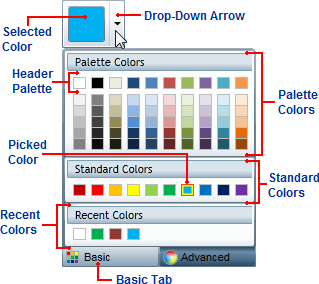
The Basic tab appears similar to the following image:

The Basic tab includes the following options/sections:
-
Drop-Down Arrow: Click the drop-down arrow to open the C1ColorPicker control's window. See Drop-Down Direction for information about setting where the drop-down window appears.
-
Basic Tab: Click the Basic tab to access pre-selected colors at run time. Click the Advanced tab to choose a custom color. The C1ColorPicker.Mode property must be set to Basic or Both for the Basic tab to be visible.
-
Selected Color: The currently selected color will appear in the color picker's window.
-
Picked Color: The currently picked color will appear with a red border in the list of colors.
-
Palette Colors: Palette colors reflect the currently selected color palette. You can choose a palette by setting the C1ColorPicker.Palette property.
-
Header Palette: These colors are the basic colors of the palette and the expanded list of palette colors are typically variations of these basic colors.
-
Standard Colors: Lists ten standard colors. These colors include a dark brick red, red, orange, yellow, light green, green, sky blue, blue, navy blue, and purple.
-
Recent Colors: Lists up to ten recently selected colors. By default this section is visible, but you can choose to hide recent colors by setting the C1ColorPicker.ShowRecentColors property to False. See Recent Colors for more information.
Advanced ColorPicker Mode
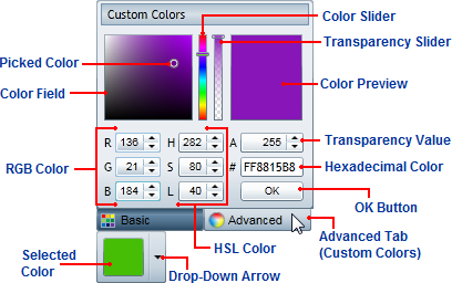
The Advanced view appears similar to the following image:

The Advanced tab includes the following options/sections:
-
Color Field/Picked Color: The Color Field lets you choose a tone in a color's range. The Picked Color indicates the currently selected color. Move the Color Slider to pick a general color family and then fine tune the color selection in the Color Field.
-
Color Slider: This slider lets you choose from the color spectrum. Move the Color Slider to pick a general color and then fine tune the color selection in the Color Field.
-
Transparency Slider: This slider lets you lets you set the color's transparency. You can choose to make the color opaque or partially or completely transparent. Move the Transparency Slider to pick a transparency and note that the number in the Transparency Value box changes as well. This slider is only visible when the C1ColorPicker.ShowAlphaChannel property is set to True (default)
-
Color Preview: Preview the color you are currently choosing. Once you are satisfied with the color choice, click the OK button to close the drop-down box and set the color as the Selected Color.
-
Transparency Value: This box lets you set the color's transparency. You can set the Transparency to a number between 0, which is completely transparent, and 255, which is completely opaque (default). When the C1ColorPicker.ShowAlphaChannel property is set to False this box appears grayed out.
-
RGB Color: These three numeric boxes let you choose a color using the Red Green Blue (RGB) color model.
-
HSL Color: These three numeric boxes let you choose a color using the Hue Saturation Lightness (HSL) color model.
-
Hexadecimal Color: If eight digits are visible, the first two digits represent the color's transparency ranging from FF (opaque) to 00 (transparent) and the last six digits represent standard hexadecimal color selection. Note that if the C1ColorPicker.ShowAlphaChannel property is set to False, only the last six digits will be visible (no transparency value). For more information about hexadecimal color selection, see w3school
-
OK Button: Once you are satisfied with the color choice, click the OK button to close the drop-down box and set the color as the Selected Color.
-
Selected Color: The currently selected color will appear in the color picker's window.
-
Drop-Down Arrow: Click the drop-down arrow to open the C1ColorPicker control's window. See Drop-Down Direction for information about setting where the drop-down window appears.
-
Advanced Tab: Click the Advanced tab to choose a custom color at run time. Click the Basic tab to view pre-selected colors. The C1ColorPicker.Mode property must be set to Advanced or Both for the Advanced tab to be visible.