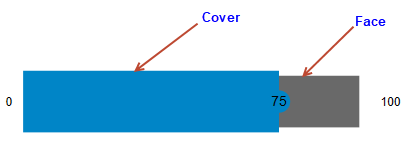
The face and cover of the Gauge control determine the geometrical appearance of the control. Face represents the bottom layer of the gauge control, while the cover represents its top layer. This is shown in the following image.

In the following code sample, you can observe how the face has been depicted using the FaceBorderWidth properties of the C1Gauge class.
| XAML |
コードのコピー
|
|---|---|
<c1:C1LinearGauge Name="linearGauge" Value="75" FaceBorderWidth="5" Step="25" TextVisibility="All" Min="0" Max="100" Width="408" Height="77"/> |
|