ғqғXғgғOғүғҖӮНҒA’иӢ`ӮіӮкӮДӮўӮйғNғүғXӮМҠФҠuҒiғrғ“ҒjӮЙ‘ОӮ·ӮйғfҒ[ғ^ӮМ“xҗ”•Ә•zӮрғvғҚғbғgӮөӮЬӮ·ҒBӮұӮкӮзӮМғrғ“ӮНҒAҗ¶ғfҒ[ғ^’lӮрҸd•ЎӮМӮИӮўҳA‘ұӮөӮҪҠФҠuӮЙ•ӘҠ„Ӯ·ӮйӮұӮЖӮЕҚмҗ¬ӮіӮкӮЬӮ·ҒB“Б’иӮМғrғ“ӮЙ“ьӮй’lӮМҗ”ӮЙҠоӮГӮ«ҒAҳA‘ұ“IӮИ X ҺІӮЙүҲӮБӮҪ’·•ыҢ`ӮМ’ҢӮЖӮөӮД“xҗ”ӮӘғvғҚғbғgӮіӮкӮЬӮ·ҒB
The following representations can created with the help of a histogram.
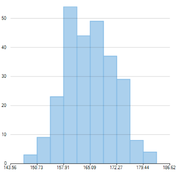
The following images show a histogram and a cumulative histogram created using FlexChart.
 |
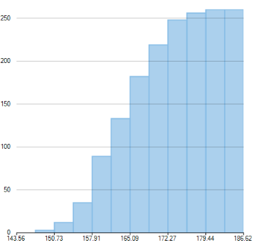 |
| Histogram | Cumulative Histogram |
|---|
ғqғXғgғOғүғҖӮрҚмҗ¬Ӯ·ӮйӮЙӮНҒA Histogram Ңn—сӮр’ЗүБӮөҒA ChartType ғvғҚғpғeғBӮр Histogram ӮЙҗЭ’иӮ·Ӯй•K—vӮӘӮ ӮиӮЬӮ·ҒB
ҠЦҳAӮ·ӮйғfҒ[ғ^ӮрҺw’иӮ·ӮйӮЖҒAғ`ғғҒ[ғgӮНҒAғfҒ[ғ^ӮрғOғӢҒ[ғvү»Ӯ·ӮйҠФҠuӮрҺ©“®“IӮЙҢvҺZӮөӮЬӮ·ҒBӮҪӮҫӮөҒA•K—vӮЙүһӮ¶ӮДҒA BinWidth ғvғҚғpғeғBӮрҗЭ’иӮ·ӮйӮұӮЖӮЕҒAӮұӮМҠФҠuӮМ•қӮрҺw’иӮ·ӮйӮұӮЖӮаӮЕӮ«ӮЬӮ·ҒB
ҺҹӮМғRҒ[ғhғXғjғyғbғgӮЙҺҰӮ·ӮжӮӨӮЙҒAFlexChart ӮЕғfҒ[ғ^ӮМ“xҗ”•Ә•zӮрҗ¶җ¬ӮөҒAғqғXғgғOғүғҖӮЙғvғҚғbғgӮөҒAҠЦҳAӮ·ӮйғfҒ[ғ^Ӯр’сӢҹӮөӮЬӮ·ҒB
Frequency Polygon
A frequency polygon shows a frequency distribution representing the overall pattern in the data. It is a closed two-dimensional figure of straight line segments -created by joining the mid points of the top of the bars of a histogram.
Use the following steps to create a frequency polygon using histogram chart.
- Set the AppearanceType property to FrequencyPolygon. This property accepts value from the HistogramAppearance enumeration.
- Set the style for frequency polygon using the FrequencyPolygonStyle property.
Moreover, you can also create a cumulative frequency polygon by setting the CumulativeMode property to true.
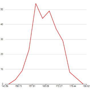
The following images show a frequency polygon and a cumulative frequency polygon created using FlexChart.
 |
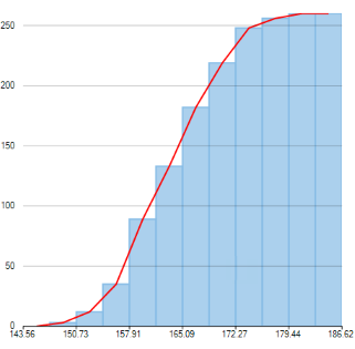 |
| Frequency Polygon | Cumulative Frequency Polygon |
|---|
Use the following code snippet to create a frequency polygon.
Gaussian Curve
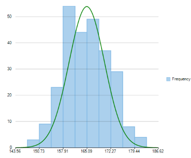
Gaussian curve is a bell shaped curve, also known as normal curve, which represents the probability distribution of a continuous random variable. It represents a unimodal distribution as it only has one peak. Moreover, it shows a symmetric distribution as fifty percent of the data set lies on the left side of the mean and fifty percent of the data lies on the right side of the mean.
Use the following steps to create a Gaussian curve using histogram chart.
- Set the AppearanceType property to Histogram. This property accepts value from the HistogramAppearance enumeration.
- Set the NormalCurve.Visible property to true to create a Gaussian curve.
- Set the style for Gaussian curve using the NormalCurve.LineStyle property.
Following image illustrates a Gaussian curve created using FlexChart, which depicts probability distribution of scores obtained by students of a university in half yearly examinations.
Use the following code snippet to create a Gaussian curve.