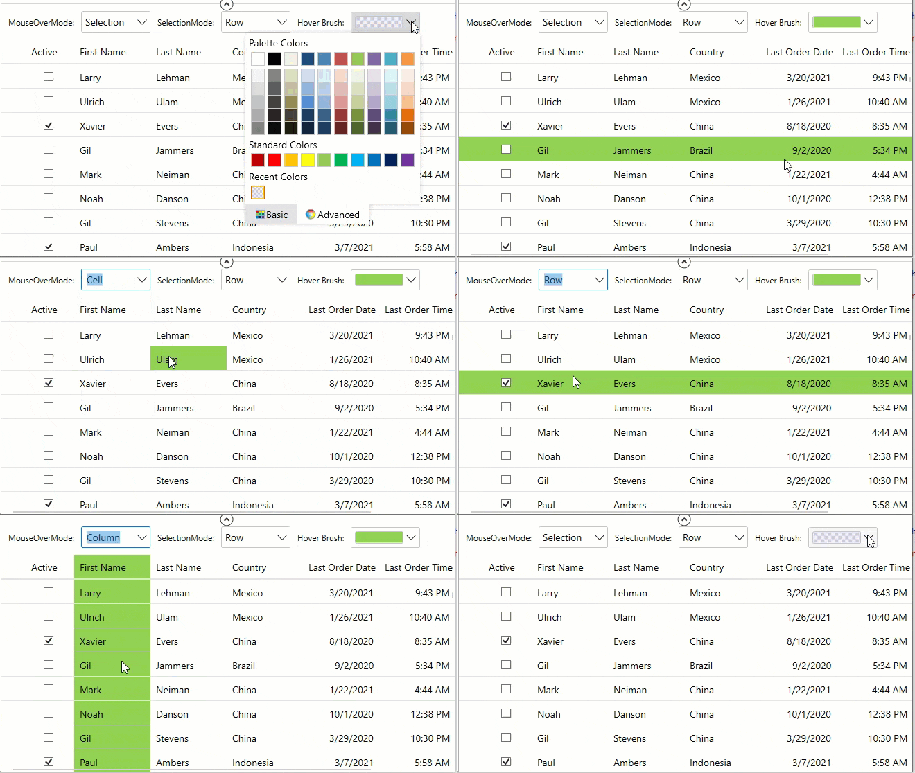
Hover styles are applied to cells when the mouse hovers over the grid. It provides visual cues so that the user can apply styling to a cell, row, column or to a specific cell according to the GridSelectionMode enumeration when they are hovered on prior to selection or editing.
The hover styles can make the FlexGrid appear more "alive" and interactive.

There are two essential properties to consider while performing hover styles, the MouseOverMode property and MouseOverBrush property in GridBase class. The MouseOverMode property helps to set how the mouse hovers over the grid, while the MouseOverBrush property sets a brush to paint the background of the selected cells. Also, SelectionMode property is equally important as it helps to set how the cells or rows are selected in the grid, since styling after all is applied based on cell hovering before selection.
Moreover, the SelectionMode property calls the GridSelectionMode enumeration, the MouseOverMode property calls the GridMouseOverMode enumeration and the MouseOverBrush property calls the Brush class.
Let us see how we can set the hover styling in the designer XAML using these properties.
| XAML |
コードのコピー
|
|---|---|
<Grid>
      <Grid.RowDefinitions>
            <RowDefinition Height="Auto"/>
            <RowDefinition />
        </Grid.RowDefinitions>
        <StackPanel Orientation="Horizontal">
            <TextBlock VerticalAlignment="Center" Text="MouseOverMode:" Margin="10 0" />
            <c1:C1ComboBox x:Name="cbMouseOverMode" Width="100" SelectedItem="{Binding MouseOverMode,ElementName=grid,Mode=TwoWay}">
                <c1:GridMouseOverMode>None</c1:GridMouseOverMode>
                <c1:GridMouseOverMode>Selection</c1:GridMouseOverMode>
                <c1:GridMouseOverMode>Cell</c1:GridMouseOverMode>
                <c1:GridMouseOverMode>Row</c1:GridMouseOverMode>
                <c1:GridMouseOverMode>Column</c1:GridMouseOverMode>
            </c1:C1ComboBox>
            <TextBlock VerticalAlignment="Center" Text="SelectionMode:" Margin="10 0" />
            <c1:C1ComboBox x:Name="cbSelectionMode" Width="100" SelectedItem="{Binding SelectionMode,ElementName=grid,Mode=TwoWay}">
                <c1:GridSelectionMode>None</c1:GridSelectionMode>
                <c1:GridSelectionMode>Cell</c1:GridSelectionMode>
                <c1:GridSelectionMode>CellRange</c1:GridSelectionMode>
                <c1:GridSelectionMode>Row</c1:GridSelectionMode>
                <c1:GridSelectionMode>RowRange</c1:GridSelectionMode>
                <c1:GridSelectionMode>Column</c1:GridSelectionMode>
                <c1:GridSelectionMode>ColumnRange</c1:GridSelectionMode>
            </c1:C1ComboBox>
            <TextBlock VerticalAlignment="Center" Text="Hover Brush:" Margin="10 0" />
            <c1:C1ColorPicker Width="100" Height="30" Name="indicatorBrush" SelectedBrush="{Binding MouseOverBrush, ElementName=grid, Mode=TwoWay}" />
        </StackPanel>
        <c1:FlexGrid Grid.Row="1" x:Name="grid" Margin="0 10 0 0" HeadersVisibility="All" MouseOverBrush="#111700FF"
                     AutoGenerateColumns="False">
            <c1:FlexGrid.Columns>
                <c1:GridColumn Binding="Active" MinWidth="70" Width="0.5*"/>
                <c1:GridColumn Binding="FirstName" MinWidth="110" Width="*"/>
                <c1:GridColumn Binding="LastName" MinWidth="110" Width="*"/>
                <c1:GridColumn Binding="CountryId" Header="Country" MinWidth="110" Width="*"/>
                <c1:GridDateTimeColumn Binding="LastOrderDate" Mode="Date" MinWidth="110" Width="*" HorizontalAlignment="Right" HeaderHorizontalAlignment="Right"/>
                <c1:GridDateTimeColumn Binding="LastOrderDate" Mode="Time" Header="Last Order Time" MinWidth="110" Width="*" HorizontalAlignment="Right" HeaderHorizontalAlignment="Right"/>
                <c1:GridColumn Binding="OrderTotal" Format="C" MinWidth="110" Width="*" HorizontalAlignment="Right" HeaderHorizontalAlignment="Right"/>
            </c1:FlexGrid.Columns>
        </c1:FlexGrid>
</Grid>
|
|
As you can observe from the GIF, we have used two ComboBoxes, 'cbMouseOverMode' (SelectedItem property data-bound to MouseOverMode property of GridBase class) and 'cbSelectionMode' (SelectedItem property data-bound to SelectionMode property of GridBase class) and ColorPicker' indicatorBrush' (SelectedBrush data-bound to MouseOverBrush property of GridBase class).