The GanttView control provides various properties which can be used to style the appearance of the control. It lets you set the foreground and background color of the control by using Foreground and Background properties of the Control class, respectively. Besides, it also allows you to set the borders using the BorderBrush property.
The following image showcases styling applied to the GanttView control.
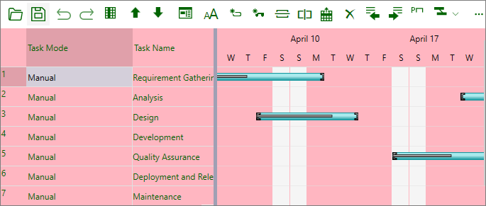
The following code sets the background, foreground, and borders of the GanttView control using Foreground, Background, BorderThickness, and BorderBrush properties, respectively. This example uses the sample created in Quick Start.
| C# |
コードのコピー
|
|---|---|
//前景色を設定します。 gv.Foreground = Brushes.DarkGreen; //背景色を設定します。 gv.Background = Brushes.LightPink; //境界線を設定します。 gv.BorderThickness = new Thickness(1); gv.BorderBrush = Brushes.Green; |
|
Additionally, you can style the highlighted row using HighlightBackColor and HighlightForeColor properties of the C1GanttView class.
Style Nonworking-Time
The nonworking-time denotes the time duration during which no work is being carried out, like company holidays, weekends, and so on. By default, the nonworking time line is displayed in a default color, i.e., light gray color. However, you can change the color of nonworking time line by using NonworkingTimeColor property of the C1GanttView class.
The following image showcases styling applied to nonworking-time line in GanttView.
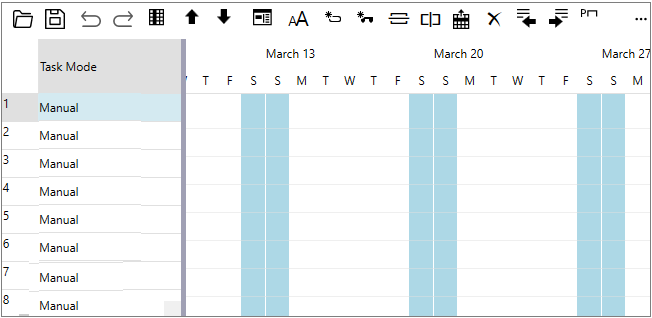
The following code sets the color of nonworking-time line to Light Blue.
| C# |
コードのコピー
|
|---|---|
gv.NonworkingTimeColor = Colors.LightBlue; |
|
Style Splitter
The GanttView control consists of two grids separated by a resize-able splitter. By default, the splitter is displayed in a default color, i.e., dark gray color. However, you can change the color of the splitter by using SplitterColor property of the C1GanttView class.
The following image showcases the dark blue colored draggable splitter in GanttView.
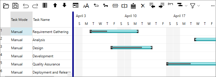
The following code sets the color of splitter to Dark Blue.
| C# |
コードのコピー
|
|---|---|
gv.SplitterColor = Brushes.DarkBlue; |
|
Style Today Line
Today-Line indicates the current day in the grid. You can easily customize the color of the Today-Line by using TodayLineColor property of the C1GanttView class.
The following image showcases the appearance of customized today line in GanttView.
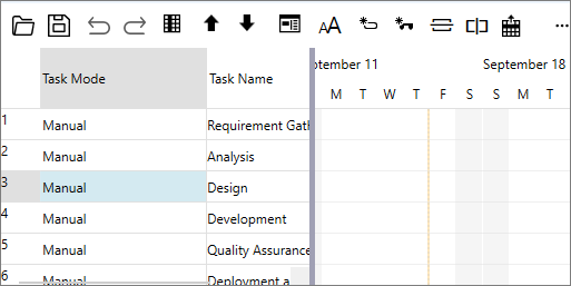
The following code sets the color of today line to Yellow.
| C# |
コードのコピー
|
|---|---|
gv.TodayLineColor = Colors.Yellow; |
|
Style Bar
GanttView facilitates you to change the color, shape, or pattern of task bars. It also allows you to change the style of a particular task bar to highlight it or to separate it from other bars of the same type.
The following image showcases styling applied to task bars in the GanttView control.
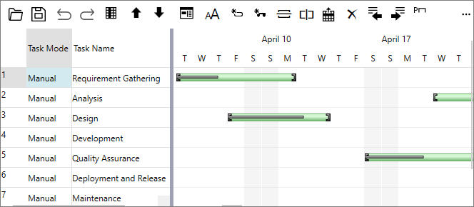
To apply styling to task bars in GanttView, you can use BarStyles property of the C1GanttView class to define a customized bar style as demonstrated in the following code. Here, we change the bar style of all the tasks in GanttView by setting bar type and bar color using BarType and BarColor properties, respectively.
| C# |
コードのコピー
|
|---|---|
//バーをスタイル設定します。 BarStyle bs = gv.GetPredefinedBarStyle(BarType.ManualTask); bs.BarColor = Colors.LightGreen; foreach (var task in gv.Tasks) { task.BarStyles.Add(bs); } |
|
The above code applies styling to all task bars in GanttView. However, there might be a scenario where you would want to highlight a specific task bar by applying styles to it.
For instance, the following image showcases styling applied to the "Maintenance" task in GanttView.
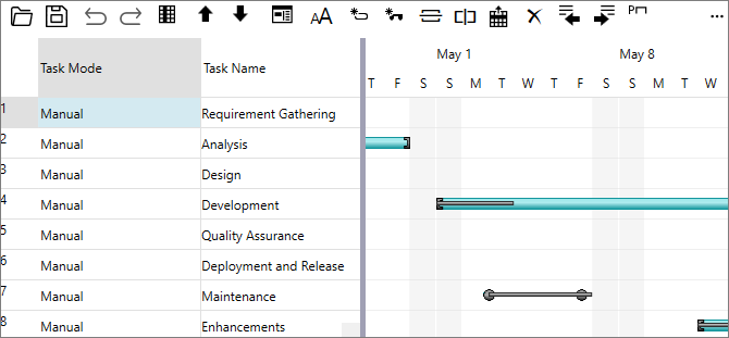
The following code demonstrates how you can change the bar shape and style of a specific task in GanttView by using the BarShape, BarType, EndShape, and StartShape properties.
| C# |
コードのコピー
|
|---|---|
//特定のタスク バーをスタイル設定します。 Task task3 = gv.Tasks.Search("Maintenance"); if (task3 != null) { BarStyle bs2 = gv.GetPredefinedBarStyle(BarType.ManualTask); bs2.BarShape = BarShape.MiddleBar; bs2.StartShape = 19; bs2.EndShape = 19; task3.BarStyles.Add(bs2); } |
|
Alternatively, you can use Bar Styles dialog to style task bars at runtime. For more information, see Bar Styles dialog.
Set BackGround Color of Day
GanttView enables users to highlight a specific day of week by setting its back color. For instance, the weekends in a GanttView can be highlighted in a different color to distinguish them from workweek. This can be achieved in code by subscribing the PaintDay event and setting the BackColor property to color specific days.
The following image shows a GanttView with weekends highlighted by a different color.
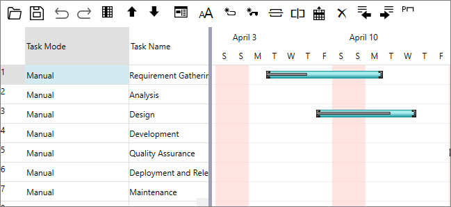
The following code illustrates how to set back color of weekend. This example uses the sample created in Quick start.
| C# |
コードのコピー
|
|---|---|
private void Gv_PaintDay(object sender, PaintDayEventArgs e) { if (e.Date.DayOfWeek == DayOfWeek.Saturday || e.Date.DayOfWeek == DayOfWeek.Sunday) { e.BackColor = Colors.MistyRose; } } |
|
Set FieldStyle
GanttView provides you the ability to customize the style and appearance of tasks fields in order to match with the UI requirements of an application. You can format the fields in the grid view by using various properties of the FieldStyle class such as Field, FieldName, FontStyle, ForegroundColor, BackgroundColor, and Underline.
The following image shows a GanttView with custom styles applied to the fields.
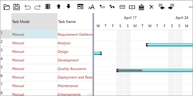
The following code illustrates how to apply custom styles to fields. This example uses the sample created in Quick start.
| C# |
コードのコピー
|
|---|---|
FieldStyle fs = new FieldStyle(); fs.Field = StyleField.All; fs.ForegroundColor = System.Windows.Media.Colors.Brown; fs.FieldName = "Task Name"; fs.FontStyle = FontStyles.Italic; foreach (Task task in gv.Tasks) { FieldStyleCollection fsc = task.FieldStyles; fsc.Add(fs); } |
|