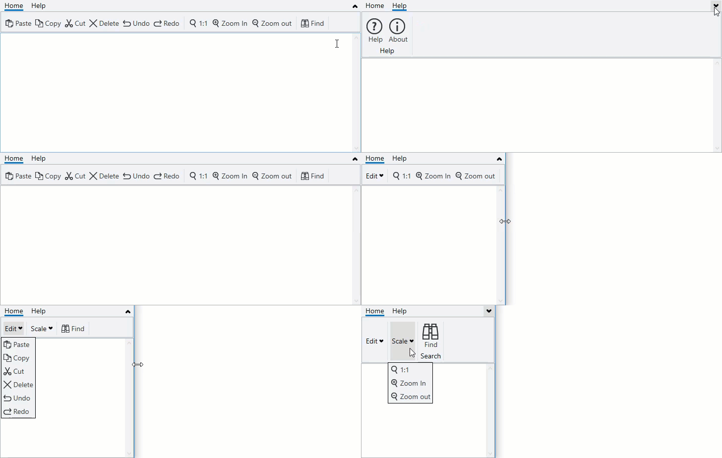
In general, a ribbon has a standard three line appearance of items. Toolbar for WPF offers SimplifiedRibbon, similar to the Ribbon tool in MS Office 365, which provides you an option to work with a single line collapsed view or an expanded view containing three line appearances. This allows you to allocate more screen space to the working area of your application. In addition, SimplifiedRibbon automatically combines items in a group into a dropdown when it doesn’t have enough space to display all group items across the window width.
The SimplifiedRibbon control is represented by the C1SimplifiedRibbon class that implements C1ToolbarBase class. The C1SimplifiedRibbon class lets you map the items of SimplifiedRibbon using the RibbonItems property. In addition, IsCollapsed property of the C1SimplifiedRibbon class lets you check whether the tab panel displaying the ribbon items is collapsed or expanded. It also allows you to choose marquee brush for the toolbar using the MarqueeBrush property of the C1SimplifiedRibbon class.
Toolbar for WPF offers another control, C1SimplifiedTabControl, which is a part of C1SimplifiedRibbon control. This control is represented by the C1SimplifiedTabControl class which inherits the C1TabContol class. It is similar to the ToolbarTabControl used in C1Toolbar control template. The control handles marquee logic and toggle collapse state of tab control. You can use this control inside the C1SimplifiedRibbon control to create a custom control template for C1SimplifiedRibbon.
