このトピックでは、テンプレートや Style を使用した描画スタイルのカスタマイズについて解説します。
コントロールテンプレートを使用してコンボコントロールをカスタマイズするには、IsEditable プロパティの設定により、テンプレートを適用するプロパティが異なります。 IsEditable プロパティが True で編集可能な場合、テンプレートの設定は EditableTemplate プロパティを、編集不可の場合は、UnEditableTemplate プロパティを使用します。
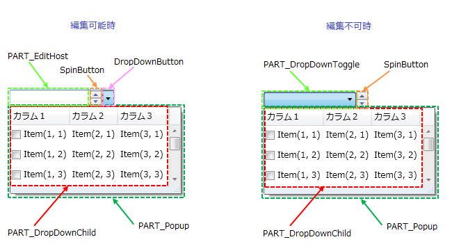
コンボコントロールは以下のパーツから構成されています。
| パーツ | 型 | 説明 |
|---|---|---|
| PART_EditHost | TextBox(デフォルト)、GcTextBox、GcMask | コンボコントロールのテキストが格納されます。 |
| PART_Popup | ComboDropDownWindow | コンボコントロールから開かれるドロップダウンウィンドウです。 |
| PART_DropDownChild | GcListBox(デフォルト)、ListBox | コンボコントロールの項目を格納するリストボックスです。 |
| パーツ | 型 | 説明 |
|---|---|---|
| PART_DropDownToggle | ToggleButton | コンボコントロールの選択テキストを表示します。 |
| PART_Popup | ComboDropDownWindow | コンボコントロールから開かれるドロップダウンウィンドウです。 |
| PART_DropDownChild | GcListBox(デフォルト)、ListBox | コンボコントロールの項目を格納するリストボックスです。 |
IsEditable プロパティが True に設定された編集可能なテキストボックスのテンプレートをカスタマイズするには、EditableTemplate プロパティを、編集不可のテキストボックスの場合は UnEditableTemplate プロパティを使用します。
テキストボックスへの編集が可能な場合は、PART_EditHost のパーツに GcTextBox や GcMask を適用できます。
次のサンプルコードは、編集可能なテキスト部分にテキストコントロールを適用し、未入力時に透かし表示テキストを設定します。
<!-- 以下の名前空間を追加する必要があります。 -->
<!-- xmlns:imp="clr-namespace:GrapeCity.Windows.InputMan.Primitives;assembly=GrapeCity.WPF.InputMan" -->

<Window.Resources>
  <ResourceDictionary Source="/GrapeCity.WPF.InputMan;component/Themes/Generic/SideButton.xaml"/>
</Window.Resources>

<im:GcComboBox Width="250" IsEditable="True">
  <im:GcComboBox.EditableTemplate>
    <ControlTemplate TargetType="im:GcComboBox">
      <Grid>
        <VisualStateManager.VisualStateGroups>
          <VisualStateGroup x:Name="CommonStates">
            <VisualState x:Name="Normal"/>
            <VisualState x:Name="ReadOnly"/>
            <VisualState x:Name="MouseOver"/>
            <VisualState x:Name="Disabled">
              <Storyboard>
                <DoubleAnimationUsingKeyFrames Storyboard.TargetProperty="Opacity" Storyboard.TargetName="DisabledBorder">
                  <SplineDoubleKeyFrame KeyTime="0" Value="1"/>
                </DoubleAnimationUsingKeyFrames>
              </Storyboard>
            </VisualState>
          </VisualStateGroup>
          <VisualStateGroup x:Name="ActiveStates">
            <VisualState x:Name="ActiveDropDown">
            </VisualState>
            <VisualState x:Name="Active">
            </VisualState>
            <VisualState x:Name="Inactive">
            </VisualState>
          </VisualStateGroup>
          <VisualStateGroup x:Name="SpinButtonStates">
            <VisualState x:Name="SpinButtonVisible">
              <Storyboard>
                <ObjectAnimationUsingKeyFrames Storyboard.TargetProperty="Visibility" Storyboard.TargetName="SpinButtonPanel">
                  <DiscreteObjectKeyFrame KeyTime="0">
                    <DiscreteObjectKeyFrame.Value>
                      <Visibility>Visible</Visibility>
                    </DiscreteObjectKeyFrame.Value>
                  </DiscreteObjectKeyFrame>
                </ObjectAnimationUsingKeyFrames>
              </Storyboard>
            </VisualState>
            <VisualState x:Name="SpinButtonCollapsed">
            </VisualState>
          </VisualStateGroup>
          <VisualStateGroup x:Name="DropDownButtonStates">
            <VisualState x:Name="DropDownButtonVisible"/>
            <VisualState x:Name="DropDownButtonCollapsed">
              <Storyboard>
                <ObjectAnimationUsingKeyFrames Storyboard.TargetProperty="Visibility" Storyboard.TargetName="DropDownButton">
                  <DiscreteObjectKeyFrame KeyTime="0">
                    <DiscreteObjectKeyFrame.Value>
                      <Visibility>Collapsed</Visibility>
                    </DiscreteObjectKeyFrame.Value>
                  </DiscreteObjectKeyFrame>
                </ObjectAnimationUsingKeyFrames>
              </Storyboard>
            </VisualState>
          </VisualStateGroup>
        </VisualStateManager.VisualStateGroups>

        <Border x:Name="Border" BorderBrush="{TemplateBinding BorderBrush}"
            BorderThickness="{TemplateBinding BorderThickness}"
            SnapsToDevicePixels="True" CornerRadius="1" Opacity="1">
          <Grid>
            <Rectangle x:Name="EnabledVisualElement" Opacity="1" Fill="{TemplateBinding EditableBackground}"/>
            <Rectangle x:Name="DisabledBorder" Fill="{TemplateBinding DisabledBackground}" StrokeThickness="0" IsHitTestVisible="False" Opacity="0"/>
            <Grid>
              <Grid.ColumnDefinitions>
                <ColumnDefinition Width="*"/>
                <ColumnDefinition Width="Auto"/>
                <ColumnDefinition Width="Auto"/>
              </Grid.ColumnDefinitions>

              <!-- テキスト部分に GcTextBox を設定します。 -->
              <im:GcTextBox x:Name="PART_EditHost" IsReadOnly="{Binding Path=IsReadOnly,RelativeSource={RelativeSource TemplatedParent}}"
                      HorizontalContentAlignment="{TemplateBinding HorizontalContentAlignment}"
                      VerticalContentAlignment="{TemplateBinding VerticalContentAlignment}"
                      Foreground="{TemplateBinding Foreground}"
                      Background="{TemplateBinding EditableBackground}"
                      Padding="{TemplateBinding Padding}"
                      WatermarkDisplayNull="選択してください。"
                      WatermarkDisplayNullForeground="LightBlue"
                      KeyboardNavigation.TabNavigation="Continue">
              </im:GcTextBox>

              <Grid Grid.Column="1" x:Name="SpinButtonPanel" Visibility="Collapsed" Margin="0,1,1,1">
                <Grid.RowDefinitions>
                  <RowDefinition/>
                  <RowDefinition/>
                </Grid.RowDefinitions>
                <imp:SpinButton Command="im:GcComboBox.SpinUpCommand" Content="{StaticResource UpArtrGeometry}" />
                <imp:SpinButton Command="im:GcComboBox.SpinDownCommand" Grid.Row="1" Content="{StaticResource DownArtrGeometry}"/>
              </Grid>

              <imp:DropDownButton x:Name="DropDownButton" Grid.Column="2"
                        IsChecked="{Binding Path=IsDropDownOpen,Mode=TwoWay,RelativeSource={RelativeSource TemplatedParent}}"/>
            </Grid>
          </Grid>
        </Border>
        <imp:ComboDropDownWindow x:Name="PART_Popup"  Width="{Binding Path=DropDownWidth, RelativeSource={RelativeSource TemplatedParent}, Mode=TwoWay}"
                     Style="{TemplateBinding DropDownWindowStyle}" TargetElementValue="{Binding Path=SelectedItem, RelativeSource={RelativeSource TemplatedParent}, Mode=TwoWay}">
          <im:GcListBox x:Name="PART_DropDownChild"
                  BorderThickness="0"
                  KeyboardNavigation.TabNavigation="Local"
                  ItemCheckBoxVisibility="{TemplateBinding ItemCheckBoxVisibility}"
                  ItemContainerStyle="{TemplateBinding ItemContainerStyle}"
                  ItemTemplate="{TemplateBinding ItemTemplate}"
                  IsSynchronizedWithCurrentItem="{TemplateBinding IsSynchronizedWithCurrentItem}"
                  AutoGenerateColumns="{TemplateBinding AutoGenerateColumns}"
                  UseMultipleColumn="{TemplateBinding UseMultipleColumn}"
                  CanUserResizeColumns="{TemplateBinding CanUserResizeColumns}"
                  CanUserSortColumns="{TemplateBinding CanUserSortColumns}"
                  CheckOnClick="{TemplateBinding CheckOnClick}"
                  VerticalGridLineBrush="{TemplateBinding VerticalGridLineBrush}"
                  VerticalGridLineStyle="{TemplateBinding VerticalGridLineStyle}"
                  HorizontalGridLineBrush="{TemplateBinding HorizontalGridLineBrush}"
                  HorizontalGridLineStyle="{TemplateBinding HorizontalGridLineStyle}"
                  ItemsSource="{TemplateBinding ItemsSource}"
                  DisplayMemberPath="{TemplateBinding ContentPath}"
                  AlternationCount="{TemplateBinding AlternationCount}"
                  AlternatingItemBackground="{TemplateBinding AlternatingItemBackground}"
                  ItemBackground="{TemplateBinding ItemBackground}"
                  SelectedItem="{Binding ElementName=PART_Popup, Path=DropDownValue, Mode=TwoWay}"/>
        </imp:ComboDropDownWindow>
      </Grid>
      <ControlTemplate.Triggers>
        <Trigger Property="IsEnabled" Value="False">
          <Setter TargetName="PART_EditHost" Property="Background" Value="Transparent"></Setter>
        </Trigger>
      </ControlTemplate.Triggers>
    </ControlTemplate>
  </im:GcComboBox.EditableTemplate>
</im:GcComboBox>
PART_Popup のパーツに該当するドロップダウン部分全体をカスタマイズするには、DropDownWindowStyle プロパティを使用します。DropDownWindowStyle プロパティは Style 型で、ターゲットの型は ComboDropDownWindow です。 ComboDropDownWindow クラスは、リサイズバーのカスタマイズ、ドロップダウン表示の方向やアニメーション、あるいは影の表示切り換えなどの設定が可能です。
ComboDropDownWindow クラスを使用してドロップダウンウィンドウのスタイルをカスタマイズする場合、デフォルト値からの変更を行わない場合でも以下のプロパティは明示的に設定する必要があります。
| プロパティ | 既定値 |
|---|---|
| AllowResize | True |
| BorderBrush | #646464 |
| BorderThickness | 1 |
| ResizeBarBackground | #E9EEF4 |
リサイズバーをカスタマイズする例については「リストボックスの使い方」を参照してください。
PART_DropDownChild のパーツに該当するリストボックス部分をカスタマイズするには、DropDownControlStyle プロパティを使用します。DropDownControlStyle プロパティは Style 型で、デフォルトのターゲットの型は GcListBox です。ヘッダやサブ項目のスタイルなど、リストボックス部分の細かいスタイルを設定するときに使用します。
次のサンプルコードは、リストボックスのヘッダを非表示にし、サブ項目の文字色と太字装飾を設定します。
Imports GrapeCity.Windows.InputMan

' サブ項目スタイルのオブジェクトを作成します。
Dim subItemStyle As New Style(GetType(SubItem))
' 文字色と太字装飾を設定します。
subItemStyle.Setters.Add(New Setter(SubItem.ForegroundProperty, Brushes.Blue))
subItemStyle.Setters.Add(New Setter(SubItem.FontWeightProperty, FontWeights.Bold))

' リストスタイルのオブジェクトを作成します。
Dim listStyle As New Style(GetType(GcListBox))
' サブ項目スタイルを割り当て、ヘッダを非表示にします。
listStyle.Setters.Add(New Setter(GcListBox.SubItemStyleProperty, subItemStyle))
listStyle.Setters.Add(New Setter(GcListBox.ShowHeaderProperty, False))

' コンボコントロールにリストスタイルを割り当てます。
GcComboBox1.DropDownControlStyle = listStyle
using GrapeCity.Windows.InputMan;

// サブ項目スタイルのオブジェクトを作成します。
var subItemStyle = new Style(typeof(SubItem));
// 文字色と太字装飾を設定します。
subItemStyle.Setters.Add(new Setter(SubItem.ForegroundProperty, Brushes.Blue));
subItemStyle.Setters.Add(new Setter(SubItem.FontWeightProperty, FontWeights.Bold));

// リストスタイルのオブジェクトを作成します。
var listStyle = new Style(typeof(GcListBox));
// サブ項目スタイルを割り当て、ヘッダを非表示にします。
listStyle.Setters.Add(new Setter(GcListBox.SubItemStyleProperty, subItemStyle));
listStyle.Setters.Add(new Setter(GcListBox.ShowHeaderProperty, false));

// コンボコントロールにリストスタイルを割り当てます。
GcComboBox1.DropDownControlStyle = listStyle;
<im:GcComboBox>
  <im:GcComboBox.DropDownControlStyle>
    <Style TargetType="im:GcListBox">
      <Setter Property="ShowHeader" Value="False" />
      <Setter Property="SubItemStyle">
        <Setter.Value>
          <Style TargetType="im:SubItem">
            <Setter Property="Foreground" Value="Blue" />
            <Setter Property="FontWeight" Value="Bold" />
          </Style>
        </Setter.Value>
      </Setter>
    </Style>
  </im:GcComboBox.DropDownControlStyle>
</im:GcComboBox>
なお、GcListBox クラスの以下のプロパティについては DropDownControlStyle プロパティを使用したスタイル設定では適用されません。同名の GcComboBox クラスのプロパティを使用してください。
- AlternationCount
- AutoGenerateColumns
- BorderThickness
- CanUserResizeColumns
- CanUserSortColumns
- CheckOnClick
- Columns
- DisplayMemberPath
- HorizontalGridLineBrush
- HorizontalGridLineStyle
- IsSynchronizedWithCurrentItem
- ItemCheckBoxVisibility
- ItemContainerStyle
- Items
- ItemsSource
- ItemsPanel
- ItemTemplate
- Name
- SelectedItem
- SelectedValuePath
- UseMultipleColumn
- VerticalGridLineBrush
- VerticalGridLineStyle