このトピックでは、ドロップダウン電卓コントロールのスタイル設定について解説します。
ドロップダウン電卓コントロールを構成する各要素(ボタン、テキストなど)には、それぞれ描画スタイルを設定するためのプロパティが用意されており、これらのプロパティを使用することで、色やフォントサイズなどのレイアウトを要素ごとに細かく設定することができます。これらのスタイルは Style 型となっており、コントロール単位で設定したり、リソースディクショナリのリソースとして宣言したりすることができます。
 |
テーマテンプレートと併用した場合は、各要素で設定した個別のスタイル設定が優先されます。 |
それぞれの要素に対応するスタイルプロパティ、およびそのスタイルプロパティで設定できるターゲットの型は以下のとおりです。
| 要素 | スタイルプロパティの名前 | ターゲットの型 |
|---|---|---|
| コントロール | Style | GcDropDownCalculator |
| 編集ボタン | EditButtonStyle | CalculatorButton |
| エラーメッセージ | ErrorMessageStyle | TextBlock |
| 計算履歴 | HistoryStyle | TextBlock |
| 演算ボタン | MathButtonStyle | CalculatorButton |
| メモリボタン | MemoryButtonStyle | CalculatorButton |
| メモリ状態 | MemoryStatusStyle | TextBlock |
| 数字ボタン | NumericButtonStyle | CalculatorButton |
| 出力 | OutputStyle | TextBlock |
| リセットボタン | ResetButtonStyle | CalculatorButton |
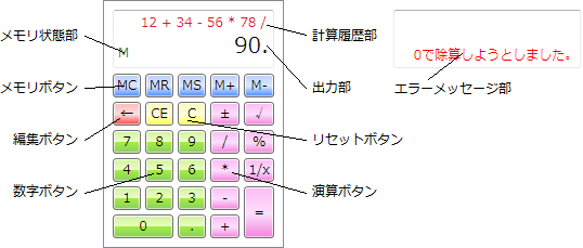
(図):電卓の構成要素
スタイルを設定する場合は、一般的な Style オブジェクトの使用方法に沿ってコードを記述します。
以下のサンプルコードは、数字ボタンの前景色を背景色と赤色に設定します。また、出力部の前景色を緑色に、テキスト配置を左揃えに、フォントサイズを24に設定します。
Imports GrapeCity.Windows.InputMan.Primitives

' ボタンに対する新規スタイルオブジェクトを作成します。
Dim buttonStyle As New Style(GetType(CalculatorButton))

' ボタンの前景色と背景色を赤色に設定します。
buttonStyle.Setters.Add(New Setter(CalculatorButton.BackgroundProperty, "MistyRose"))
buttonStyle.Setters.Add(New Setter(CalculatorButton.ForegroundProperty, "Red"))

' 数字ボタンにスタイルを割り当てます。
GcDropDownCalculator1.NumericButtonStyle = buttonStyle

' テキストに対する新規スタイルオブジェクトを作成します。
Dim textStyle As New Style(GetType(TextBlock))

' テキストの前景色を緑色に、テキストの配置を左揃えに、フォントサイズを24に設定します。
textStyle.Setters.Add(New Setter(TextBlock.ForegroundProperty, "Green"))
textStyle.Setters.Add(New Setter(TextBlock.HorizontalAlignmentProperty, HorizontalAlignment.Left))
textStyle.Setters.Add(New Setter(TextBlock.FontSizeProperty, 24))

' 出力テキストにスタイルを割り当てます。
GcDropDownCalculator1.OutputStyle = textStyle
using GrapeCity.Windows.InputMan.Primitives;

// ボタンに対する新規スタイルオブジェクトを作成します。
var buttonStyle = new Style(typeof(CalculatorButton));

// ボタンの前景色と背景色を赤色に設定します。
buttonStyle.Setters.Add(new Setter(CalculatorButton.BackgroundProperty, "MistyRose"));
buttonStyle.Setters.Add(new Setter(CalculatorButton.ForegroundProperty, "Red"));

// 数字ボタンにスタイルを割り当てます。
GcDropDownCalculator1.NumericButtonStyle = buttonStyle;

// テキストに対する新規スタイルオブジェクトを作成します。
var textStyle = new Style(typeof(TextBlock));

// テキストの前景色を緑色に、テキストの配置を左揃えに、フォントサイズを24に設定します。
textStyle.Setters.Add(new Setter(TextBlock.ForegroundProperty, "Green"));
textStyle.Setters.Add(new Setter(TextBlock.HorizontalAlignmentProperty, HorizontalAlignment.Left));
textStyle.Setters.Add(new Setter(TextBlock.FontSizeProperty, 24));

// 出力テキストにスタイルを割り当てます。
GcDropDownCalculator1.OutputStyle = textStyle;
<im:GcDropDownCalculator>
  <im:GcDropDownCalculator.NumericButtonStyle>
    <Style TargetType="im:CalculatorButton">
      <Setter Property="Background" Value="MistyRose" />
      <Setter Property="Foreground" Value="Red" />
    </Style>
  </im:GcDropDownCalculator.NumericButtonStyle>
  <im:GcDropDownCalculator.OutputStyle>
    <Style TargetType="TextBlock">
      <Setter Property="Foreground" Value="Green" />
      <Setter Property="HorizontalAlignment" Value="Left" />
      <Setter Property="FontSize" Value="24" />
    </Style>
  </im:GcDropDownCalculator.OutputStyle>
</im:GcDropDownCalculator>
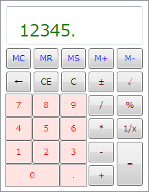
(図):上記サンプルコードの実行結果
|
ボタンに対してスタイルを設定すると既定のスタイルで定義しているマージンやパディングの設定がクリアされるため、ボタンのサイズが若干大きく表示されます。既定のボタンサイズに合わせて表示するには、CalculatorButton オブジェクトの以下のプロパティ設定をスタイル設定に追加してください。
|
また、リソースディクショナリのリソースとして宣言することにより、複数のコントロールで同じスタイル設定を共有することができます。複数のスタイルを定義しておき、キー値を使用してコントロール側で使用するスタイルを指定することも可能です。以下のサンプルコードは、UserControl コントロールの Resources プロパティを使用して、上記サンプルのスタイル設定をリソースディクショナリに追加した場合の例です。
<UserControl.Resources>
  <Style x:Key="CustomButton" TargetType="im:CalculatorButton">
    <Setter Property="Background" Value="Red" />
    <Setter Property="Foreground" Value="Red" />
  </Style>
  <Style x:Key="CustomText" TargetType="TextBlock">
    <Setter Property="Foreground" Value="Green" />
    <Setter Property="HorizontalAlignment" Value="Left" />
    <Setter Property="FontSize" Value="24" />
  </Style>
</UserControl.Resources>
以下のサンプルコードは、リソースのキーを使用して、ドロップダウン電卓コントロールに上記の例で定義したスタイルを割り当てます。
GcDropDownCalculator1.NumericButtonStyle = Me.Resources("CustomButton")
GcDropDownCalculator1.OutputStyle = Me.Resources("CustomText")
GcDropDownCalculator1.NumericButtonStyle = (Style)this.Resources["CustomButton"];
GcDropDownCalculator1.OutputStyle = (Style)this.Resources["CustomText"];
<im:GcDropDownCalculator NumericButtonStyle="{StaticResource CustomButton}" OutputStyle="{StaticResource CustomText}" />