ドロップダウンカレンダーで使用されている表示スタイルについて解説します。
描画スタイル
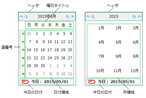
描画スタイルは、Styleオブジェクトを使って設定します。カレンダーを構成する要素の中で、描画スタイルが適用されるのは次の6種類です。
- コントロール(ControlStyleプロパティ)
- ヘッダ(HeaderStyleプロパティ)
- 曜日タイトル(TitleStyleプロパティ)
- 日付領域(ItemStyleプロパティ)
- 今日の日付領域(LegendStyleプロパティ)
- 週番号領域(WeekNumberStyleプロパティ)
コントロールに対して、ControlStyleプロパティで設定した描画スタイルを適用するかどうかは、UseControlStyleプロパティで指定します。
これらの描画スタイルで設定できる項目は、次のとおりです。
- 背景色(BackColorプロパティ)
- 3D効果のべべル(Bevelプロパティ)
- 境界線の色(BorderColorプロパティ)
- 境界線の種類(BorderStyleプロパティ)
- テキストの配置(ContentAlignmentプロパティ)
- フォント(Fontプロパティ)
- 文字色(ForeColorプロパティ)
- 文字の表示スタイル(TextEffectプロパティ)
次のサンプルコードは、日付領域にスタイルを適用する例です。
Imports GrapeCity.Win.MultiRow
Imports InputManCell = GrapeCity.Win.MultiRow.InputMan

Dim GcDateTimeCell1 As New InputManCell.GcDateTimeCell()

' 描画スタイルの内容を設定します。
Dim aStyle As New InputManCell.Style()
aStyle.BackColor = Color.AliceBlue
aStyle.ForeColor = Color.Black
aStyle.Font = New Font("メイリオ", 10)
aStyle.BorderColor = Color.Black
aStyle.BorderStyle = BorderStyle.FixedSingle
aStyle.ContentAlignment = ContentAlignment.MiddleCenter

' 描画スタイルを日付領域へ適用します。
GcDateTimeCell1.DropDownCalendar.ItemStyle = aStyle

GcMultiRow1.Template = Template.CreateGridTemplate(New Cell() {GcDateTimeCell1})
using GrapeCity.Win.MultiRow;
using InputManCell = GrapeCity.Win.MultiRow.InputMan;

InputManCell.GcDateTimeCell gcDateTimeCell1 = new InputManCell.GcDateTimeCell();

// 描画スタイルの内容を設定します。
InputManCell.Style aStyle = new InputManCell.Style();
aStyle.BackColor = Color.AliceBlue;
aStyle.ForeColor = Color.Black;
aStyle.Font = new Font("メイリオ", 10);
aStyle.BorderColor = Color.Black;
aStyle.BorderStyle = BorderStyle.FixedSingle;
aStyle.ContentAlignment = ContentAlignment.MiddleCenter;

// 描画スタイルを日付領域へ適用します。
gcDateTimeCell1.DropDownCalendar.ItemStyle = aStyle;

gcMultiRow1.Template = Template.CreateGridTemplate(new Cell[] { gcDateTimeCell1 });
gcMultiRow1.RowCount = 5;
日付スタイル
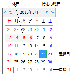
日付スタイルは、SubStyleオブジェクトを使って設定します。カレンダーを構成する要素の中で、日付スタイルが適用されるのは次の5種類です。
- 特定の曜日(Weekdaysプロパティで指定)
- 休日(HolidayStyleオブジェクトで指定)
- 隣接日(TrailingStyleプロパティ)
- 選択された日(SelectionStyleプロパティ)
これらの日付スタイルで設定できる項目は、次のとおりです。
次のサンプルコードは、日曜日と土曜日の日付スタイルを変更する方法を示します。
Imports GrapeCity.Win.MultiRow
Imports InputManCell = GrapeCity.Win.MultiRow.InputMan

Dim GcDateTimeCell1 As New InputManCell.GcDateTimeCell()

' 日曜日の日付スタイルを設定します。
GcDateTimeCell1.DropDownCalendar.Weekdays.Sunday.ReflectToTitle = GrapeCity.Win.Editors.ReflectTitle.Both
GcDateTimeCell1.DropDownCalendar.Weekdays.Sunday.SubStyle.BackColor = Color.WhiteSmoke
GcDateTimeCell1.DropDownCalendar.Weekdays.Sunday.SubStyle.ForeColor = Color.Red
GcDateTimeCell1.DropDownCalendar.Weekdays.Sunday.WeekFlags = GrapeCity.Win.Editors.WeekFlags.All
' 土曜日の日付スタイルを設定します。
GcDateTimeCell1.DropDownCalendar.Weekdays.Saturday.ReflectToTitle = GrapeCity.Win.Editors.ReflectTitle.Both
GcDateTimeCell1.DropDownCalendar.Weekdays.Saturday.SubStyle.BackColor = Color.WhiteSmoke
GcDateTimeCell1.DropDownCalendar.Weekdays.Saturday.SubStyle.ForeColor = Color.Blue
GcDateTimeCell1.DropDownCalendar.Weekdays.Saturday.WeekFlags = GrapeCity.Win.Editors.WeekFlags.All

GcMultiRow1.Template = Template.CreateGridTemplate(New Cell() {GcDateTimeCell1})
using GrapeCity.Win.MultiRow;
using InputManCell = GrapeCity.Win.MultiRow.InputMan;

InputManCell.GcDateTimeCell gcDateTimeCell1 = new InputManCell.GcDateTimeCell();

// 日曜日の日付スタイルを設定します。
gcDateTimeCell1.DropDownCalendar.Weekdays.Sunday.ReflectToTitle = GrapeCity.Win.Editors.ReflectTitle.Both;
gcDateTimeCell1.DropDownCalendar.Weekdays.Sunday.SubStyle.BackColor = Color.WhiteSmoke;
gcDateTimeCell1.DropDownCalendar.Weekdays.Sunday.SubStyle.ForeColor = Color.Red;
gcDateTimeCell1.DropDownCalendar.Weekdays.Sunday.WeekFlags = GrapeCity.Win.Editors.WeekFlags.All;
// 土曜日の日付スタイルを設定します。
gcDateTimeCell1.DropDownCalendar.Weekdays.Saturday.ReflectToTitle = GrapeCity.Win.Editors.ReflectTitle.Both;
gcDateTimeCell1.DropDownCalendar.Weekdays.Saturday.SubStyle.BackColor = Color.WhiteSmoke;
gcDateTimeCell1.DropDownCalendar.Weekdays.Saturday.SubStyle.ForeColor = Color.Blue;
gcDateTimeCell1.DropDownCalendar.Weekdays.Saturday.WeekFlags = GrapeCity.Win.Editors.WeekFlags.All;

gcMultiRow1.Template = Template.CreateGridTemplate(new Cell[] { gcDateTimeCell1 });
gcMultiRow1.RowCount = 5;
境界線と区切り線
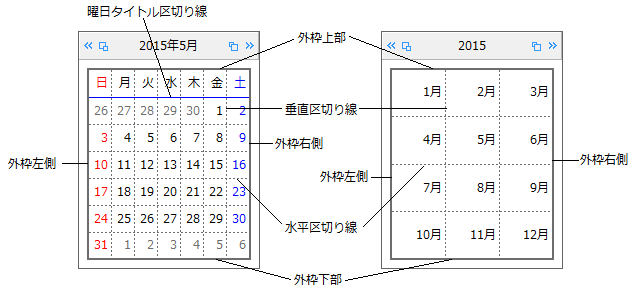
StyleオブジェクトのBorderColorおよびBorderStyleプロパティを設定することで、描画スタイルの設定が適用される各要素に境界線を表示することができます。
また、Linesプロパティを使用すると、日付領域の区切り線を設定できます。LinesプロパティはGridクラスを参照し、以下の区切り線の色および線種を設定することが可能です。
- 日付領域の外枠下側の線(Bottomプロパティ)
- 日付領域の外枠上側の線(Topプロパティ)
- 日付領域の外枠左側の線(Leftプロパティ)
- 日付領域の外枠右側の線(Rightプロパティ)
- 曜日タイトルと日付領域の区切り線(Separatorプロパティ)
- 日付領域の水平区切り線(Horizontalプロパティ)
- 日付領域の垂直区切り線(Verticalプロパティ)
- 垂直区切り線を日付領域と曜日タイトルの両方に表示するかどうか(VerticalFlagプロパティ)
次のサンプルコードは、区切り線を設定する例です。
Imports GrapeCity.Win.MultiRow
Imports InputManCell = GrapeCity.Win.MultiRow.InputMan

Dim GcDateTimeCell1 As New InputManCell.GcDateTimeCell()

' 垂直方向の区切り線を曜日タイトルに設定します。
GcDateTimeCell1.DropDownCalendar.Lines.VerticalFlag = GrapeCity.Win.Editors.VerticalFlags.HeaderOnly
' 水平方向の区切り線を設定します。
GcDateTimeCell1.DropDownCalendar.Lines.Vertical = New InputManCell.Line(LineStyle.Dotted, Color.Gray)
GcDateTimeCell1.DropDownCalendar.Lines.Horizontal = New InputManCell.Line(LineStyle.DashDot, Color.Green)

GcMultiRow1.Template = Template.CreateGridTemplate(New Cell() {GcDateTimeCell1})
using GrapeCity.Win.MultiRow;
using InputManCell = GrapeCity.Win.MultiRow.InputMan;

InputManCell.GcDateTimeCell gcDateTimeCell1 = new InputManCell.GcDateTimeCell();

// 垂直方向の区切り線を曜日タイトルに設定します。
gcDateTimeCell1.DropDownCalendar.Lines.VerticalFlag = GrapeCity.Win.Editors.VerticalFlags.HeaderOnly;
// 水平方向の区切り線を設定します。
gcDateTimeCell1.DropDownCalendar.Lines.Vertical = new InputManCell.Line(GrapeCity.Win.Editors.LineStyle.Dotted, Color.Gray);
gcDateTimeCell1.DropDownCalendar.Lines.Horizontal = new InputManCell.Line(GrapeCity.Win.Editors.LineStyle.DashDot, Color.Green);


gcMultiRow1.Template = Template.CreateGridTemplate(new Cell[] { gcDateTimeCell1 });
gcMultiRow1.RowCount = 5;
関連トピック