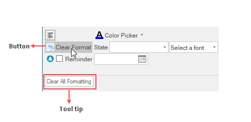
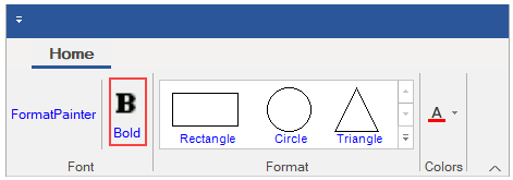
A Button is a clickable ribbon item that executes a command. Inside a button item, you can put any text or image as required.
The image below displays a ribbon application with Clear Format button and tooltip.

Add Ribbon Button at Design-Time
The Ribbon Button can be added at design-time using the Ribbon Group Floating Toolbar or RibbonGroup Items Collection Editor. Also, you can customize the look of the Ribbon Button using the Ribbon Button Floating ToolBar or by editing the properties in the Properties Window. For more info on floating toolbars, refer this フリー ツール バー.
This image below shows the floating toolbar of Button.

Add Button via Code
A ribbon button can also be added to the C1Ribbon control through the code. This can be done by using the RibbonButton class.
Change ForeColor
The ForeColor of an item typically refers to its text color. Users can change the ForeColor of the ribbon button item. The C1Ribbon class provides the UpdatingItemStyle event, which occurs before a style is applied to a ribbon item.

Let's see how to change the ForeColor of RibbonButton by setting the UpdatingItemStyle event in the code snippet.
| C# |
コードのコピー
|
|---|---|
//RibbonButton の前景色を設定するように UpdatingItemStyle イベントを処理します。 private void C1Ribbon1_UpdatingItemStyle(object sender, UpdatingItemStyleEventArgs e) { if (e.RibbonItem.GetType() == typeof(RibbonButton)) { e.ForeColor = Color.Blue; } } |
|