The Floating Toolbar is a part of the Ribbon Smart Designer, which allows the user to customize different types of Ribbon Elements at design time. C1Ribbon provides visual editing to make it easier to create a Ribbon at design time. The user can set properties directly on the form using the Smart Designer Floating Toolbar.
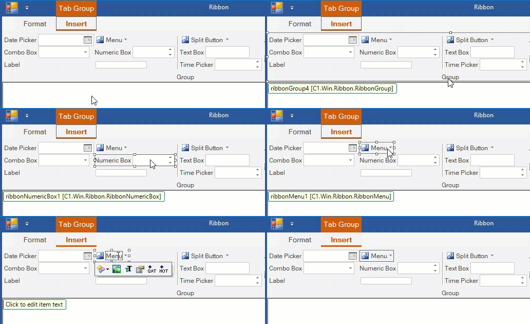
Hovering the mouse over an item in the C1Ribbon smart designer in the form displays the ribbon element name. This is depicted in the GIF below:

| Elements | Floating Toolbar |
| C1Ribbon |
|
| Application Menu |  |
| BackstageView |  |
| Quick Access Toolbar |  |
| Configuration Toolbar |  |
| Contextual Tab Group |  |
| Ribbon Tab |  |
| Ribbon Group |  |
| StatusBar |  |
| Button |  |
| CheckBox |  |
| ColorPicker |  |
| ComboBox |  |
| ControlHost |  |
| Date Picker |  |
| Font ComboBox |  |
| Gallery |  |
| Label |  |
| Menu |  |
| Numeric Box |  |
| Progress Bar |  |
| Separator |  |
| SplitButton |  |
| TextBox |  |
| Time Picker |  |
| Toggle Button |  |
| Tool Bar |  |
| Track Bar |  |
| Top Toolbar |  |
| Bottom Toolbar |  |
- Floating Toolbar for C1Ribbon(.NET Framework) has an additional option for Localization.
- Floating Toolbars for BackstageView, Top Toolbar and Bottom Toolbar are available only on .NET Framework.
From the table, it is evident that many ribbon elements have the same type of floating toolbar. For example, ribbon items like QAT, Configuration Toolbar, Progress Bar, Tool Bar, Track Bar, Top Toolbar and Bottom Toolbar have the same type of floating toolbar.
Floating Toolbar Options
The different types of options available in the floating toolbars are elucidated below.
| Floating Toolbar Options |
Description |
| Actions: It opens a dropdown menu that usually contains the Cut,Copy, Paste and Deleteoptions. This lets the user cut, copy, paste or delete that item. Depending on the type of Ribbon Item, more options can appear in the Actions dropdown menu. For example, the Tab Floating Toolbar has an extra option Add Group, while the Group Floating Toolbar has options like AddButton, Add CheckBoxes, Add TrackBar, Add ControlHost etc. The Contextual Tab Group has an Add Tab option to add tabs. The Actions menu in the C1Ribbon floating toolbar differs from the rest items and has unique options like Load Ribbon Template, Save Ribbon Template, Add Tab and Add Contextual Tab Group. | |
| Change Image: Use the Change Image option to customize the appearance/icon of the item. The Change Image button now opens a window with four options specifying image sizes in advance. The user can conveniently choose from 16 x 16 px, 20 x 20 px, 32 x 32 px images or select a custom image. Clicking any one of the four options opens the Select Image editor. Refer the Icons topic to know more about the Select Image editor. | |
| Text settings: When the user clicks this option, the Text Setting dialog box appears. The user can add the Text, ToolTip, Cue, Label, Description etc. to the Ribbon element. | |
| Miscellaneous settings: The Miscellaneous Settings option allows the user to configure certain Properties associated with an element. Note that it can vary with Ribbon elements. For example, in case of Ribbon ComboBox, TextBox and FontComboBox, the Miscellaneous Settings dialog box allows the user to edit Properties like Text Area Width, Max Text Length and Horizontal Alignment. Similarly, the TrackBar and ProgressBar has a Miscellaneous Settings dialog Box with properties like Maximum and Minimum. Likewise, the Toggle Button Miscellaneous Settings contains the ToggleGroupName property.The Miscellaneous Settings option for other Ribbon elements contains check boxes to enable or disable the respective ribbon element. | |
| Add Launcher Button / Remove Launcher Button: This option allows to add or remove a dialog box launcher button to the Ribbon Group. | |
| Add to Quick Access Toolbar: This option allows the user to add the Ribbon element to QAT (Quick Access Toolbar). | |
| Add to Hot Item List: This option allows the user to add the Ribbon element to the Hot Item List. | |
| Contextual Color Scheme: It lets you change the color scheme of the Contextual Tab Group. | |
| Hide/show Ribbon items: It allows you to hide or show Ribbon items in the ribbon UI. This is available in the floating toolbar of C1Ribbon. Note that while adding more tabs or groups, the smart designer may hide some tabs or groups. But the Hide/Show Ribbon Items option lets the user get back to the first tab or group. | |
| Localize: The Localize option opens the Localize dialog box. |
In-Place Caption Editing
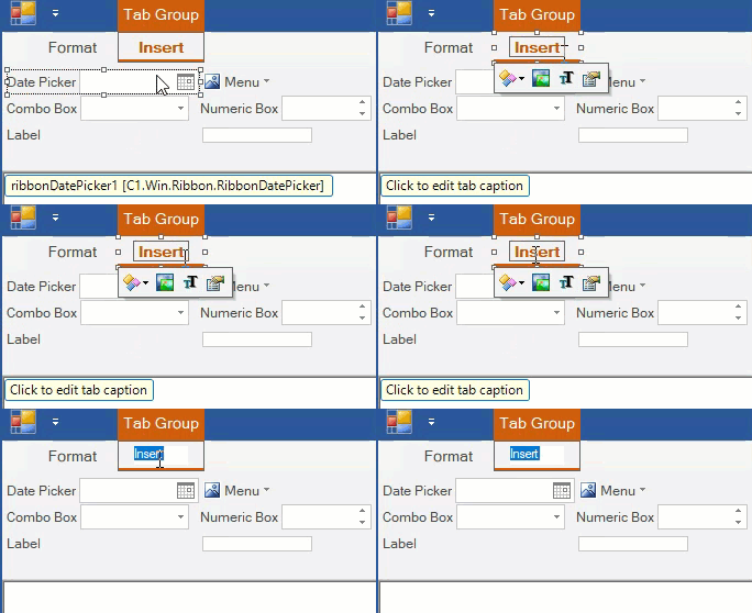
An interesting feature of the smart designer is that it allows in-place text editing of the Ribbon element on the Form. Clicking on a Ribbon element launches the floating toolbar and a tooltip 'Click to edit item text/tabcaption'. As directed in the tooltip, the user can edit the text by simply clicking on the text label with the mouse pointer.
This is illustrated in the GIF below:

