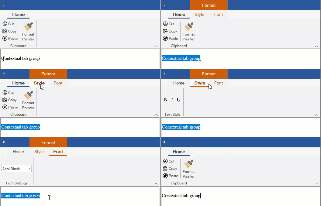
The Ribbon control has a contextual tab group, which is a hidden tab of groups that appears only when texts or images are selected in your application. By default, the tab group header is displayed at the top of the tab group with an orange background. However, you can easily hide this header by setting ShowContextualGroupsHeaders property of the C1Ribbon class to False.
The following GIF depicts the appearance of the contextual tab when a selection of text is being made.

Adding contextual Tab Group at Design-Time
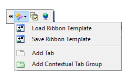
A user can add a Contextual Tab Group using the floating toolbar of C1Ribbon.

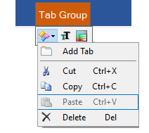
You can add Tabs to Contextual Tab Group using the floating toolbar menu. For more info on floating toolbar, refer this フリー ツール バー.

You can also add a Contextual Tab Group using the RibbonContextualTabGroup Collection Editor from the ContextualTabGroups property of C1Ribbon control in the Properties Window. You can add tabs to the Contextual Tab Group using the RibbonTab Collection Editor from the Tabs property of Contextual Tab Group in the Properties window. For more info on collection editors, refer this コレクション エディター.
Configuring Contextual Tab Group via Code
This section discusses the implementation of contextual tab groups via code in a Ribbon control using the RibbonContextualTabGroup class.
In the following example, we create a contextual tab group and add ribbon groups to it using the Add method. Then, add ribbon items to the ribbon groups, change the color of contextual tab group by setting its tab header color, and add this contextual tab group to the Ribbon. Also, demonstrated a way to hide or show the contextual tab based on text selection.