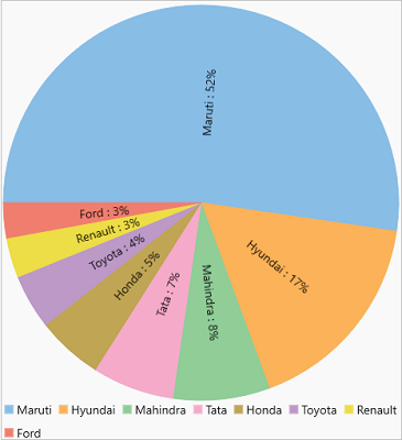
Pie charts, the most common tools used for data visualization, are circular graphs that display the proportionate contribution of each category which is represented by a pie or a slice. The magnitude of the dependent variable is proportional to the angle of the slice. These charts can be used for plotting just one series with non-zero and positive values. For example, you can use a pie chart to show the market share of various automobile companies.

Create a Pie Chart
To create a Pie chart through code, follow these steps:
- In XAML, initialize the FlexPie control and configure the X and Y axes by setting the BindingName and Binding properties, respectively. Here, you can also set up the chart by setting other required properties such as Height, LegendPosition, etc., as showcased in the following code:
XAML コードのコピー<c1:FlexPie x:Name="flexPie" Binding="Value" BindingName="Name" LegendPosition="Bottom" Height="500" > <c1:FlexPie.DataLabel> <c1:PieDataLabel Content=" {name} : {p:0}%" Position="Radial"/> </c1:FlexPie.DataLabel> </c1:FlexPie>
- Switch to C# and use the following code to set up the data source through the ItemsSource property. Here, we use a custom method named GetCarSales to supply data which is a part of the datasource named DataService used in the Quick Start topic.
C# コードのコピーflexPie.ItemsSource = DataService.GetCarSales();