リストボックスには、ヘッダを表示する機能が実装されています。以下では、ヘッダの機能について説明します。
リストボックスのヘッダは、次のようにヘッダ全体の領域と、各カラムが保持するカラムヘッダで構成されます。カラムの設定については「カラムの設定」を参照してください。
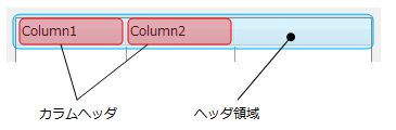
ヘッダ領域の機能は、ヘッダの表示・非表示の切り替えやヘッダの高さなどヘッダ全体に適用され、ListHeaderPaneプロパティが参照するListHeaderPaneオブジェクトを使用して設定します。
カラムヘッダは各カラムに対する個別の設定を行い、ListColumnクラスのHeaderプロパティで行います。Headerプロパティは、ListHeaderオブジェクトを参照します。
ヘッダ領域は、ListHeaderPaneプロパティが参照するListHeaderPaneオブジェクトを使用して設定します。リストボックスにヘッダを表示するには、VisibleプロパティをTrueに設定します。その他、以下のような外観設定が可能です。
- ヘッダの高さを自動調整するかどうか(AutoHeightプロパティ)
- ヘッダ全体の背景色(BackColorプロパティ)
- ヘッダ文字のフォント(Fontプロパティ)
- ヘッダ全体の背景に使用するグラデーション効果(GradientEffectプロパティ)
- ヘッダの高さ(Heightプロパティ)
次のサンプルコードは、ヘッダ領域を設定する例です。
Imports GrapeCity.Win.MultiRow
Imports InputManCell = GrapeCity.Win.MultiRow.InputMan

Dim GcComboBoxCell1 = New InputManCell.GcComboBoxCell()

GcComboBoxCell1.ListHeaderPane.Visible = True
GcComboBoxCell1.ListHeaderPane.AutoHeight = True

GcMultiRow1.Template = Template.CreateGridTemplate(New Cell() {GcComboBoxCell1})
using GrapeCity.Win.MultiRow;
using InputManCell = GrapeCity.Win.MultiRow.InputMan;

InputManCell.GcComboBoxCell gcComboBoxCell1 = new InputManCell.GcComboBoxCell();

gcComboBoxCell1.ListHeaderPane.Visible = true;
gcComboBoxCell1.ListHeaderPane.AutoHeight = true;

gcMultiRow1.Template = Template.CreateGridTemplate(new Cell[] { gcComboBoxCell1 });
カラムヘッダの設定は、ListColumnクラスのHeaderプロパティで行い、Headerプロパティは、ListHeaderクラスを参照します。
ListHeaderクラスを使用して、カラムヘッダには以下のような設定が可能です。
ヘッダタイトル
ヘッダのタイトルを変更するには、ListHeaderクラスのTextプロパティを使用します。
以下にヘッダのテキストを変更する例を示します。
Imports GrapeCity.Win.MultiRow
Imports InputManCell = GrapeCity.Win.MultiRow.InputMan

Dim GcComboBoxCell1 = New InputManCell.GcComboBoxCell()

GcComboBoxCell1.ListColumns.Add(New InputManCell.ListColumn())
GcComboBoxCell1.ListColumns.Add(New InputManCell.ListColumn())

GcComboBoxCell1.ListColumns(0).Header.Text = "カラム1"
GcComboBoxCell1.ListColumns(1).Header.Text = "カラム2"

GcMultiRow1.Template = Template.CreateGridTemplate(New Cell() {GcComboBoxCell1})
using GrapeCity.Win.MultiRow;
using InputManCell = GrapeCity.Win.MultiRow.InputMan;

InputManCell.GcComboBoxCell gcComboBoxCell1 = new InputManCell.GcComboBoxCell();

gcComboBoxCell1.ListColumns.Add(new InputManCell.ListColumn());
gcComboBoxCell1.ListColumns.Add(new InputManCell.ListColumn());

gcComboBoxCell1.ListColumns[0].Header.Text = "カラム1";
gcComboBoxCell1.ListColumns[1].Header.Text = "カラム2";

gcMultiRow1.Template = Template.CreateGridTemplate(new Cell[] { gcComboBoxCell1 });
カラムのリサイズ
ListHeaderクラスのAllowResizeプロパティをTrueに設定すると、アプリケーションの実行時にユーザーはマウス操作等でカラムのサイズを自由に変更できるようになります。
実行時にカラムのサイズ(幅)を変更するには、サイズを変更したいカラムの境界線の位置でマウスの左ボタンを押し、変更したいサイズに合わせてマウスカーソルを移動し、左ボタンを離します。
画像の表示
カラムヘッダにはテキスト以外に画像を表示することができます。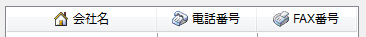
画像を表示するには、ListHeaderクラスのImageプロパティを使用します。
Imageプロパティには、表示する画像のインデックスを設定します。Imageプロパティに設定するインデックスは、セルのImageListプロパティに設定したImageListオブジェクトのImagesプロパティが参照するImageList.ImageCollectionのインデックスです。
表示された画像の位置は、ListHeaderクラスのTextAttachAlignmentプロパティで設定します。
また、画像とテキストの距離は、ImageTextSpaceプロパティで設定します。
以下にヘッダに画像を変更する例を示します。次のサンプルコードでは、リストボックスに予め2つのカラムが追加されていることを前提にしています。
Imports InputManCell = GrapeCity.Win.MultiRow.InputMan

Dim GcComboBoxCell As InputManCell.GcComboBoxCell = DirectCast(GcMultiRow1(0, 0), InputManCell.GcComboBoxCell)

'  ImageListプロパティを設定
Dim iList As New ImageList()
iList.Images.Add(Image.FromFile("C:\Image1.bmp"))
iList.Images.Add(Image.FromFile("C:\Image2.bmp"))
GcComboBoxCell.ImageList = iList

' ヘッダに画像を設定
GcComboBoxCell.ListColumns(0).Header.Image = 0
GcComboBoxCell.ListColumns(0).Header.TextAttachAlignment = GrapeCity.Win.Editors.AttachAlignment.LeftMiddle
GcComboBoxCell.ListColumns(0).Header.ImageTextSpace = 3
GcComboBoxCell.ListColumns(1).Header.Image = 1
GcComboBoxCell.ListColumns(1).Header.TextAttachAlignment = GrapeCity.Win.Editors.AttachAlignment.LeftMiddle
GcComboBoxCell.ListColumns(1).Header.ImageTextSpace = 3
using InputManCell = GrapeCity.Win.MultiRow.InputMan;

InputManCell.GcComboBoxCell gcComboBoxCell = (gcMultiRow1[0, 0] as InputManCell.GcComboBoxCell);

// ImageListプロパティを設定
ImageList iList = new ImageList();
iList.Images.Add(Image.FromFile("C:\\Image1.bmp"));
iList.Images.Add(Image.FromFile("C:\\Image2.bmp"));
gcComboBoxCell.ImageList = iList;

// ヘッダに画像を設定
gcComboBoxCell.ListColumns[0].Header.Image = 0;
gcComboBoxCell.ListColumns[0].Header.TextAttachAlignment = GrapeCity.Win.Editors.AttachAlignment.LeftMiddle;
gcComboBoxCell.ListColumns[0].Header.ImageTextSpace = 3;
gcComboBoxCell.ListColumns[1].Header.Image = 1;
gcComboBoxCell.ListColumns[1].Header.TextAttachAlignment = GrapeCity.Win.Editors.AttachAlignment.LeftMiddle;
gcComboBoxCell.ListColumns[1].Header.ImageTextSpace = 3;
省略文字
ListHeaderクラスのEllipsisプロパティを使用すると、ヘッダのテキストの長さがカラムの幅より大きいとき、省略文字を表示するかどうか設定することができます。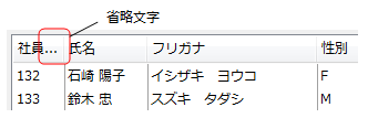
ListDefaultColumnプロパティが参照するDefaultListColumnオブジェクトのHeaderプロパティを使用すれば、カラムヘッダの既定値にすることができます。すべてのヘッダに共通の設定は、既定値を設定することで複数のヘッダに同じ設定を繰り返す手間が省けます。
Headerプロパティは、ListHeader型のオブジェクトを値に持つプロパティのため、カラムヘッダと同じ設定内容を持ちます。