リストボックス部の項目のスタイル、サブアイテムのスタイル等について説明します。ヘッダのスタイルについては「ヘッダの設定」を参照してください。
リストボックス内に表示されている項目のスタイルは、項目(行)ごとにスタイルを定義することができます。
項目にスタイルを定義するには、リスト内の個々の項目を表すListItemのオブジェクトを使用して、個別にスタイル定義することもできますが、ListItemTemplatesプロパティを使用すれば、リストボックス全体に一貫したスタイルを適用することができるため便利です。ItemTemplatesプロパティを使うと下図のように、複数のスタイルを特定の行おきに繰り返して表示することができます。
ItemTemplatesプロパティは、ItemTemplateCollectionオブジェクトを参照します。ItemTemplateCollection オブジェクトは、 項目のスタイルを定義するItemTemplateオブジェクトを格納するコレクションです。
スタイルの繰り返しの数は、ItemTemplateCollectionに追加されたItemTemplateオブジェクトの数で決定されます。つまり、コレクションに1つのオブジェクトが格納されている場合は、1つのスタイルが毎行繰り返されるため、リストボックス内の項目のすべてが同じスタイルになります。コレクションにオブジェクトが2つ格納されている場合は、1行おき項目のスタイルが繰り返されるようになります。
ItemTemplate オブジェクトでは、スタイルや外観の設定に関して次のプロパティを持っています。
- AutoItemHeight(項目の高さを自動設定します。)
- BackColor(背景色を設定します。)
- Font(フォントを設定します。)
- ForeColor(前景色を設定します。)
- GradientEffect(グラデーション効果を設定します。)
- Height(項目の高さを設定します。)
- Image(項目の先頭カラムに表示する画像を設定します。)
- Indent(セル左端からのインデントの距離を設定します。)
次のサンプルは、1行おきに項目のスタイルを設定する例です。
Imports GrapeCity.Win.MultiRow
Imports InputManCell = GrapeCity.Win.MultiRow.InputMan

Dim GcComboBoxCell1 = New InputManCell.GcComboBoxCell()

' ヘッダを非表示にします。
GcComboBoxCell1.ListHeaderPane.Visible = False

' GcComboBoxCell に項目を追加
GcComboBoxCell1.Items.AddRange(New InputManCell.ListItem() { _
    New InputManCell.ListItem("Sunday"), New InputManCell.ListItem("Monday"), _
    New InputManCell.ListItem("Tuesday"), New InputManCell.ListItem("Wednesday"), _
    New InputManCell.ListItem("Thursday"), New InputManCell.ListItem("Friday"), _
    New InputManCell.ListItem("Saturday") _
})

' 項目のスタイルを作成
Dim myItemTemp1 As New InputManCell.ItemTemplate(0, Nothing, Color.Silver, Color.Black, 0, New Font("MS ゴシック", 9), Nothing)
Dim myItemTemp2 As New InputManCell.ItemTemplate(0, Nothing, Color.Black, Color.White, 0, New Font("MS ゴシック", 9), Nothing)

' スタイルをテンプレートに設定
GcComboBoxCell1.ListItemTemplates.Add(myItemTemp1)
GcComboBoxCell1.ListItemTemplates.Add(myItemTemp2)

GcMultiRow1.Template = Template.CreateGridTemplate(New Cell() {GcComboBoxCell1})
using GrapeCity.Win.MultiRow;
using InputManCell = GrapeCity.Win.MultiRow.InputMan;

InputManCell.GcComboBoxCell gcComboBoxCell1 = new InputManCell.GcComboBoxCell();

// ヘッダを非表示にします。
gcComboBoxCell1.ListHeaderPane.Visible = false;

// GcComboBoxCell に項目を追加
gcComboBoxCell1.Items.AddRange(new InputManCell.ListItem[] {
    new InputManCell.ListItem("Sunday"), new InputManCell.ListItem("Monday"),
    new InputManCell.ListItem("Tuesday"), new InputManCell.ListItem("Wednesday"),
    new InputManCell.ListItem("Thursday"), new InputManCell.ListItem("Friday"),
    new InputManCell.ListItem("Saturday")
});

// 項目のスタイルを作成
InputManCell.ItemTemplate myItemTemp1 = new InputManCell.ItemTemplate(0, null, Color.Silver, Color.Black, 0, new Font("MS ゴシック", 9), null);
InputManCell.ItemTemplate myItemTemp2 = new InputManCell.ItemTemplate(0, null, Color.Black, Color.White, 0, new Font("MS ゴシック", 9), null);

// スタイルをテンプレートに設定
gcComboBoxCell1.ListItemTemplates.Add(myItemTemp1);
gcComboBoxCell1.ListItemTemplates.Add(myItemTemp2);

gcMultiRow1.Template = Template.CreateGridTemplate(new Cell[] { gcComboBoxCell1 });
なお、デザイン画面では項目のスタイルを設定する専用のエディタ「項目スタイルの既定値の設定」から容易な設定が可能です。 このエディタは次の方法で起動できます。
- プロパティウィンドウのListItemTemplates プロパティをアクティブした時に表示される「…」ボタンを押下
また、GcComboBoxCellは、プリセットとして予め定義されたスタイルテンプレートを使って項目や交互行のスタイルを定義することができます。 スタイルテンプレートから選択したスタイルは、自動的に項目スタイルに変換され「項目スタイルの既定値の設定」エディタで再編集することも可能です。スタイルテンプレートは次の方法で起動できます。
- セルのスマート タグから「テンプレート...」を選択
ListGridLinesプロパティを使用して、水平方向および垂直方向のグリッド線を設定できます。ListGridLinesプロパティはListGridLinesクラスを参照し、このクラスのHorizontalLinesプロパティは水平方向のグリッド線を、VerticalLinesプロパティは垂直方向のグリッド線を設定します。
これらのプロパティはLineクラスを参照し、色や幅、線種などを設定することができます。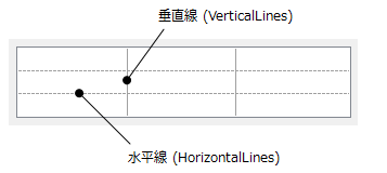
リストボックスの項目は、選択されている状態と無効な状態のときのスタイルを個別に設定することができます。
選択行のスタイルを設定するには、ListSelectedItemStyleプロパティを使用します。
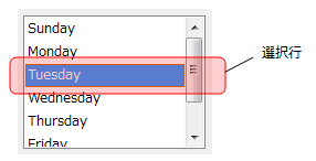
また、項目を定義するListItemオブジェクトのEnabledプロパティがFalseに設定され、選択できず無効な項目のスタイルはListDisabledItemStyleプロパティを使用します。いずれもItemStyleクラスを参照し以下のプロパティを持ちます。
- BackColor(背景色を設定します。)
- ForeColor(前景色を設定します。)
- GradientEffect(グラデーション効果を設定します。)
次のサンプルは、選択項目と無効な項目のスタイルを設定する例です。
Imports GrapeCity.Win.MultiRow
Imports InputManCell = GrapeCity.Win.MultiRow.InputMan

Dim GcComboBoxCell1 = New InputManCell.GcComboBoxCell()

' ヘッダを非表示にします。
GcComboBoxCell1.ListHeaderPane.Visible = False

' コンボコントロールに項目を追加します。
GcComboBoxCell1.Items.AddRange(New InputManCell.ListItem() { _
    New InputManCell.ListItem("Sunday"), New InputManCell.ListItem("Monday"), _
    New InputManCell.ListItem("Tuesday"), New InputManCell.ListItem("Wednesday"), _
    New InputManCell.ListItem("Thursday"), New InputManCell.ListItem("Friday"), _
    New InputManCell.ListItem("Saturday") _
})

' 選択項目の背景色と前景色を設定します。
GcComboBoxCell1.ListSelectedItemStyle.BackColor = Color.SlateBlue
GcComboBoxCell1.ListSelectedItemStyle.ForeColor = Color.Yellow

' 3つの項目を無効に設定します。
GcComboBoxCell1.Items(0).Enabled = False
GcComboBoxCell1.Items(1).Enabled = False
GcComboBoxCell1.Items(3).Enabled = False

' 無効な項目のスタイルを設定します。
GcComboBoxCell1.ListDisabledItemStyle.BackColor = Color.Gray
GcComboBoxCell1.ListDisabledItemStyle.ForeColor = Color.Silver

GcMultiRow1.Template = Template.CreateGridTemplate(New Cell() {GcComboBoxCell1})
using GrapeCity.Win.MultiRow;
using InputManCell = GrapeCity.Win.MultiRow.InputMan;

InputManCell.GcComboBoxCell gcComboBoxCell1 = new InputManCell.GcComboBoxCell();

// ヘッダを非表示にします。
gcComboBoxCell1.ListHeaderPane.Visible = false;

// コンボコントロールに項目を追加します。
gcComboBoxCell1.Items.AddRange(new InputManCell.ListItem[] {
    new InputManCell.ListItem("Sunday"), new InputManCell.ListItem("Monday"),
    new InputManCell.ListItem("Tuesday"), new InputManCell.ListItem("Wednesday"),
    new InputManCell.ListItem("Thursday"), new InputManCell.ListItem("Friday"),
    new InputManCell.ListItem("Saturday")
});

// 選択項目の背景色と前景色を設定します。
gcComboBoxCell1.ListSelectedItemStyle.BackColor = Color.SlateBlue;
gcComboBoxCell1.ListSelectedItemStyle.ForeColor = Color.Yellow;

// 3つの項目を無効に設定します。
gcComboBoxCell1.Items[0].Enabled = false;
gcComboBoxCell1.Items[1].Enabled = false;
gcComboBoxCell1.Items[3].Enabled = false;

// 無効な項目のスタイルを設定します。
gcComboBoxCell1.ListDisabledItemStyle.BackColor = Color.Gray;
gcComboBoxCell1.ListDisabledItemStyle.ForeColor = Color.Silver;

gcMultiRow1.Template = Template.CreateGridTemplate(new Cell[] { gcComboBoxCell1 });
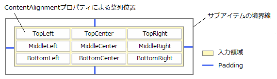
リストの項目に含まれるサブアイテムを表すSubItemには、テキストの配置位置を設定するプロパティが2つ用意されています。入力領域内でテキストの水平および垂直方向の整列位置を指定するには、ContentAlignmentプロパティを使用します。また、Paddingプロパティを使うことで、サブアイテムの上下左右の境界線からデータコンテンツの表示領域までの距離をピクセル単位で調整できます。